

DUCCIO GRASSI ARCHITECTS designs the new MAX MARA flagship store in Beijing, more than 700 sqm on four levels in a main luxury district of the Chinese capital city.
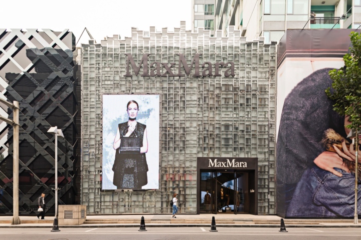
The shop is characterized by a high, surprising and very recognizable façade: a large lighting surface composed by stainless steel frames and glazed glasses, arranged in a fascinating scheme that rarefies while ascending.

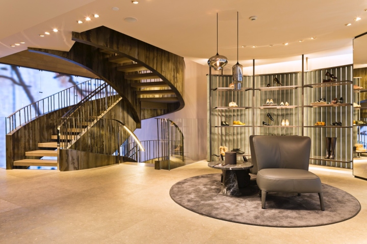
Inside, the main element is represented by the staircase which recalls the helical trend of the Milan’s stairs, further enhanced by the covering material: a distinctive natural-looking metal that highlights the curves with its golden and amber glares. The special suspended structure allows to design a single continuous stripe that joins every story, as the façade conforms and identifies the exteriors. A wide LED wall is used as background, inviting us to explore the various spaces composing this shop.

The ground and first levels relate very closely with the Milan’s concept: luxury, coziness, femininity, preciousness and elegance are its keywords. The spaces recall the typical MAX MARA shops but, as always, there are some innovative features: the large dark wall reinvents the iconic crosta wood using a patchwork of treated irons and small platinum glass inserts, refreshing the look of the rooms together with the styling elements, objet trouve matched to form more intimate and private areas.

The last floor is dedicated to the most elegant collections and reveals the most important concept’s evolution, particularly through the preciousness of the materials and their combination: a brass grid embraces the elegant cenere wood and the charming platinum glass forming two irregular volumes that contain the VIP fitting rooms and define a non-conventional space. The hanging system is as non-con- ventional as the surrounding ambiance: it is composed by random metal bars held together by a geome- tric scheme that is as simple as peculiar, conferring this level the importance it deserves.

A further evolution of the original Milan’s concept is found in the basement floor, designed for the fresher collections. When on other levels natural daylight shines through the façade, here there is no direct lighting. A wide orthogonal structure frames the walls and reveals unexpected views of the Italian gardens, transforming the whole level in a bright and comfortable living room.
Design: Duccio Grassi Architects / Duccio Grassi
Photography: Yves Chan You




Add to collection

