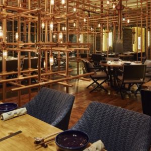

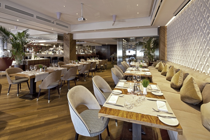
The customer had an idea to create a gastronomic space with an open kitchen so that the guests could see the food being cooked. As for the interior design, it was necessary to make it simple and succinct yet comfortable and fashionable.
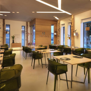
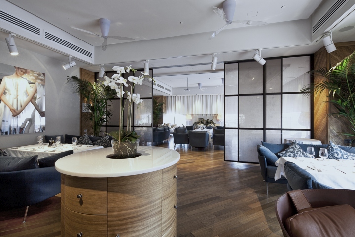
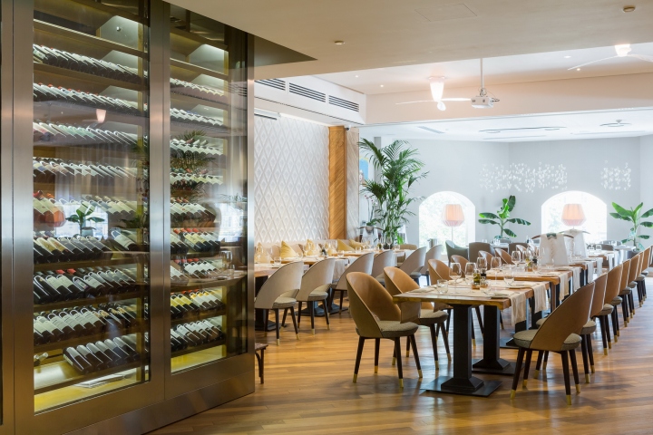
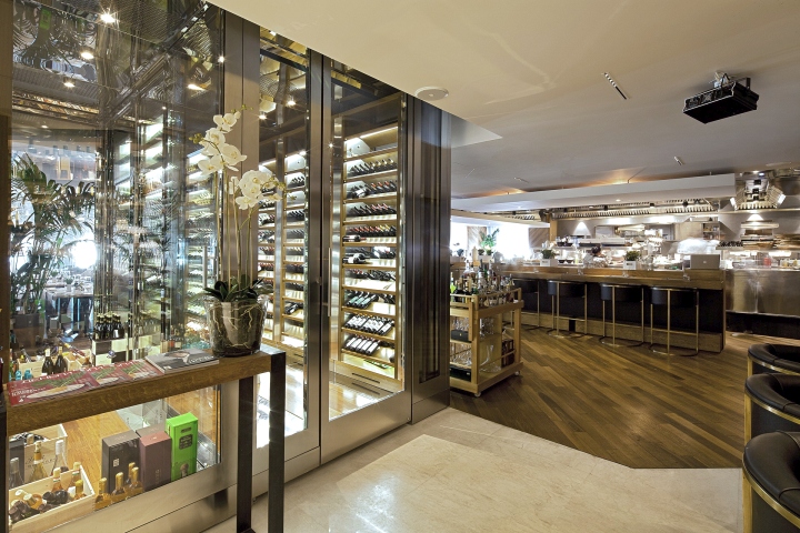
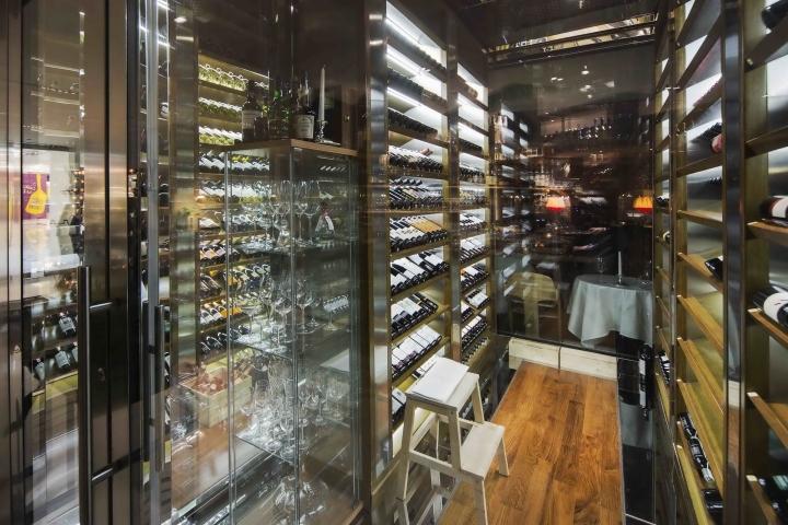
There is a wine rack standing at the entrance in the first dining hall. The idea was to include into the interior design not only the kitchen, but also part of the storage space; to show a high level of the restaurant by putting wines in a place it can be seen by the guests of the restaurant. This dining hall is designed in the style of European restaurants, with sofas and chairs in it. The space of the dining hall can be arranged in a different way by moving the furniture around the hall.
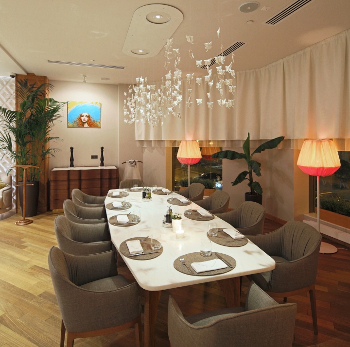
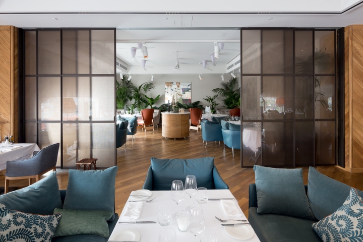
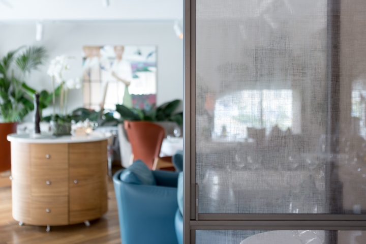
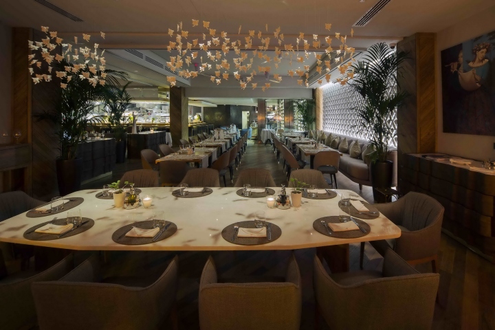
The second dining hall has a bay window. There is a large marble table for a large group of guests. The VIP-lounge has four tables that can be re-arranged. This area is separated from other spaces by dense thickets of plants and a glass partition. Dining halls can be separated by drapes of the metal mesh. In this way it is possible to create another four isolate zones.
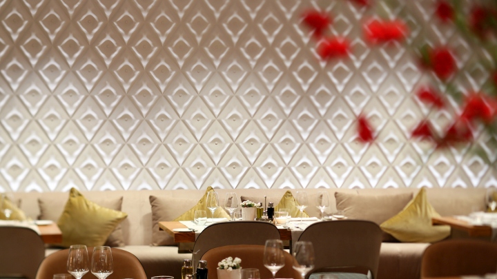
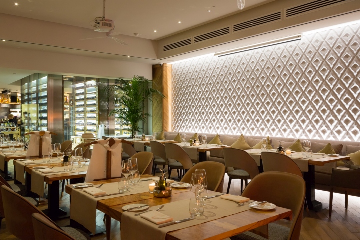
The restaurant has simple, comfortable furniture, reminding us of the style of the 60s. Maximum natural materials were used. The furniture is made of leather, wood, interesting textile hound’s tooth patterns. Tables are made of natural wood and olive veneer. The table in the second dining hall is made of marble.

We wanted to avoid anything in the interior that would be too pretentious, to design without clear focus on anything attracting too much attention. Everything had to be balanced yet every detail to be elaborately thought out. And together, they provide comfort and unique charm.
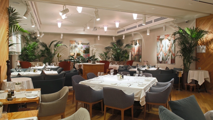
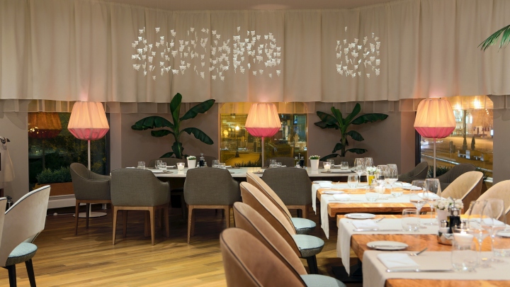
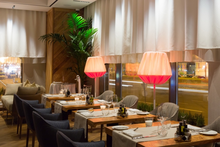
Thinking of types of the light, we decided to refuse from chandeliers. Instead, small lamps with lampshades in the shape of butterflies are hang above the tables. Other illumination includes built-in lighting, which is not visible. Exceptions are the fans, randomly “scattered” around the dining hall, with the lamps fitted to them. There are also floor lamps on the floor of the dining hall giving a warm light and creating a sense of the setting sun.
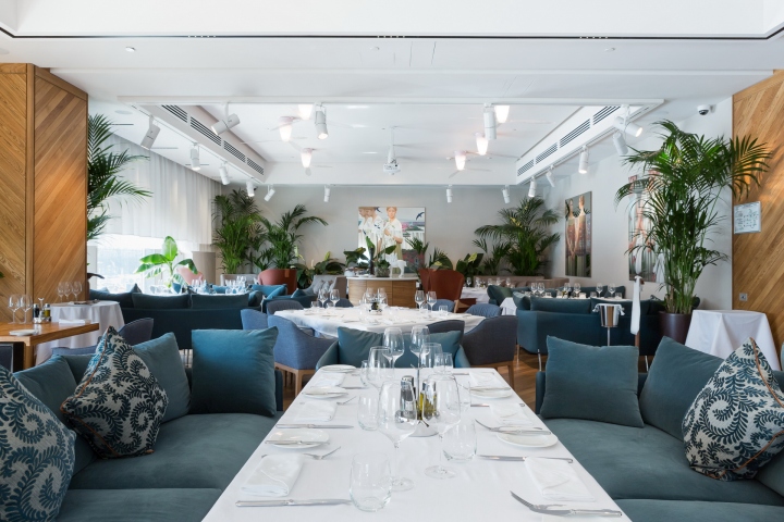
As a plant for interior decoration olive and rosemary were chosen. Guests can literally pluck the leaves off the tree, and add to their dishes. One of the challenges when working with the project was to increase the visual height of the windows. The windows themselves are quite low, which in turn creates the impression of the low ceiling.
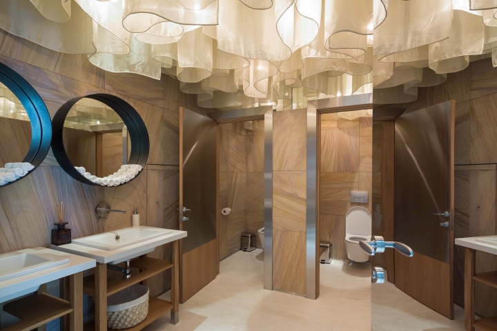
It was decided to hang high light white curtains so they could slightly sway. An interesting solution is a wall of concrete with the diamond (carriage upholstery) pattern. This wall is visible from anywhere in the restaurant. Paintings in the VIP-lounge are created using a unique technique of painting in oil on a mirror that not all parts of the picture are painted, the image is flowing, splits into fragments, reappearing and disappearing.
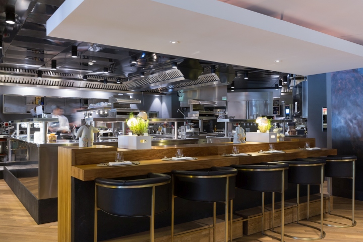
It was decided to leave some of the tables without tablecloths, despite the high level of the restaurant to open the texture of wood and marble tables. Special attention should be given to the kitchen. It has a very interesting facade, and the table for guests has an unusual table leg made in the shape of a hewn log. If we take a look at the wooden tables, we can see that the table top is slanted a little on both sides. It smoothes the corners and adds some coziness. Furniture was ordered from the original manufacturers in Europe. High quality furniture has a very good effect on the general perception of the interior level.
Designed by ARCHPOINT
Photography by Sergey Morgunov, Olga Alexyenko, Olga Melekestseva


Add to collection

