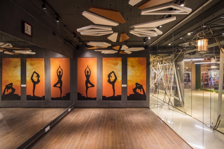

Sitting in the middle of a sprawling urban setting, Moksha Fitness Center and Spa is a study in functionality and a contemporary retail design. Covering an area of about 2000 sqft., the fitness and spa center resides in the basement of the original building and is designed as an extension to an existing gymnasium. The client brief specified a space to act as a support facility for the customers using the existing facility.

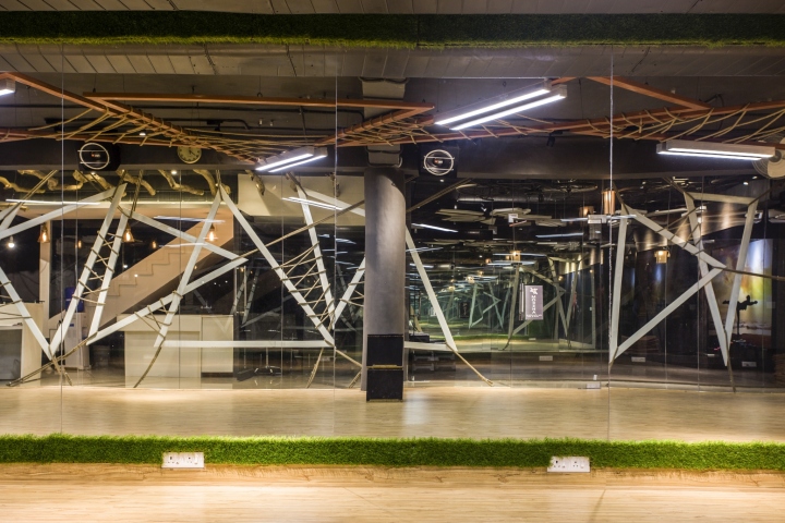
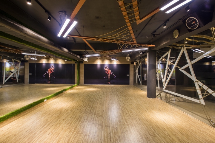
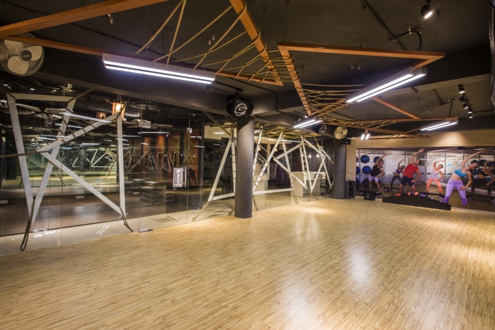
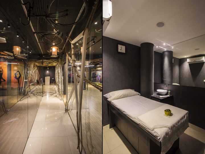
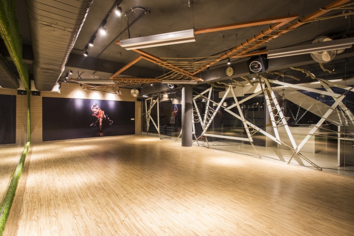
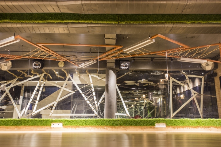
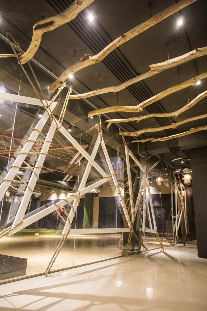
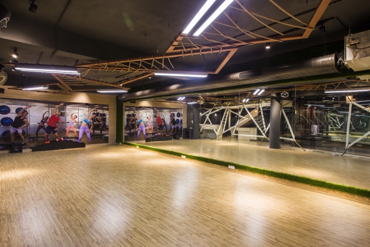
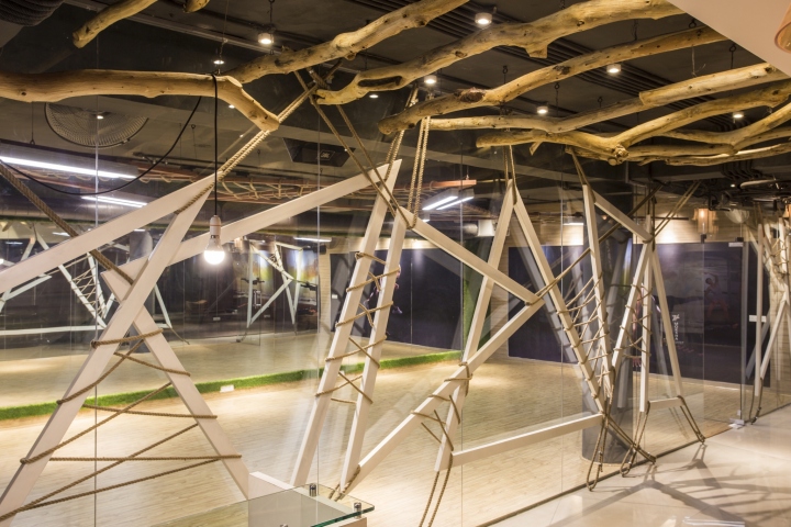
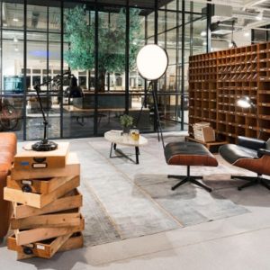
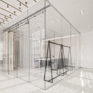
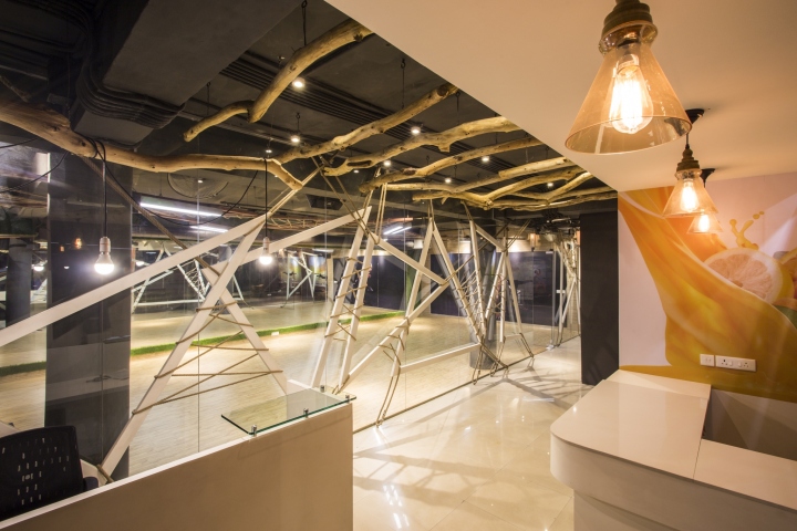
The space, to be used by young men and women in a competitive environment, needed to translate the energy of its occupants into the design. Therefore, the design utilizes a number of layers. The plan is deliberately kept simple so as to enhance the interior features of the fitness center. The project boasts of a space sensitive design in a modest budget. Aiming for a raw, understated look, the design makes use of unconventional materials such as rope and metal frames, extended from the floor and almost touching the ceiling. Bi-cycles hung from roofs and modern lighting features form the highlights of the design and add zing to the space. Glazed surfaces of the studios allow glimpses of activities inside, without disturbing the activities going on elsewhere. Overall, the design is subtle, yet eye-catching, subdued nevertheless impactful. The fabric of the design makes use of simple shapes that despite being geometric, allow fluidity and movement.

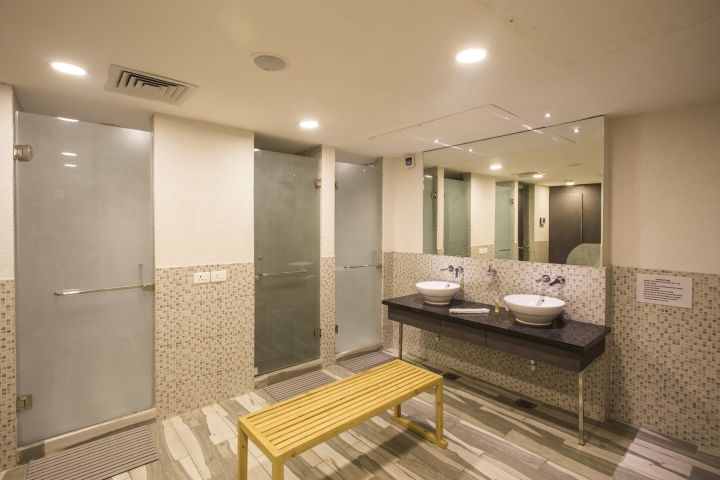
The reception area divides into a cafeteria and a waiting area. A 1.4 meter wide corridor acts as the axis of the space and divides it into two main areas—the spinning studio to the right and a multi-purpose hall to the left. The locker rooms for men and women are located at the end of the corridor and accommodate spa facilities, including the Steam and Massage rooms.
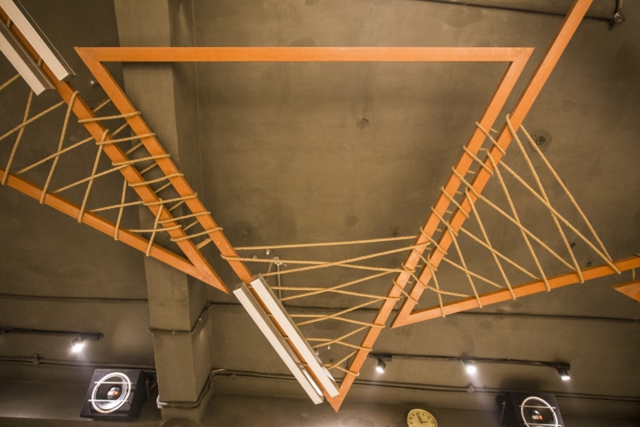
The language of the space is defined by overlapping, triangulated and free standing metal frames that act as screens differentiating spaces and add another layer to the design. Most of the load is borne by ropes that not only support the structure but also add another dimension to the interiors. The triangulated frames are interlaced so as to include an exciting, organic mesh.
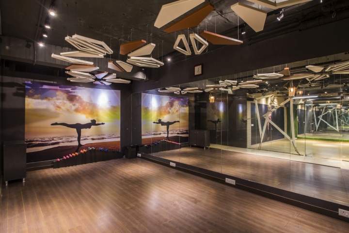
The flooring makes use of a lighter colour inside the studios to provide a contrast to the darker tones of the interiors. The Spa facility utilizes state of the art equipments and an international design language. Moksha fitness and spa defines the way urban interior design ought to be treated and read.
Designed by Studio Ardete
Photography by Purnesh Dev Nikhanj
