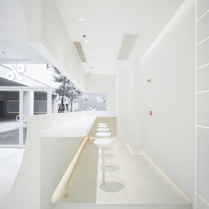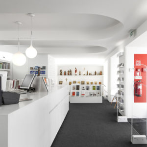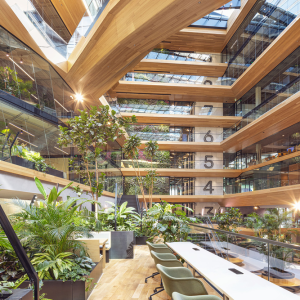
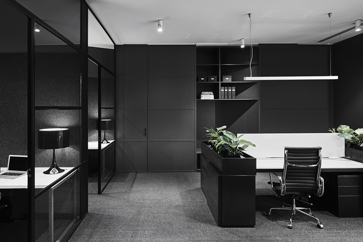

Plus Architecture have created a sleek, monochromatic workspace that not only reflects the client’s practical needs and aesthetic sensibilities, but also aligns with their branding and corporate image, carving out nine spaces within a limited footprint of 135sqm.

A rigid structure compromised by the existing services of a surrounding carpark, this site became an exercise in floorplan optimisation. Educated in its allocation of space and arrangement of furnishings, Plus have demonstrated intuitive spatial awareness and restraint.
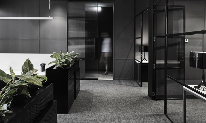
The design composition is resolute and effortless. The end-user has been brought to the fore and as a result the space flows organically, with the open-plan office space, three private offices, boardroom and kitchen a natural progression from the reception and banquette area. Thus, a fine balance between private and functional work spaces is achieved.
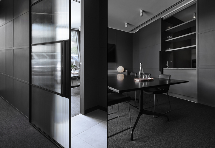
Polished in its presentation, the office exudes industrial sophistication with a refined, monochromatic palette featuring Dulux’s powder coat and acrylic paint ranges.
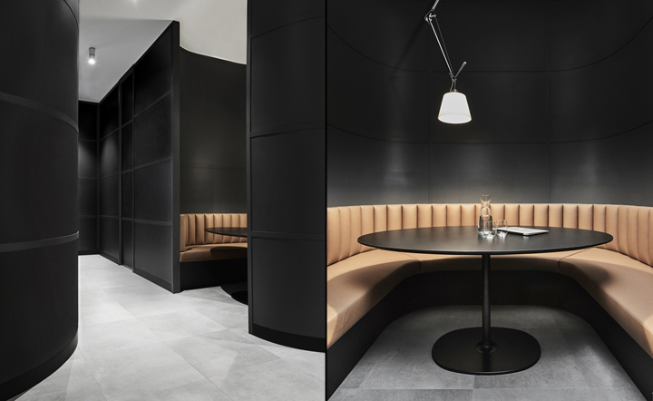
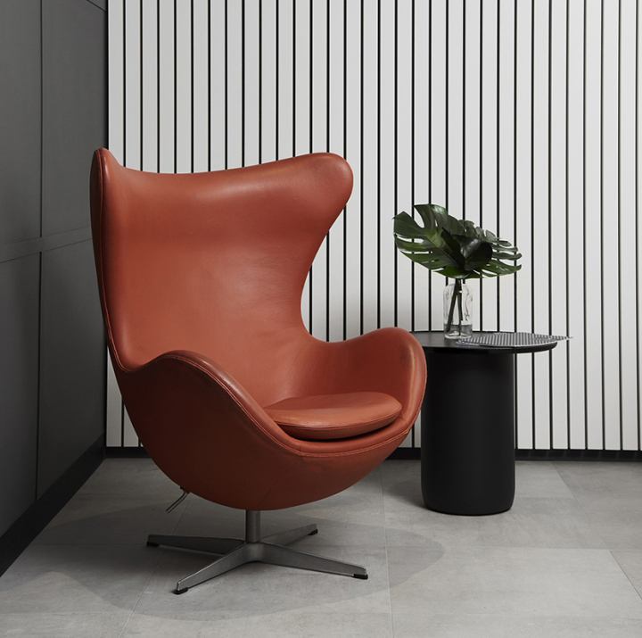
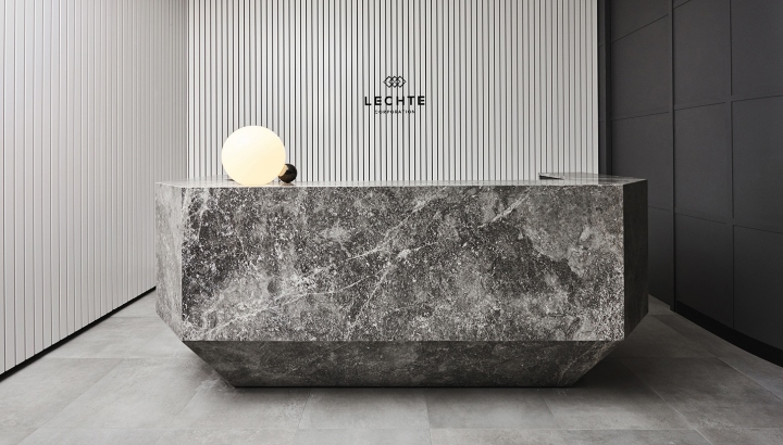
Metal framing defines internal windows, whilst the curvature of the walls and moments of neutral leather provide moments of textural relief, which is illustrated further through the feature reception desk. Appearing as though carved from a large block of stone, the statement piece introduces a sculptural element and sets the tone for the wider office.
Architect: Plus Architecture
Interior Designer: Narelle Cuthbert
Photography by James Geer


Add to collection
