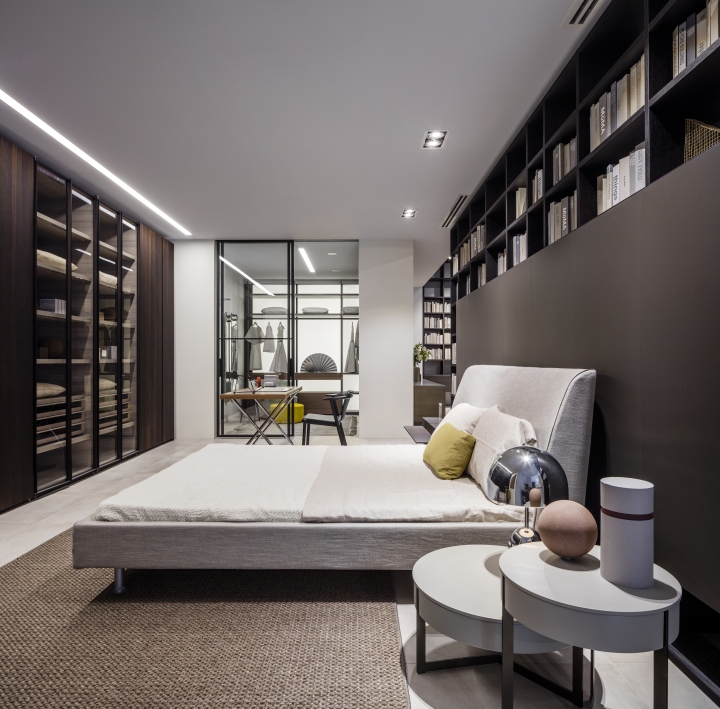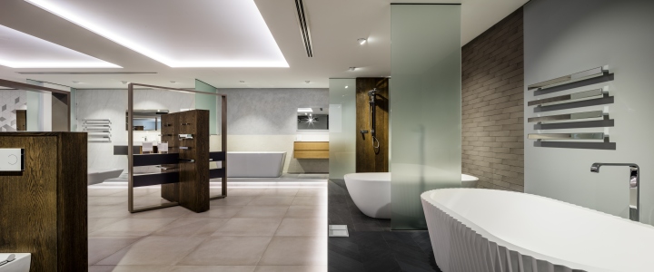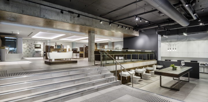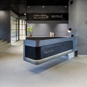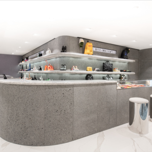
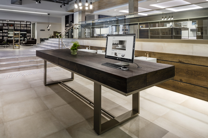

This Sydney showroom is Rogerseller’s new flagship. Our design embodies the Rogerseller design philosophy of “Minimal and restrained, with a quiet confidence.”

It was very clear to us that in the showroom the product itself should be the hero, not the design of the space. Outside of the display areas we avoided any use of distinctive or trendy design elements and let the products do the talking. Our goal is to inspire both designers and their clients by focusing on the products. The layout is very open with great sight lines and flow of space, the hallmarks of contemporary Sydney domestic architecture.

The atmosphere is informal and visitors are encouraged to make themselves at home. Staff interact with customers it’s most comfortable- next to the products. The Rogerseller team were very involved during the design process. We certainly challenged each other, to the benefit of the project. Its success is a product of our collaboration.
Designed by McCartney Design
Photography by Steve Back
