
Assignment
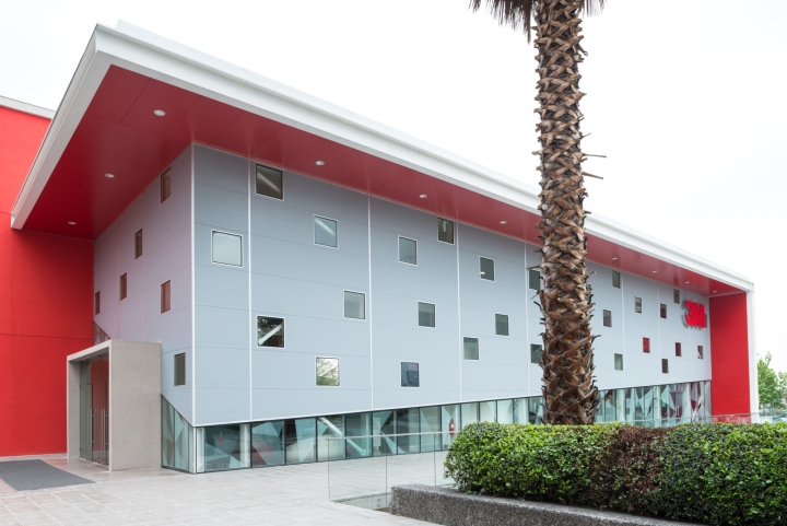
The Technology Display Project is part of 3M’s new Innovation Center in Chile. Siente Cinco has been commissioned with the design and set-up of the space intended for customers and technologies developed by the Company to interact. In addition we were also commissioned with the interior design of the building’s café and the complete graphic design.

Project
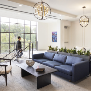
Despite the new 3M Innovation Center houses a number of offices and laboratories, the Atrium is the most important space in the building given it houses the Tecnology Display: place in which each and every visitor is introduced with 3M’s technologies world.

The assignment was not an easy task due to the Atrium’s complex configuration; a long, narrow and double-heighted space that serves as a balcony for the offices that circumscribe it. We were required to comply with a three-stage-space request that had to include: an Introduction, with a Sitting Room and Reception; a Transition, entailing a Video Room; (3) and an Interaction, where the customer is allowed to test and understand the technology behind the various materials and solutions offered by 3M.

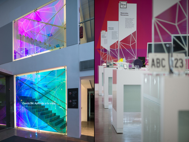
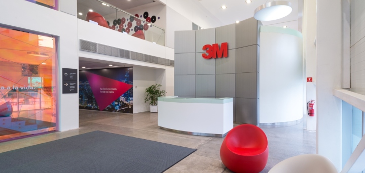
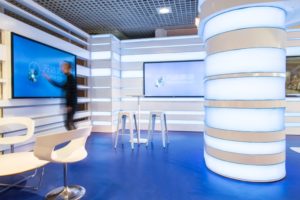
Siente Cinco decided to arrange the requirements in a linear fashion, having the Audio Visual Room as a divider between the Reception and the Interaction Areas. In the entrance, next to the stairwell, a large glass lined with a Dichroic Film Finish, draws the attention of every visitor who enters the building. This material, one of a kind in Chile, has the particularity of changing color as the arrivers move around the place.

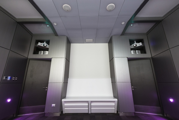
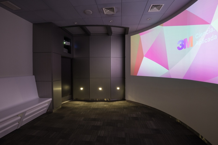
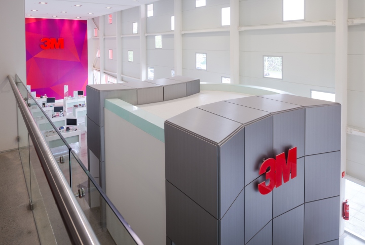
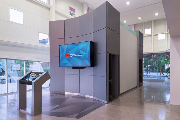
Just past the Reception, the customer enters the Transition Area, an elliptical Audiovisual Room. There, in a dimly lit room with a large curved screen, the customers are shown the welcoming video explaining the world of 3M’s technologies. The Interaction Area is adjacent to the AV Room. Visitors immediately face an interactive wall screen that browses videos of the company’s history in innovation.

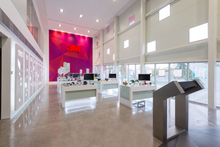
The central space shows 3M’s technologies over tables that display different materials and products. The tables may be approached from all sides easily enabling demonstrations. They also count with a totem-like structure that identifies the scope of their technological area.

The tables’ and the furniture’s coating was manufactured with DI-NOC, an adhesive film for lining furniture manufactured by 3M. Siente Cinco developed a design with removable plates to prevent any exposure of the seams’ cuts. The walls of the Interactive Room were also coated with this material, however in a metallic finish.

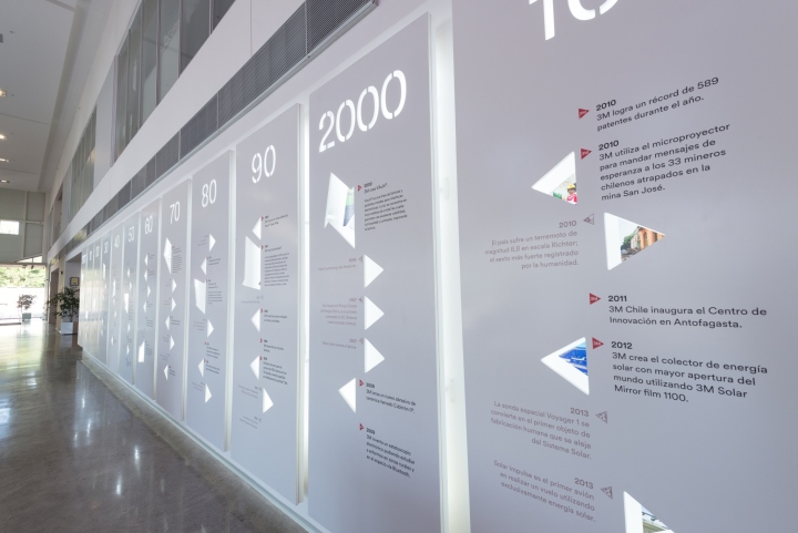
Right by the tables, there is a timeline showing the company’s business development. Twelve panels present 3M’s, Chile’s and global historic milestones. Each panel was diagrammed based on the geometric figure of a triangle as an element for graphic construction. That is to say, the markers and spaces for the images are based on this shape, hence configuring the entire piece. All the panels have perforations that reveal images in the background in backlit colors.

At the other side, we have set depictions of the histories in innovation and the markets where 3M operates. These are shown in pictures that float against the building’s panoramic window. In order not to block the light, they have been crafted translucently and are suspended with turnbuckles. Pictures with bright and saturated colors were used with the graphical intention of allowing them to shine with natural sun light.

The main wall has a gigantography based on the triangles, 3M’s new corporate image. It’s red and magenta palette contrasts with the cleanliness and neutrality of the rest of the building. Above it, a backlit 3M volumetric logo is visible from the room’s entrance.

In terms of lighting, the space is oriented to the north and has a glass facade on its first floor. The second level has randomly ordered windows that may be appreciated throughout the atrium. This is the reason Siete Cinco had to find a means to filter light, without covering the glass facade, while using it to convey 3M’s personality to the exterior of the building. Hence, a triangular pattern was designed in shades of translucent gray that allows creating an ambience while generating shades of light-and-shadow on the inside.

In addition, the artificial lighting had to play a vital role, theatrically emphasizing and highlighting every element, generating a visual impact and an unforgettable experience for the customers. That is why two scenarios were laid out. On the one hand, a general very faint lighting was achieved with dimmers, along punctual lighting to accentuate the most important elements. In this specific case, we decided to highlight the Reception’s wall, which with its concave shape and logo welcome visitors. The tables that display technologies are lit at the base which gives them the appearance to be floating in space. The timeline is also backlit, which allows for vivid colored images to appear and be seen through the triangular perforations. And to top it off, the back wall is lit with vivid colors bringing this neutral space to life.

In contrast, the second scenario is totally illuminated with carefully studied levels of lux to allow working properly when necessary. In this case, the ceiling’s dimmable lighting achieves its goal with perfection.

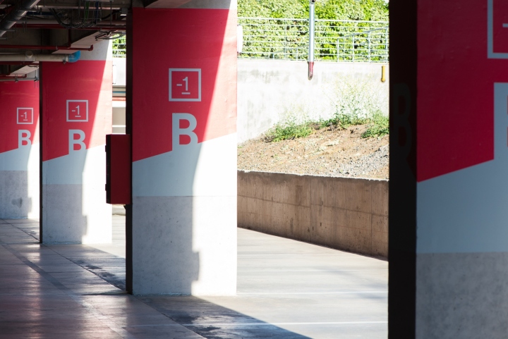
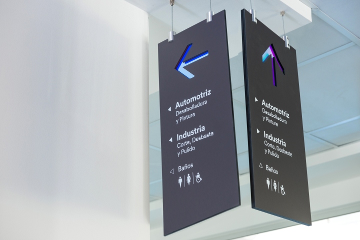
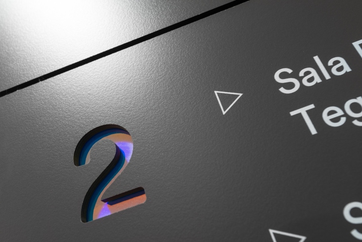
Another important part of the assignment was to design a new signage system. This part of the project included designing all navigation units in search of a consistent global image of all the points of interaction. With this in mind, Siente Cinco rescued graphic and constructive elements already used in the rest of the Technology Display. Hence the decision of working with perforations, using innovative materials such as 3M’s Iridescent Dichroic Film, and keeping the company’s original typeface and universal iconography, specially designed to complement communication. Four categories of signage were defined: room names, services, general browsers, safety and evacuation signage. All of them had their size and readability studied in detail.

To complement the Technology Display, other graphic interventions were carried out in laboratories, auditoriums, and transit areas. First, the Demonstration Labs, called Demo Rooms were supplemented with gigantographies of periodic tables related to the characteristics of the corresponding 3M area of technology. The design is based on the same touch screen graphic described above. However, greater importance was given to the use of whites and light grays, so its presence in a work room would not be tiring and invasive.

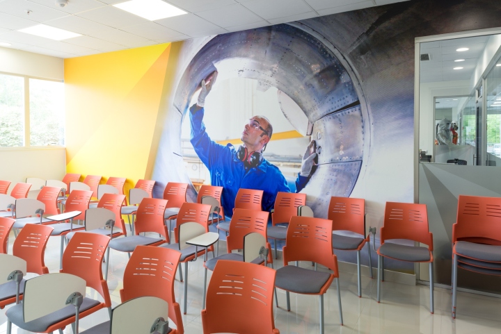
In addition to the Demo Rooms, it was decided that the Auditoriums and Training Rooms would have as a theme the use of colored photographs and 3M’s triangular patterns that allow these images to emerge. They were chosen fulfilling the 3M criteria showing the use of their products or their areas of application.

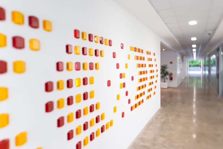
Other interesting interventions, are the 3M products installations, which when removed from their context, they make a new composition that aim to enrich through their physical and aesthetic characteristics lobbies and hallways. An example of this is the use of 3M retroreflective raised pavement markers that give off flashes of light from different points along the wall.
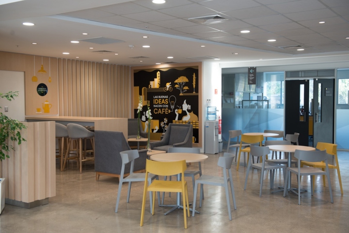
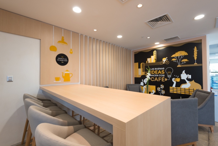
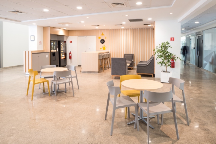
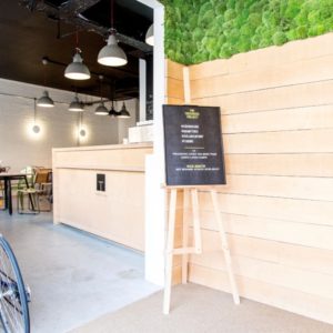
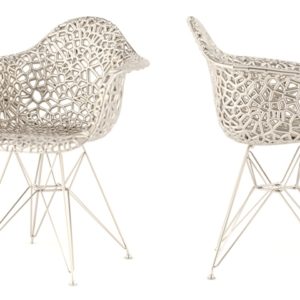
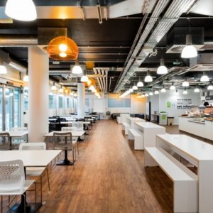
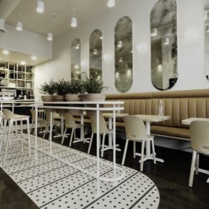
Finally, the cafeteria is intended as a meeting place, having different settings for different interactions that welcome all visitors. Its entire set of furniture is lined in a wood colored DI-NOC giving the space more warmth, and the graphical color palette changes to yellow differentiating it from the rest of the project.
