
Add to collection

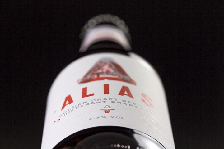
Rationale: Alias comes from a psychology that, when you have an Alias beer, you are away from the world’s stresses, problems and you are in a positive social environment…your Alias as such. This provided us with a rich story to tell and convey, whilst not overlooking the hand-made craft tangibility. The beer itself is a golden ale, with a taste that bridges a pale craft ale to a session lager…basically it tastes like angel’s tears.
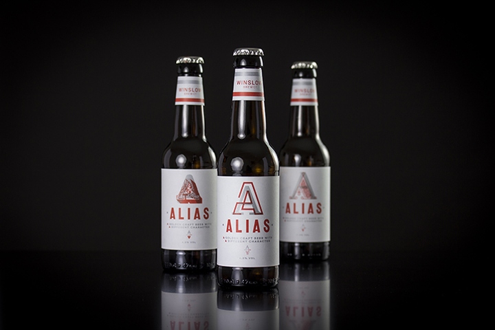
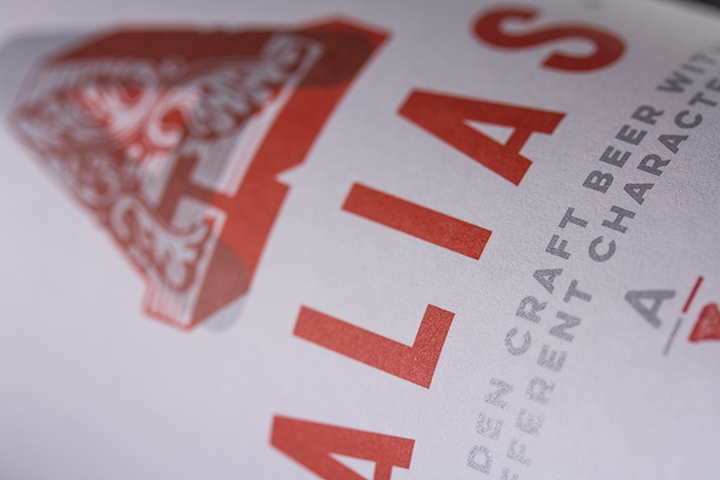
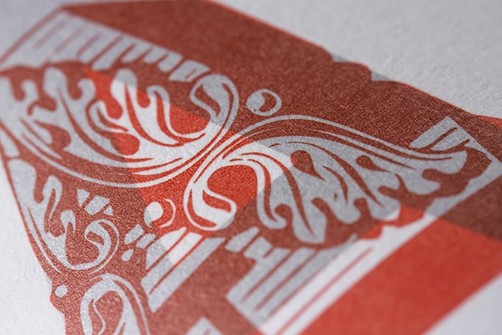
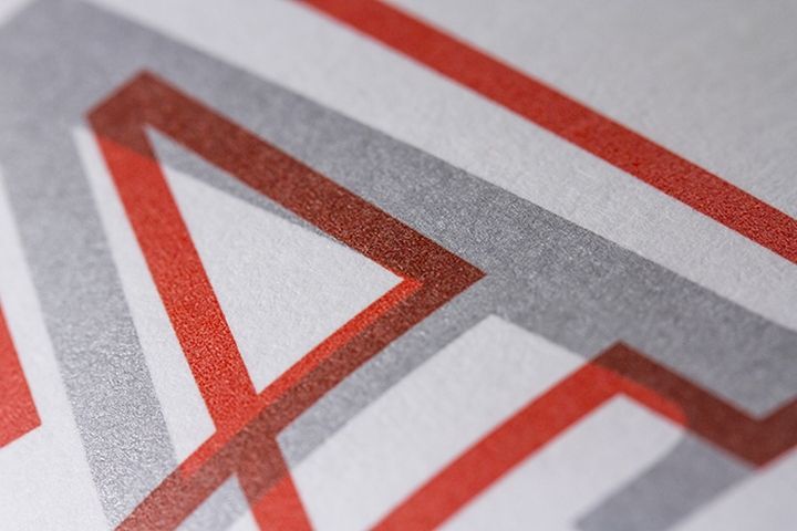
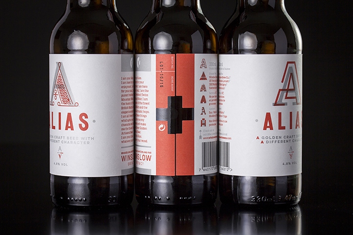
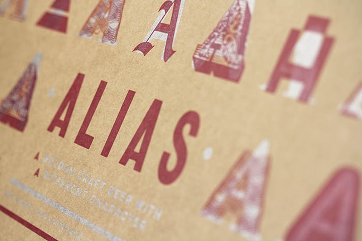
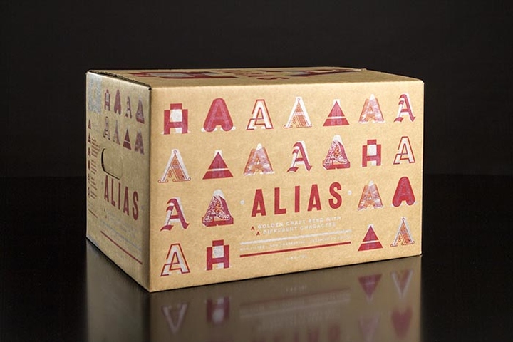
ALIAS – The more we delved into the name Alias the further we explored the notion of character, in terms of lavour, in terms of ‘type’ and in terms of personality. This resonated with us instantly and became the foundation for our creative path. The silver, whilst still beautiful, is the more conservative ‘you’, the opaque red over the top is your vibrant ‘alias’. These characters echo both the lavour and the sentiment of the product and produce an extensive brand proposition and language which translates culturally and commercially.
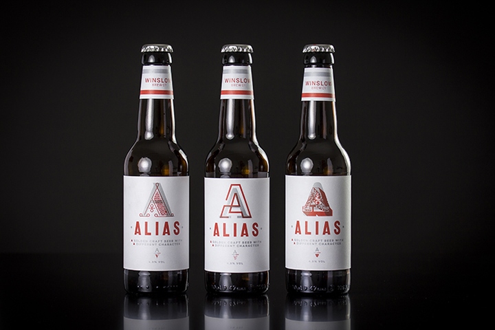
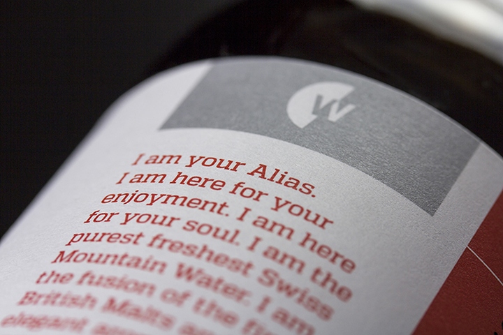
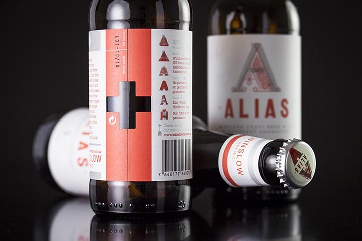
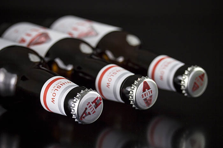
We entertained the idea of possibly never picking up the same Alias twice…thereby extending the Alias into the product itself. Ok so the reality was something that may not have been achievable but we did our best by producing 8 di fferent designs for the same product. You never feel as though it’s not an ‘Alias beer’ as you know it but the 8 di erent character combinations provided a further point of interest for the brand and keeps it constantly alive for it’s audience.
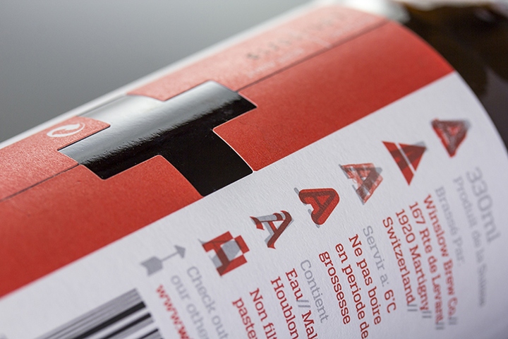
Whilst it is a Swiss product, it’s sold to British people in Switzerland and in the UK. We didn’t want to over ‘Swiss’ the design. Our subtle homage to Switzerland comes in the form of the cut-out Swiss cross on the meeting of the labels on the reverse – which provides a visual and tactile nod to it’s home. We remained crafty whilst adding a sense of class to the product. Whilst the brand is new the reaction to it has been quite profound. With only 6 months to market it has been picked up by major venues in both Switzerland and the UK. All have commented on the brand and it’s parity with the quality of the product.
Designed by The Potting Shed


Add to collection