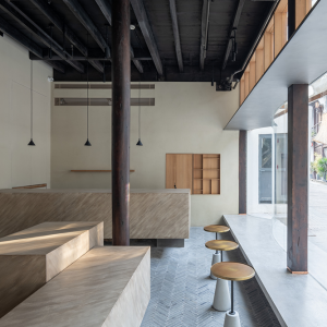


The C25 CAFÉ has existed amongst the lanes and alleys of the clamorous eastern district for more than two decades. It specializes in coffee and light meals and provides office workers and holiday shoppers with a very comfortable haven in which to take a short break and relax. The owner hopes his past experience will allow him to develop a brand new style of operation on the original foundation. The idea being that patrons will be able to “dine pleasantly together” in a quiet relaxing atmosphere. The establishment has been renamed the C25PLUS.

As the designer of C25 CAFÉ, right from the mode of operations, relationships with neighbors, new corporate identification system (CIS), spatial design, and furniture, TBDC (Taipei Base Design Center) began to think what C25PLUS should look like and what dining experience it should bring to consumers in each aspect that comes into contact with consumers, rather than just “style” and “appearance”.

Without a doubt, helping the client to make effective use of resources and financial control through design and planning was more important. However, the subject is located on the first floor of a 30-year-old building with elevators, we saw the complex relationships of pillars and beams, a sense of tension due to inadequate ceiling height, and seriously insufficient lighting. They all ran against the purpose of “dining with pleasure”.

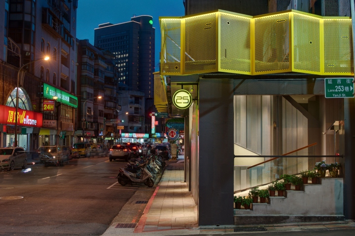
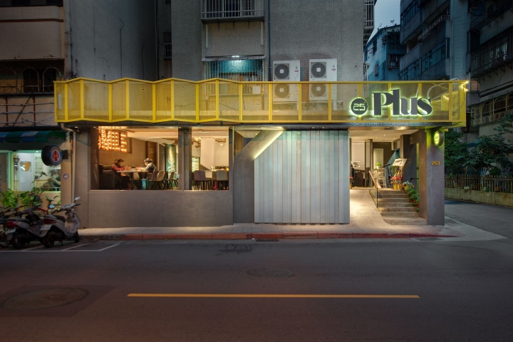
First, we set about changing the appearance of the building and its external relationship to the interior. TBDC used punched iron plates with high saturation. They were folded from different angles and created a new relationship with the original building. The design was matched with the signboard and lighting to create a great visual contrast with the surrounding areas in both day and night. One can see the C25PLUS café sign clearly from a considerable distance. Large windows allowed the interior atmosphere of the café to become a part of its outside appearance. People passing outside can see in and get a strong feeling about the internal environment. The windows also solved the poor lighting problem.

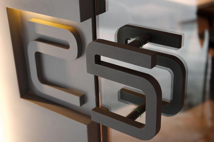
TBDC did not separate the internal space from the external one intentionally. Good natural light from the windows and the entrance by the Logo delineates the seating arrangements inside. In ceiling planning, the area of ceilings was minimized as necessary to conceal equipment and provide lighting to make more space for height and reduce project budget. Irregular masses were applied to integrate with beams and pillars in a complex arrangement. New connections were created for the coffee bar and equipment, ceilings, wall surfaces, and floor to turn original disadvantages into new advantages in the space. Different furniture combinations were designed for different number of customers and purposes to fulfil operating needs at any time.
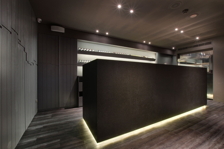
All these measures provide diners with the maximum comfort and the most pleasant dining experience. Style has been combined with operation efficiency and the design fully satisfies the intention of the owner to extend and expand the C25PLUS brand.
Designed by Roy Huang / Taipei Base Design Center (TBDC)
Photography by Black Wang



Add to collection
