
The old winery building is one of the largest and most impressive spaces in the Sarona Colony. Wine was an important produce of the Sarona Templar colony between 1879 and 1907. Vineyards were planted in the colony grounds and an entire industrial complex was built that included a wine cellar, various production machinery, warehouses and even a bottles factory.
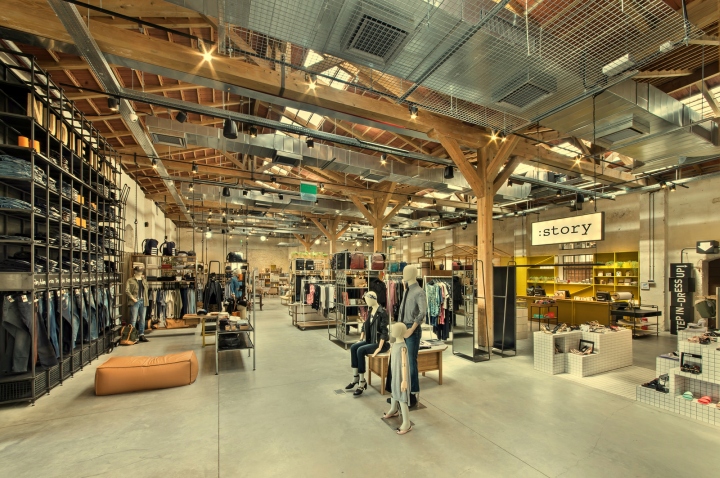
Underground, cut into the Kurkar sandstone, is the wine cellar, where today the Jajo Wine Bar restaurant is located. Above ground, on the first floor, stands a breathtaking structure with two adjacent wings and double slanting roofs, where wine production machinery and warehouses were once located. The building is made up of a series of symmetrical concrete columns supporting the outside Kurkar walls to the north and south.
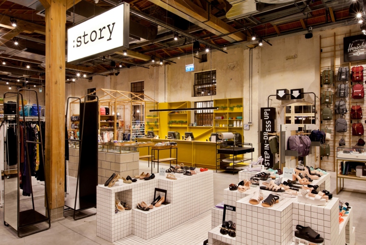
At the center of the building and across its length, matching pine posts are arranged between floor and tiled roof support. The symmetrical roof construction, made of authentic wooden beams and steel connectors, is incredibly beautiful – the entire roof, including the roof tiles, has been carefully and accurately reconstructed.
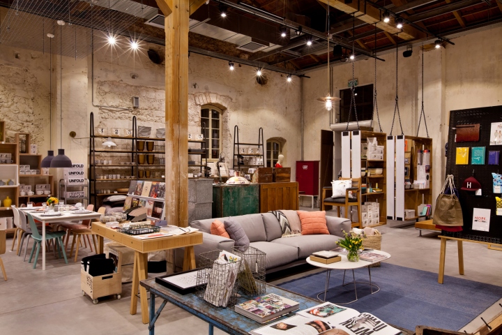
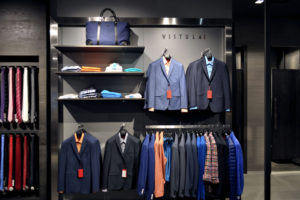
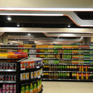
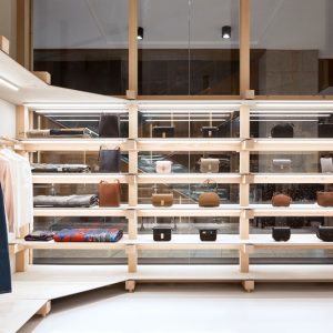
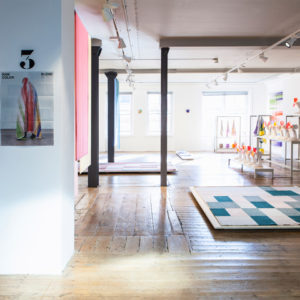
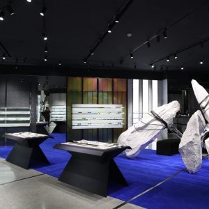
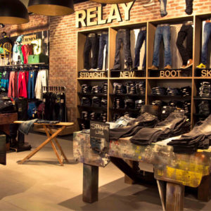
The STORY chain of stores is run by the fashion company 911, the sole importer of leading brands. It chose this space for their flag store, a unique concept store combining various brands and fashion departments under one roof. The store’s program includes women and men clothing, women and men shoes, kids fashion, accessories and home design – including furniture, fixtures and tools. Similar concept stores can be found abroad in places like DOVER STREET MARKET in London or the American URBAN OUTFITTERS.
Planning and design:
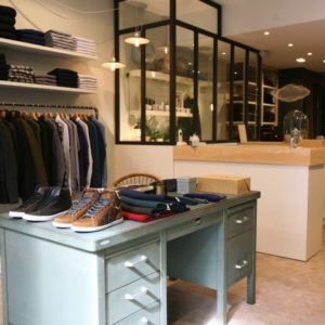
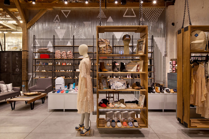
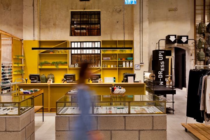
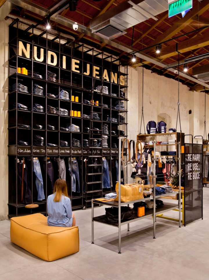
Our first decision was to leave the walls, the wooden beams and the tiled roof as they were, but avoid the risk of a corny looking place with classical Templar era aesthetics. We managed that mainly by placing light, nonchalant furniture in the various departments, providing a current and trendy design feeling. Each brand or department had to have its own focus and language inside a single space, which posed a very difficult challenge: combining multiple languages from different design worlds inside a single large space.
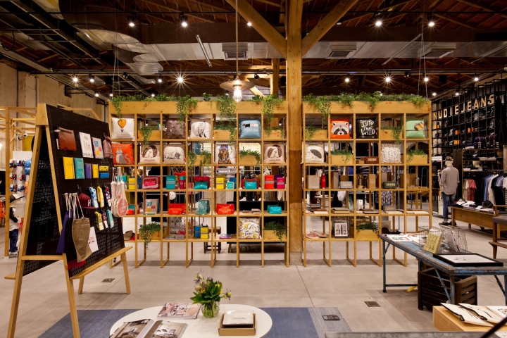
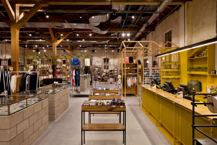
In order to give some sense of order to this 700 square meters space intended to contain 15 different departments, we divided it using light hanging shelf units made of wood. These units hang from the structure’s beams by iron chains and correspond with the rhythm of columns and beams of the space. Between the units we placed the various departments. The units create a light and noncommittal separation between departments and allow easy flow of movement between them.
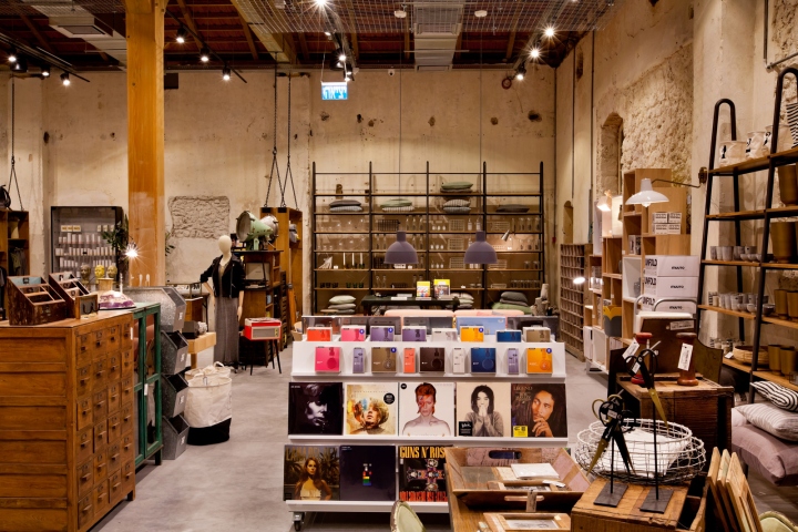
In addition, we maintained an open design and planning for each department so as to allow looking at other departments. A transparent design that doesn’t block the view between departments helps to create a sense of connection between them. The sense of connection between the different areas is also emphasized by using the same basic materials, such as iron, wood, marble, glass and brass, and only changing the language of the design.
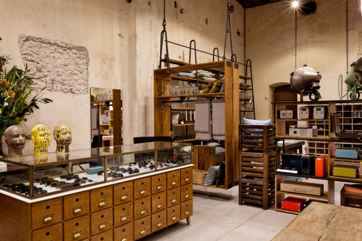
We also had to deal with the imposing 7 meter high space. We managed to minimize its intimidating effect by planning each department to a height of 3.10 meters, thus creating a human height line within the space. The entire place was designed and built with the aim of creating a common density that encourages movement between the many departments, while maintaining their distinct characters. The eclectic design encourages visiting customers to enjoy a create stroll about the place.
Designed by Studio Dan Troim
Design team: Dan Troim, Neta Bashan
Photographer: Boaz Lavi


Add to collection

