

Brand image and interior design project for a dental office located in front of the modernist Sant Pau Hospital in Barcelona. The clinic occupies the first floor former two apartments that were once connected.
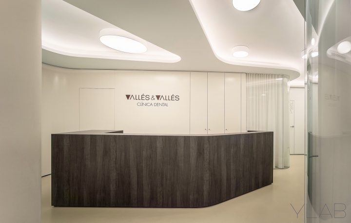
The owners, two young doctor sisters, needed to remodel the father’s dark and old fashioned clinic to create a modern and functional office that would reflect their own open and dynamic character. The clients brief was a space to host an accessible and fresh atmosphere with open and full of light spaces to enjoy working.
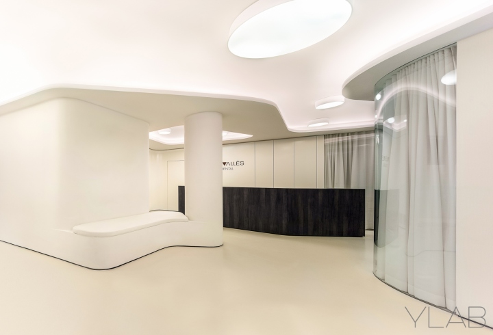
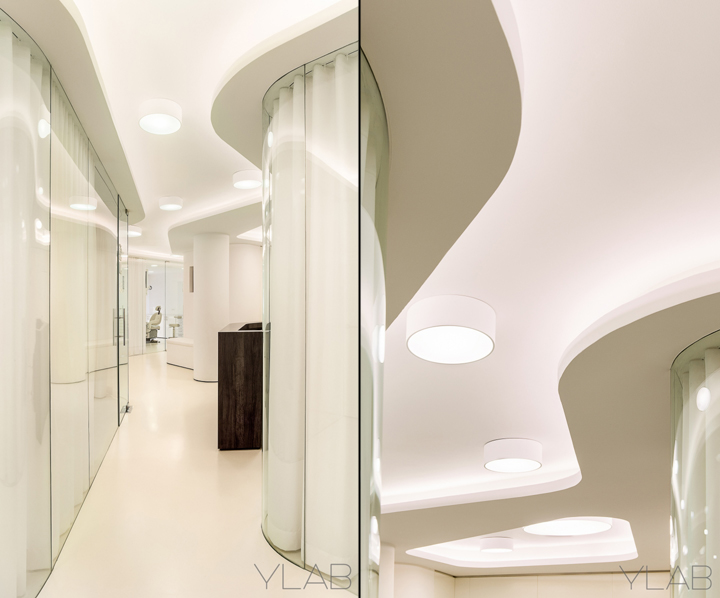
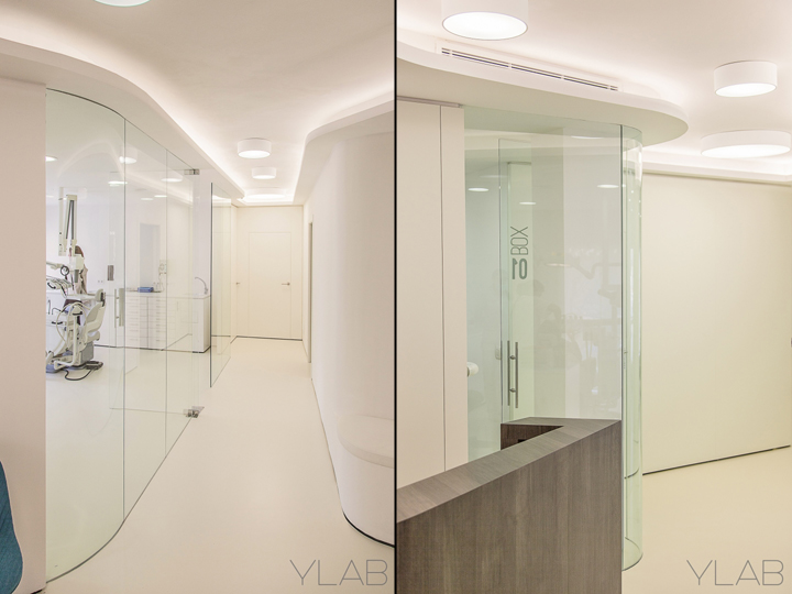
The clinic was planned as an organic distribution with glass partitions where all the functions would be placed in a continuous space that would suggest a dynamic and a spacious feel. A soft undulating partition separates the space into two main areas: a large central area and the adjacent treatment rooms and offices.
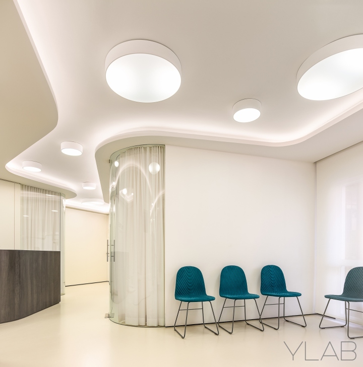
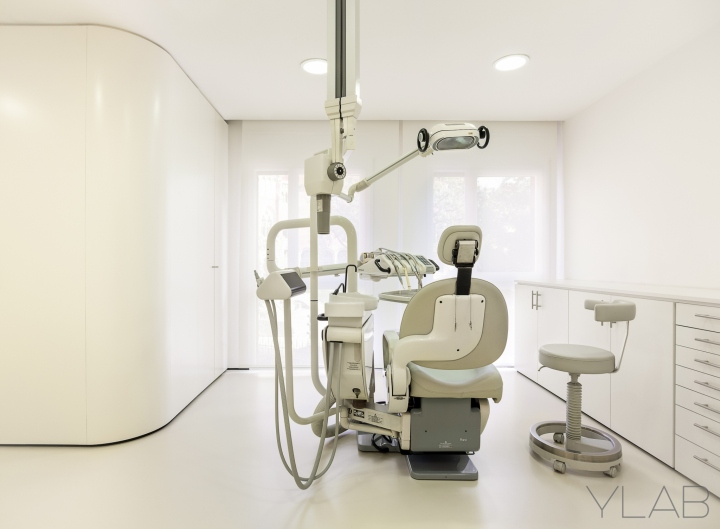
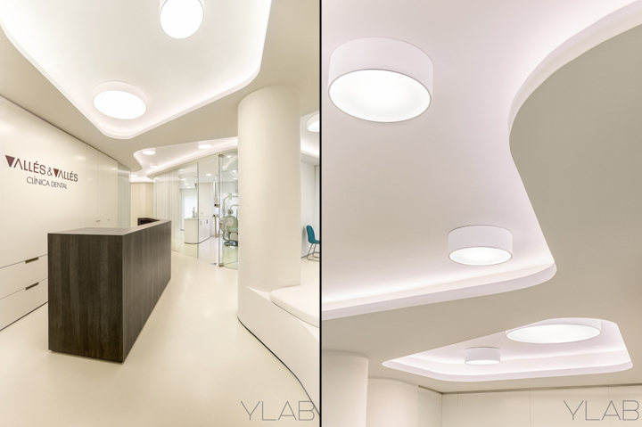
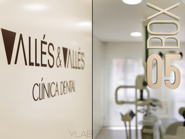
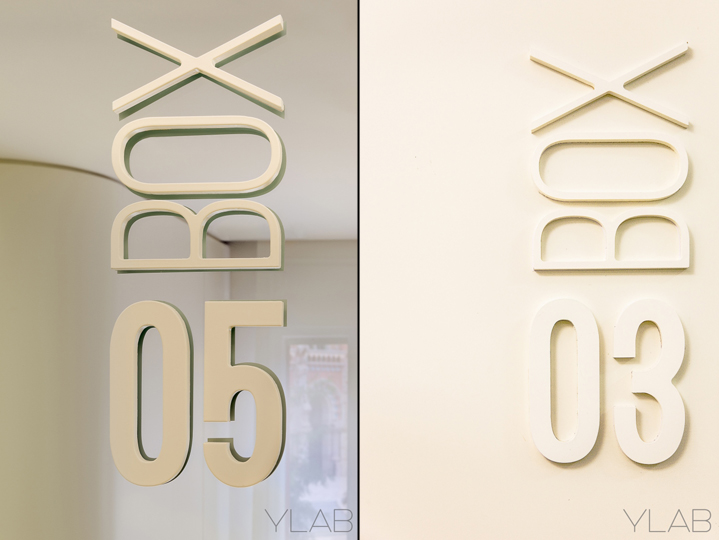
White is the main base color, applied to finishings such as the satin lacquer, the laminated panels, the continuous cement floor or even the white on white signage. The white color contrasts with very few color such as the corporate dark tobacco displayed on the reception desk or the aluminum corporate signal and the blue upholstered chairs at the waiting area.

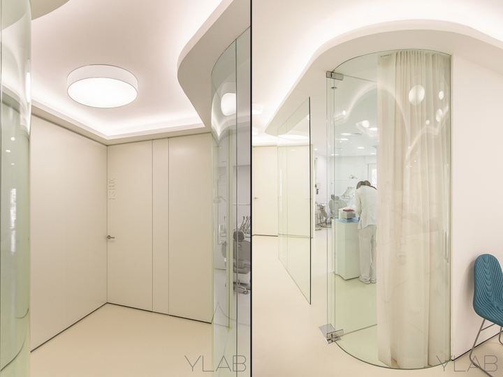
The decorative ceilings with illuminated oval form cavities are also a key element, strengthening the different ambients and the sense of dynamism. The light colors, the use of curved shapes and the indirect lighting, which goes through all the areas, convey the sensation of calm and balance both for patients and medical staff.
The central area, formed by the entrance hall with the reception desk, the waiting room and the corridors, is a widening and narrowing zigzagging space that creates the illusion of movement and invites individuals to enter the space. At the reception zone, a large bespoke desk together with the back cabinetry host the patient welcome and management.
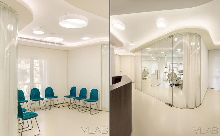
The treatment rooms and working areas are located along the façade, around the central area. The predominant glass partitions let the light flow into the inner spaces, following the overall transparency and continuity idea. White translucent curtains can occasionally protect the patient privacy when needed. The clinical furniture is also made-to-measure for a better use of space.
Architecture and interior design: YLAB ARQUITECTOS BARCELONA
Authors: Tobias Laarmann & Yolanda Yuste López
Photos: Eugeni Pons
About
YLAB Arquitectos Barcelona is a Spanish-German architectural design firm formed by Tobias Laarmann and Yolanda Yuste. From their studio in Barcelona, YLAB works on the design, management and construction of architecture and interior design projects. YLAB is specialized in residential, commercial and corporate design.


Add to collection


