

Add to collection

Clean and minimalistic design is fresh approach to the visuals in pharmaceutical sector. The task of this design is to differentiate from visual clichés, that are prevailing in the pharmaceutical market. To communicate core message sharply and in unusual way.
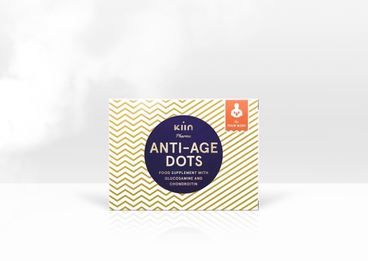
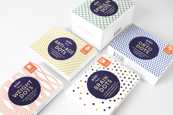
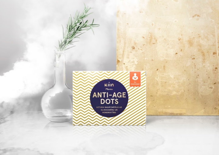
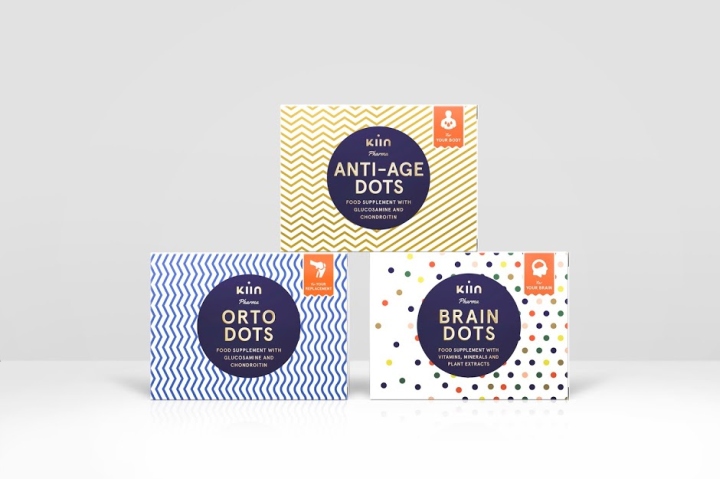
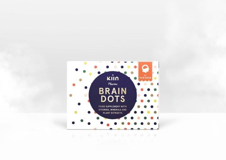
Function of the design was chosen to simplify the perception of the cure and to distinguish main characteristics of kind of impact on health you’re going to receive through simple and clean communication technique. Technical approach: 1. dynamic graphic elements symbolising each benefit of the product. 2. Clarity and approachability – through using basic geometric shapes: lines and circles. Finite colour palette also plays a role in authenticating the brand’s striving for the highest quality. With blending of these elements the brand acquires individual character, thus allowing to stand out among other products
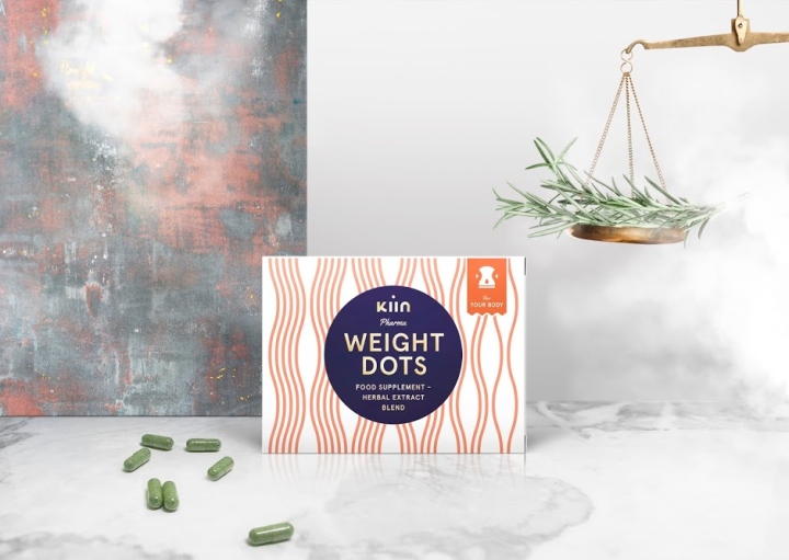
Product name was made simple and easy to recognize health effect of the product – the chosen font for packaging supports this approach of readability. As a focus on the brand name the circle was chosen, thus uniting the product group. Kiin Pharma is a new brand from Latvia with aspiration to tell simple and true story, that merges high quality of the product with the effect, thus building a trust between the brand and the user.
Designed by Jānis Andersons
http://www.packagingoftheworld.com/2016/05/kiin-pharma.html


Add to collection