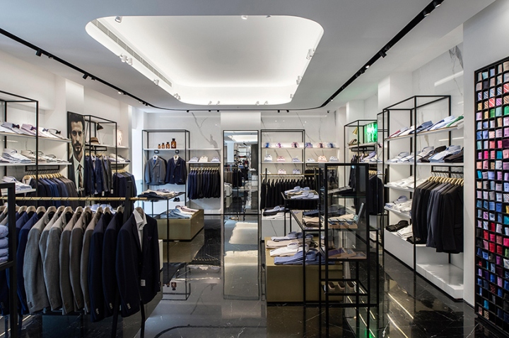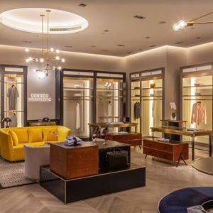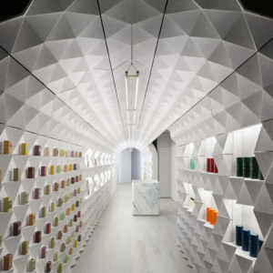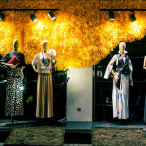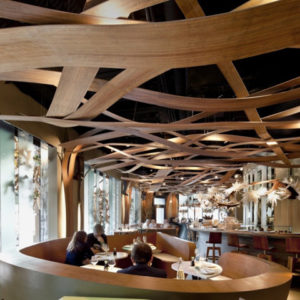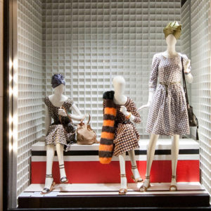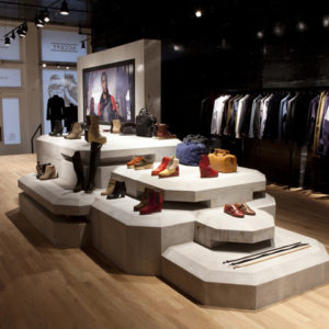

Following a sweeping facelift that took little over 2 years, Hamra Shopping and Trading Co, a leading retail company has opened a brand new ‘GS’ store in the heart of Downtown Beirut. The freshly opened 2000m² retail concept area, divided into four extensive floors and designed by Joseph Barakat Architects sets the stage to a new interior and expanded retail space, thereby cementing the new store’s special status as the ‘GS’ flagship store. Its four floors feature women’s wear, a shoe salon with separate entrance, men’s and kids wear and a brand new product design and home accessories department.

Joseph Barakat has designed the total experience, a carefully crafted adjustment of the current identity, a full communications and navigation approach for the retail space, and tailored digital installations for multi-media storytelling about the brand and its enticing offers. The design elevates the store experience with a more aspirational, fashion-led, premium attitude, differentiating GS from its competitors and appealing to a younger, more fashion-forward audience.

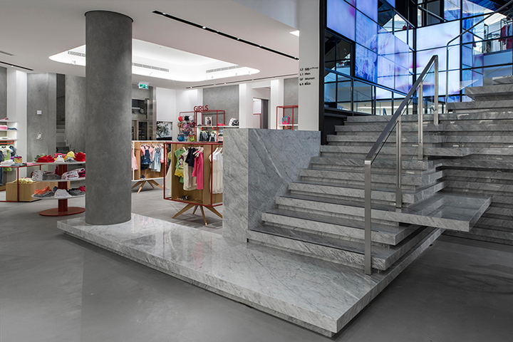
Customers that step inside the store immediately notice a unique blend of classical and high-tech elements that will usher them into the new world of GS. A 12-meter high L-shape video wall installation towers over the main entrance (where advertising campaigns, short films, fashion videos and more can be displayed) while the structure of the building itself displays a number of materials: marble, gunmetal steel, brass, glass and cement, all preserved and blended together to offer visitors a variety of unique visual and tactile sensations. Simple and more precious materials are used side by side, creating an effect of structural elegance and chromatic minimalism.

Using smart and simple shifts in material, lighting and mood, the design provides each of the store’s four floors with its own distinct aesthetic, while maintaining a sense of visual unity throughout. The flooring, made of Carrara and Marquina marble, laid out in a diagonal pattern accompanies and leads the customer’s journey while adding dynamism and organized motion to the overall space. Its 4th floor however, dedicated to its new home accessories department, showcases exposed concrete floor and ceiling to give it a modern and lofty look.

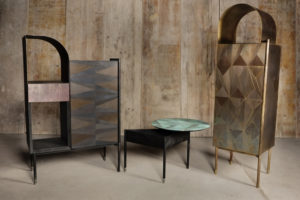
The display furniture is tailor-made to adapt to each floor’s department. Although they all abide by the same overall aesthetic, the materials used such as wood, gunmetal and colored steel, brass, glass and marble vary depending on the merchandise displayed, whether its casual or dressy, for women, men, kids or home accessories. The desire was to bring the spirit of contemporary international style to the space and create a timeless, calm, elegant space, totally transforming the retail environment with premium finishes, bold digital statements and ambient illumination that have all been specifically designed to offer a more sophisticated shopping experience.


