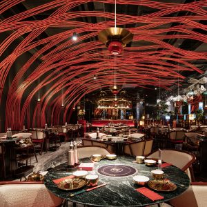
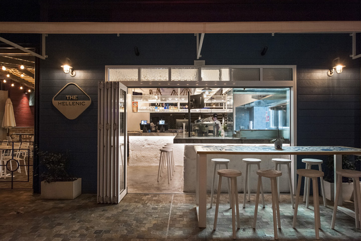

The Hellenic, a popular souvlaki bar at Brighton, recently expanded into the new rooftop dining precinct at Westfield, South Sydney. We were engaged to design a new restaurant which would merge a modern Greek island scheme utilising traditional tiles, rendering and natural stone with an Aussie ‘beach hut’ pavilion. The outcome is a unique and eclectic design blend that harmoniously inhabits an unorthodox site.
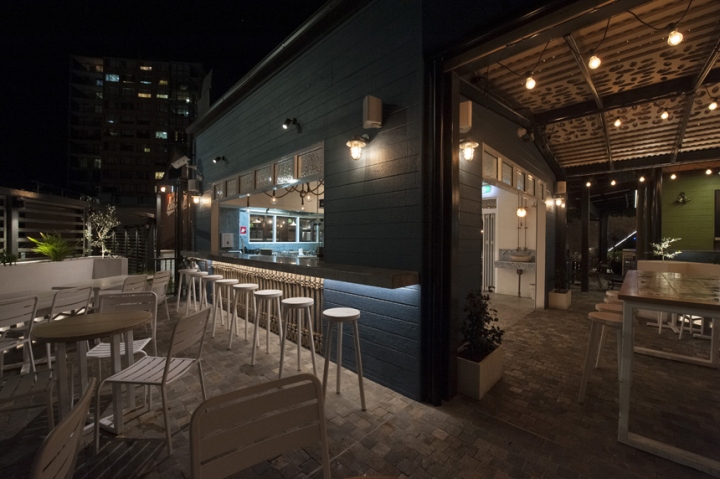
The primary challenge of the brief was the overall space planning needed contained within a small, awkward triangle-shaped site. To operate the business effectively, the space needed to function and flow as a regular sized restaurant would. We realized early on that a more realistic budget was necessary in order to fulfill the brief and advised accordingly. As a result, this little souvlaki bar contains a deceptively large amount of detail and utilizes space to its maximum capacity, without feeling overcrowded.
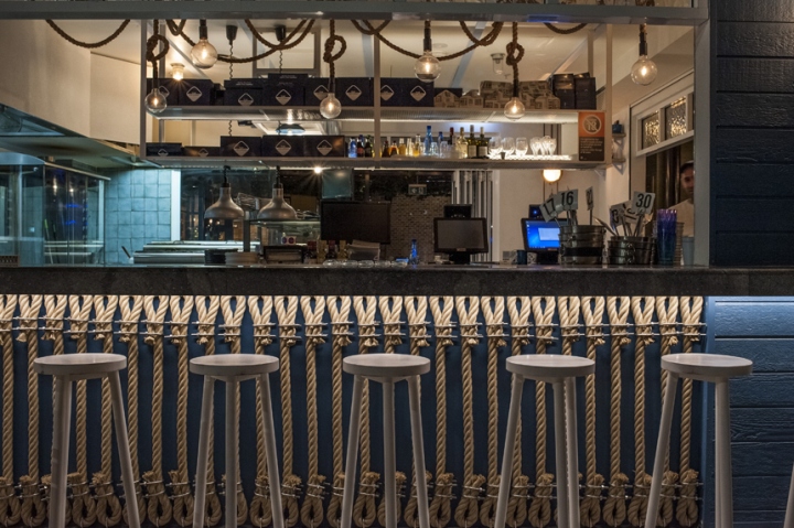
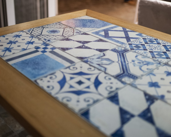
Collaborating with the client, we employed Greek island characteristics to reflect the cuisine and take diners on a journey, while anchoring the rationale with a subtle undertone of the Aussie beach hut. We conveyed both ideas without being too literal. Mediterranean-like tiles and white textured render on the bar facade refer to the Greek islands and elements such as rope, plants and lighting gave a coastal feel.
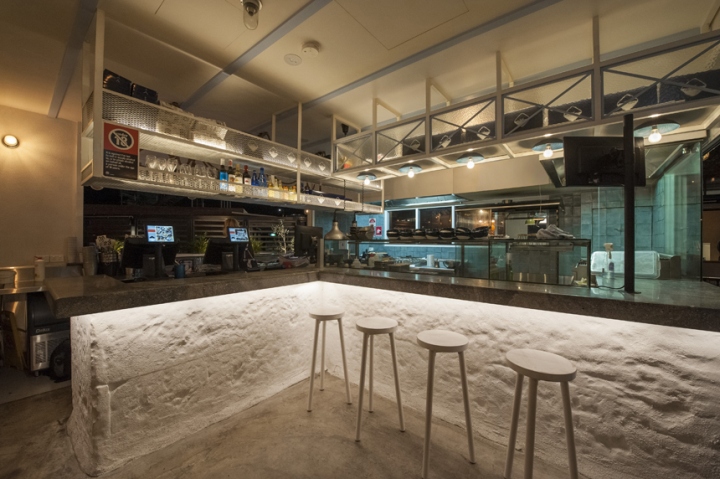
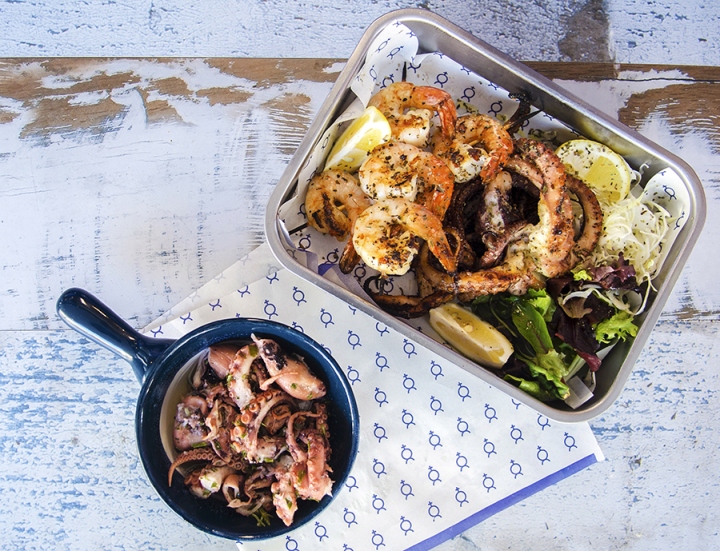
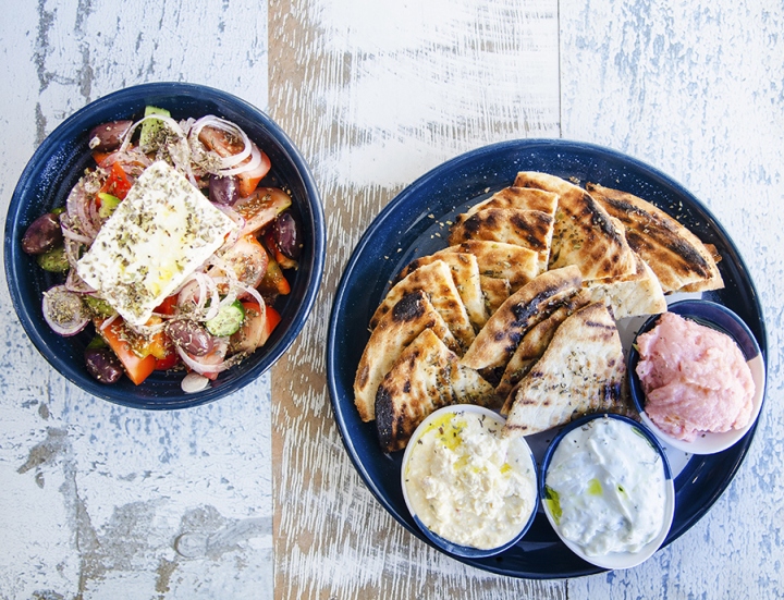
The main needs were met in operationally getting things working well in a tight space ensuring the work flow in the kitchen was as smooth as possible. This was done through researching the clients current business operations and improving where needed. With the concept, as often is the case, we were inspired by the food. The Hellenic offers a simple but hearty, well crafted menu using fresh local ingredients.
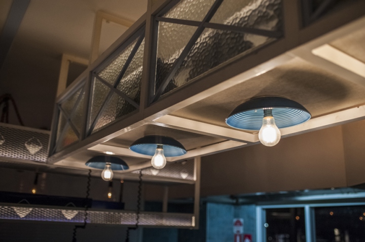
The client also desired a bar featuring both local and Greek wines and beers. This had to be a cohesive and flexible part of the restaurant. A relaxed and inviting setting synonymous with the Greek and Australian coast was needed to keep patrons returning. Mediterranean-like tiles, white textured render on the bar facade refer to the islands and elements such as rope, plants and lighting gave a coastal feel. Seating needed to be flexible and cater for small groups where possible.
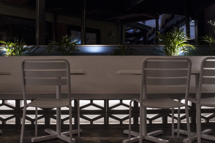
This project demonstrates that with careful consideration, thinking through options, challenges, such as space limitation, can be overcome. Given the menu is fairly limited and the concept basic, through the clever use of materials we have sought to create many stimulating details to further enhance the dining experience whilst ensuring they are part of the overall functionality or at least have meaning in order to strengthen the brand Identity.
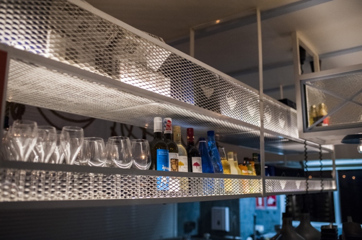
We believe we have created not only a relaxed yet stimulating space to be in but a successful food operation that has exceeded expectations. Great design is best when it transcends the conctraints of the literal location and transports the diner into another world, ideally an unexpected one that simultaneously excites and revitalises the mind and soul.
Written by Emmanuelle Haworth
Designed by De Simone Design
Photography: Edward de Simone



Add to collection
