
During the first Designathon, a 48-hours design challenge that took place in Athens in 2013, we were assigned the branding and web design of the -fictional- bottled water brand, PURO.
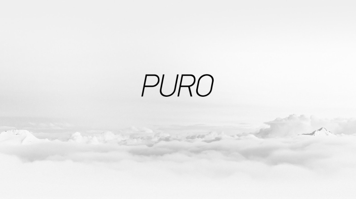
Three years later, being loyal followers of evolution and constant self-improvement, always doubting and exceeding our limits, we are proud to introduce the brand-new and most complete look and feel of PURO – one that amalgamates nature’s beauty and wildness, exempted from human interference.
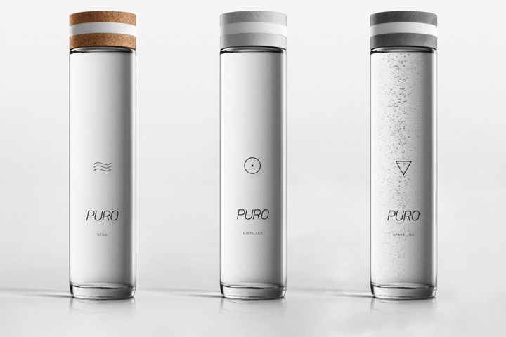
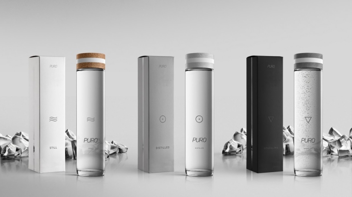
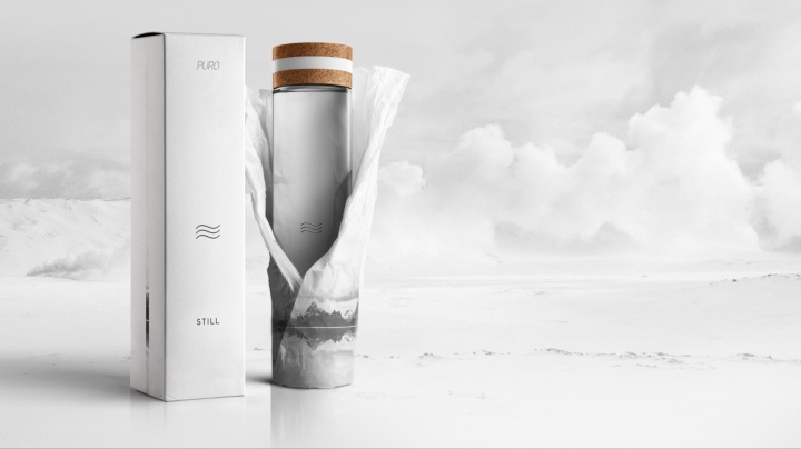
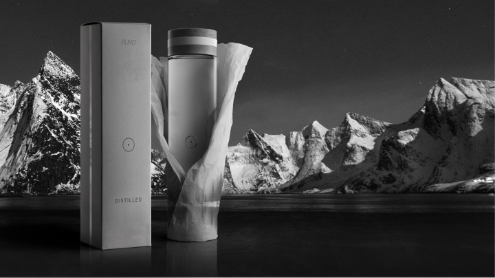
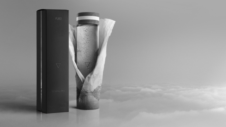
Hereafter, PURO family cradles three counterparts; PURO Still Water, PURO Distilled Water and PURO Sparkling Water. Combining nature’s most raw and pure elements in a saliently surrealistic way, PURO’s new presentation makes the most of natural light’s innumerable and beneficial properties along with black-and-white coarse landscapes’ majesty.
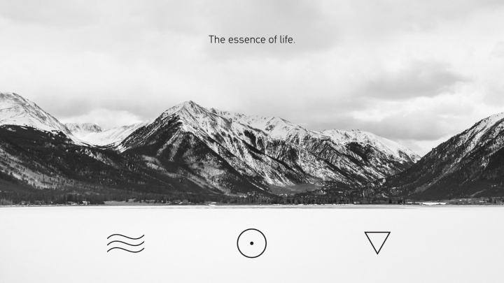
Primary intention is to give prominence to the premium and high-quality expression a bottled water can uphold. Βe our guests and enjoy the sensuous story of PURO, emanating from the most untamed and wintry mountains of the breathtaking scandinavian landscape, unfold before your eyes.
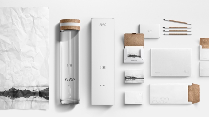
The uniqueness of PURO lies in both design and packaging itself. PURO is designed in a simple yet modern way, featuring minimal details that make it unique and distinguishable. Continuing with the bottle’s manufacturing, it’s worth describing caps’ special feature which is found in their actual texture.
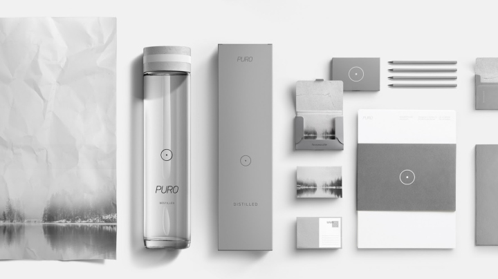
Every material, cork, white stone and concrete, are not printed. Everyone can sense their texture and enjoy the feeling of their pure touch, while soft natural rubber grip eases bottle’s opening. Also, the bottle is sustainable and environmentally friendly, as it can be washed and reused as many times as wished.
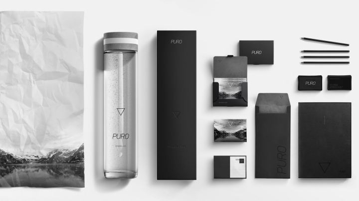
Arriving at PURO’s packaging, and especially the Family version, its shape is a perfect square made of premium rough paper, holding all three products in a safe and smash-proof way, guaranteeing bottles’ security, while the bottles are covered in onionskin for extra safety.
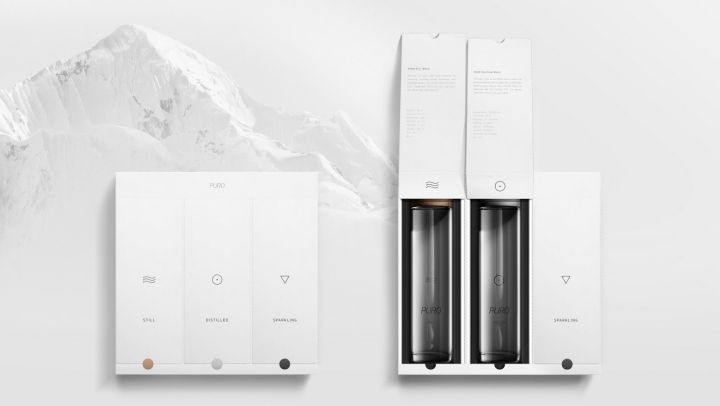
The uniqueness of family package lies on its opening, which enables anyone to remove any product they want and keep the rest packaged and safe, while providing all important information about each one’s history and composition.
Design: høly

http://www.packagingoftheworld.com/2016/09/puro-re-imagined-concept.html#sthash.rYuGtqsH.dpuf


Add to collection

