
Add to collection
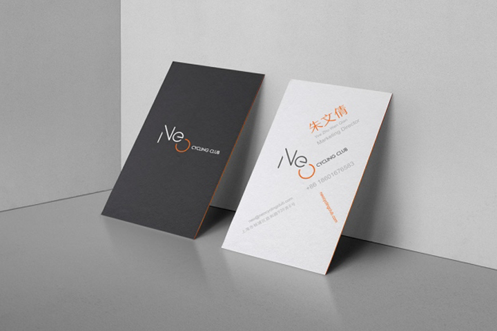

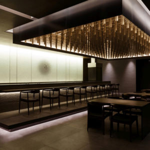
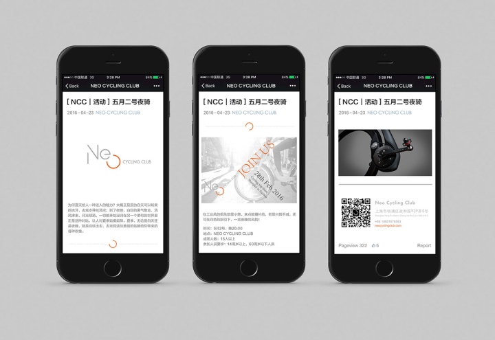
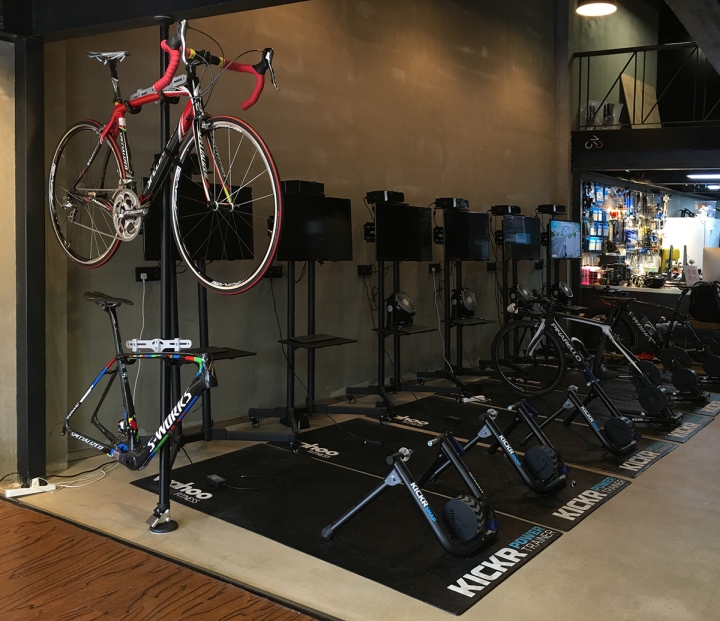
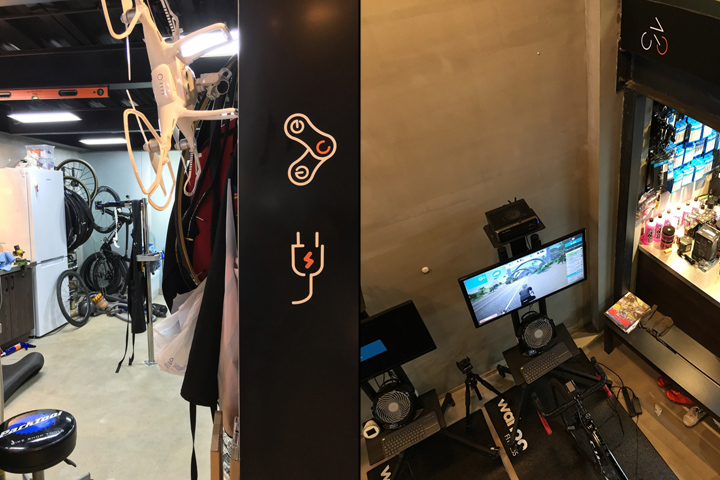
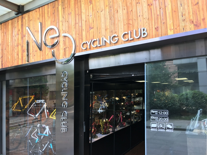
Neo Cycling Club is a located at Yang Pu District, on the north eastern corner of Shanghai (Zhenghe Rd Lane 939 Unit 05). They specializes in selling Pro level bikes (costing a cool 20k RMB), bike repairs, paintwork, outdoor biking events, and cycling classes.
Cyclist can bring their own bikes, dismount the back wheel, mount it on their simulation machine, proprietary cycling software simulates cycling competitions, with slopes, impedence, and even a fan in front for speed and whisking off perspiration.

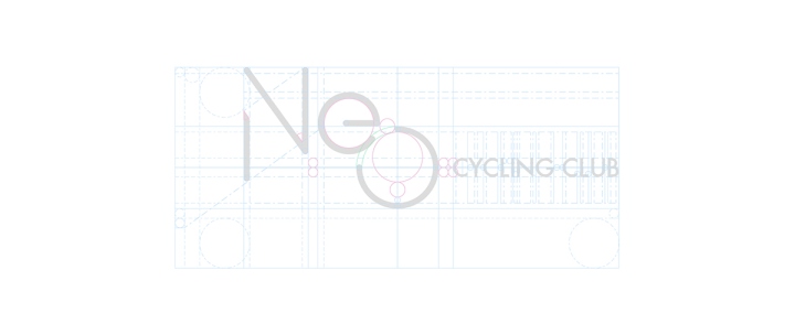
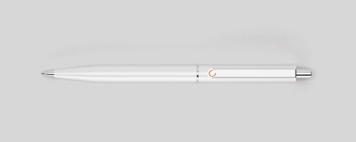
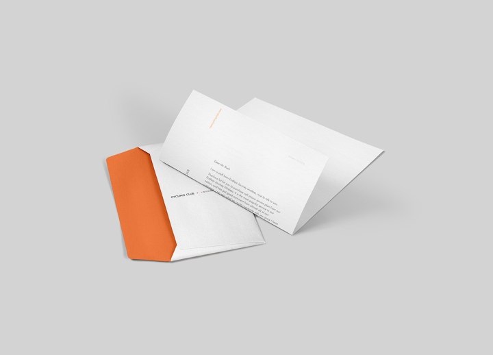
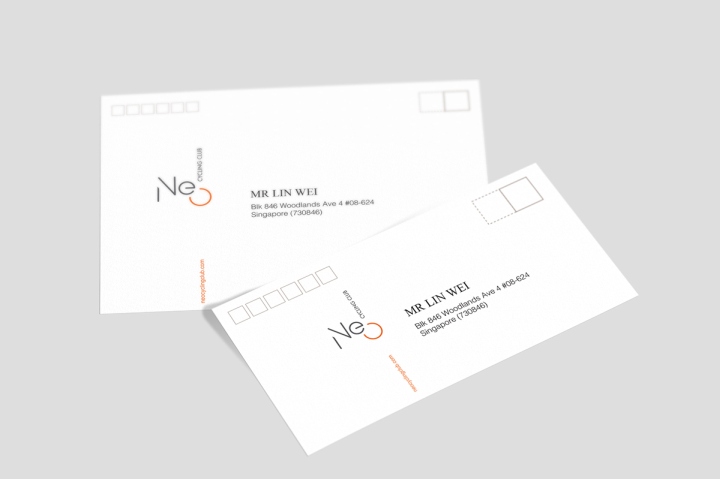
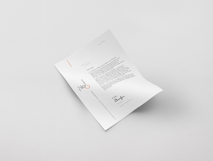
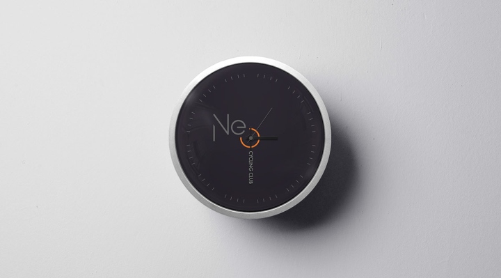
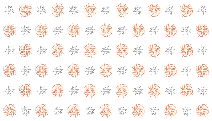
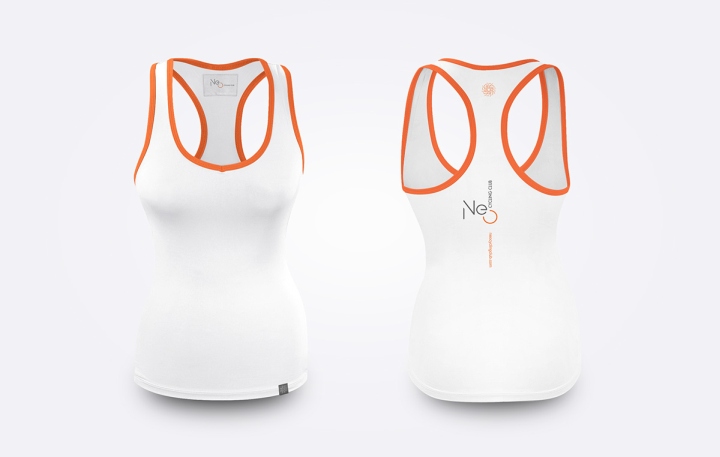
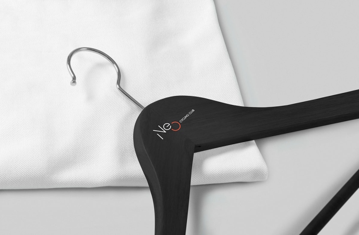
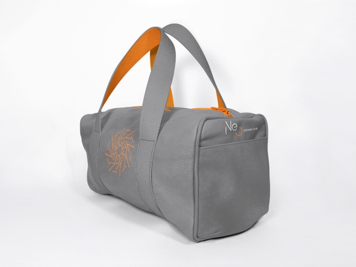
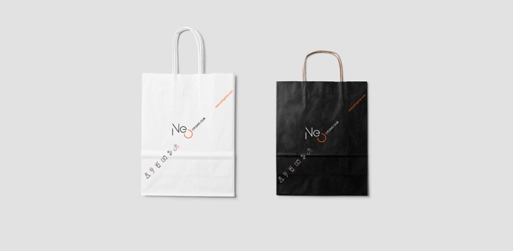
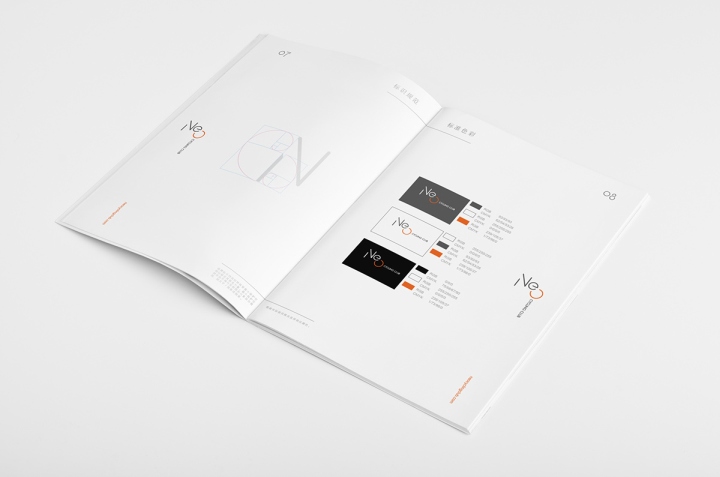
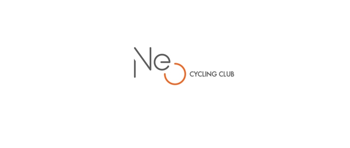
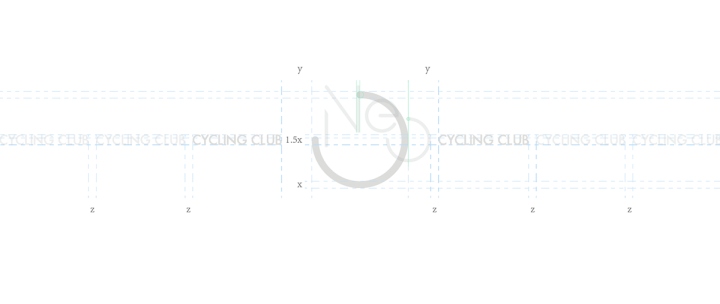
We used this unique opportunity to play with a logo that spins, much like a wheel. Typically logo are locked into a fixed orientation. We made the O in Neo into a hub, from which ‘cycling club’ spins into different 45 degree incremental positions.

The difficulty with such a design is two-fold.
1) As a whole the logo is asymetrical, we had to balance it visually with line-weights, and spacing.
2) To bring this idea to life we had to make the different orientations work across different extensions, this took quite a bit of skill and effort!
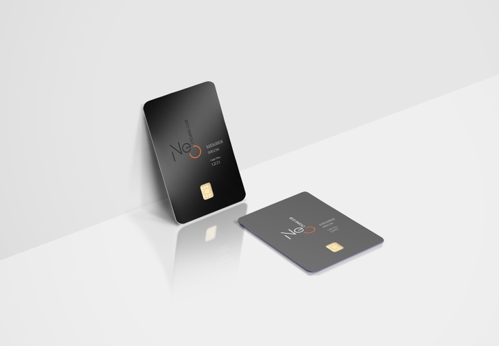
The end result is a logo that looked classy at first glance, but playful, dynamic, and suitably sporty across the entire consumer journey.
Design: United Design Practice
Photography: Lin Wei


Add to collection