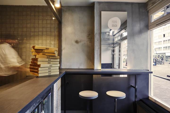

MAMA DOUGH is a new pizza place ready to be discovered in Amsterdam East. With a nostalgic reference to the owners mother, being a restaurant owner, the name also carries a strong connection with the interior design concept. Carefully selected materials and finishes create a flour sensation, referring to the flour used to make pizza dough.

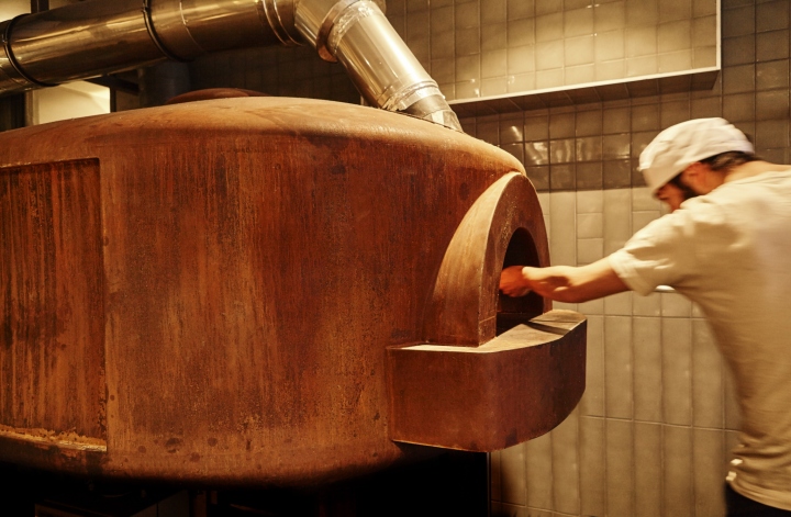
Chalky walls, floor and ceiling finishes are complemented with special elements such as a wooden bar and a pizza oven with a weathered corten steel finish. The former layout of the restaurant has been rearranged creating a larger, more open space upon entrance. The kitchen, along with its wood burning pizza oven has been relocated to the front of the restaurant to make ‘the art of pizza making’ visible from outside as well as inside, while it creates a new space in the front for a take out area.

A skylight formerly giving light to the kitchen, now brings in daylight into the restaurant. The new kitchen becomes a box in a box and stands out from the rest of the interior with its distinguished material palette. Grey glossy tiles cover one wall and terrazzo tiles cover the counters on each side of the kitchen, which creates a separation between the restaurant space and the pizza take out.

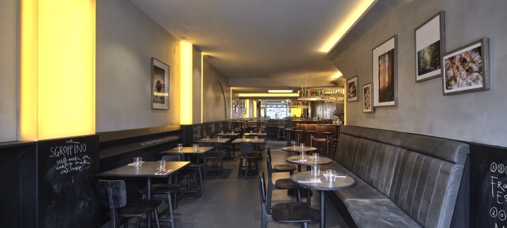
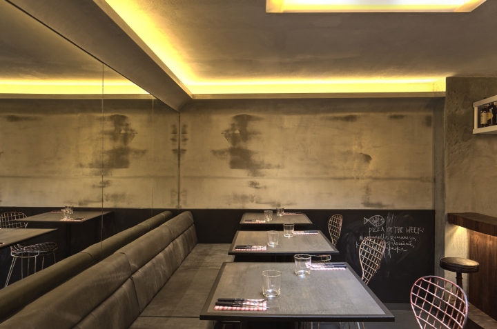
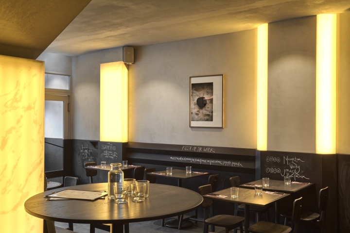
Each with their own function and distinct look and feel, the pizza take out and the restaurant complement each other with their characteristics. Special wall finishes ,weathered grey stucco and chalk board, create a clear separation at seating height in the restaurant interior, which results in a great sense of intimacy while dining.

Together with a gradient shade from dark to light, the wall finishes help intensify the presence of the light boxes, which are formed based on the existing spatial shapes in the walls and ceiling of the restaurant. These shapes were taken as a starting point to create a range of light boxes which vary in shape and form while perfectly fitting into the interior.

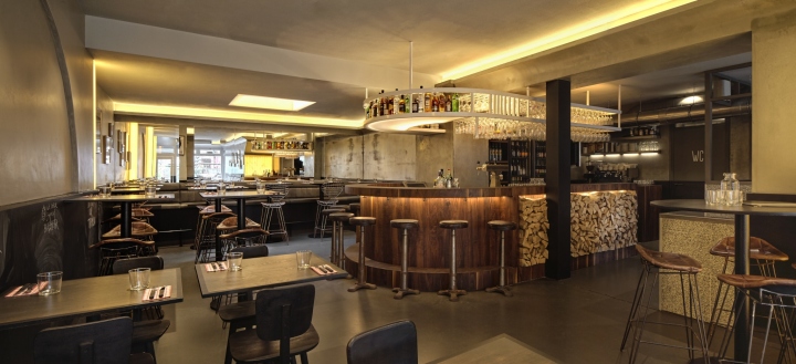
A grey colour palette can be seen throughout the space. The bar, placed in the center of the space, is designed as a special element in a round shape, with its heavy wooden finish, the bar has a strong connection with the wood burning oven. Both with a round shape and warm colour and finish are connected to each other through wood, the bar covered in wood and the oven filled with it.

A glass rack with playful patterns and a lamp hangs above the bar, creating an accent in the space. Folded elements in mirrors create illusionary scenes and a special table designed as a huge record plays tribute to the owners biggest passion after pizza; music. Bistro dining chairs give an Italian essence to the pizza place complementing the custom made grey benches with graphic patterns. Carefully selected barstools add some colour and new material to the interior.

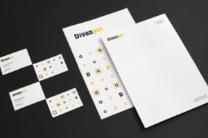
Translating from the interior aspects of the space, the graphic identity adds an extra layer of design to the new interior. The round logo is an abstract mark of pizza in the making. A strong and recognizable identity is created featuring elements in black & white. This contrast becomes visible in the signing inside and outside the restaurant. A playful graphic identity is the result of using high contrast elements and circles as accents. The menu design is carried out with the same principles in mind.

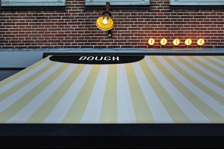
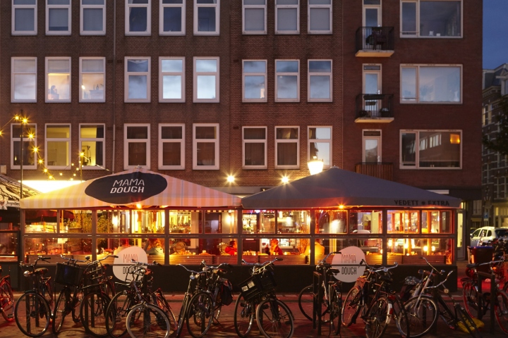
A cozy atmosphere is created in the terrace by using different colours and patterns of fabric to design the sunscreens, which are highlighted by French façade lights in the evening. This playful approach appears in the design of the parasols covering the whole terrace.

Strong accents in the terrace are custom made group tables with terrazzo tops, that complement an extra-long custom made bench. Designed with graphic patterns, the bench covers the complete length of the terrace. The unique use of material, in combination with indirect lighting and special light boxes creates a unique interior to enjoy a hot wood fire baked pizza.
Design: Studio Modijefsky
Photography: Maarten Willemstein

