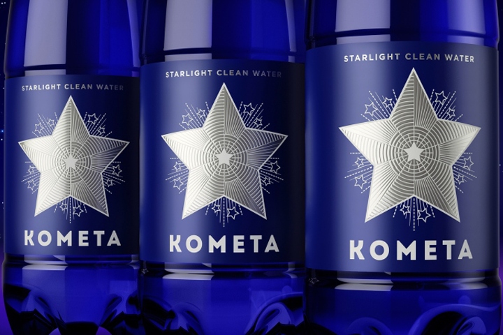

Unicorn Studio Moscow has created a packaging design for “КOMETA” spring water. “Комета” (eng.: Comet) is a new Russian brand of drinking water produced for the domestic and international markets. “Комета” is a very apt name for an international brand: it’s cyrillic logo can be read and understood by virtually anyone, there’s no language barrier.
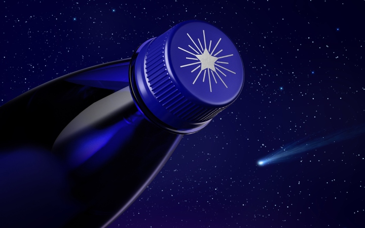
High tech purification system and laser quality control ensure an exceptional level of water purity – this positioning is disclosed in the slogan “Starlight clean water”. Our objective was clear: package must be instantly recognizable and easily remembered. To achieve this, we have chosen a simple, minimalistic image – a silver star.

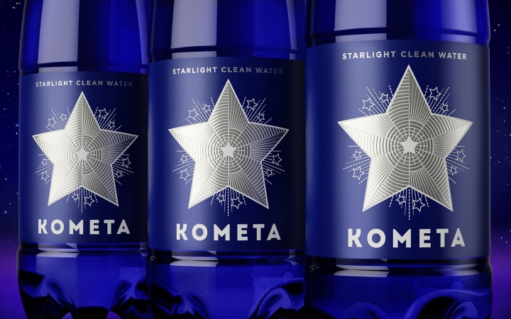
It symbolizes everything at once: pureness, technology, space-level quality, and in addition, it resembles one of the most well-known emblems of Russia in the world. Our star visually looks like the stars of Moscow Kremlin towers. These illustrious design objects built in the first half of the twentieth century have always inspired us. Our star has an elaborate internal structure, filled with an array of details, but despite this, the label looks concise.
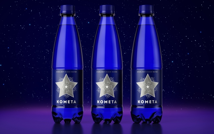
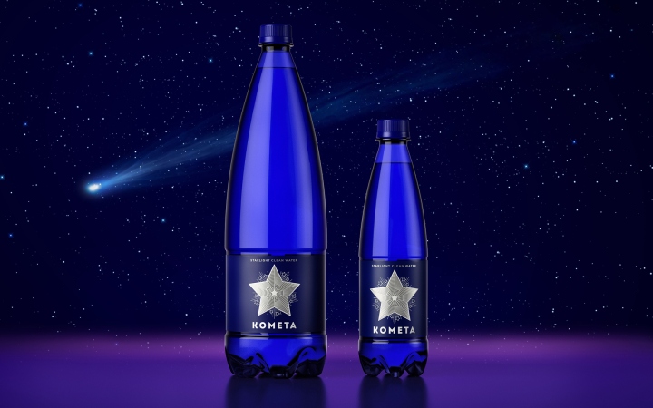
“Комета” logo is easy to remember and recognize, even if you do not memorize the name immediately. This product can be described in one sentence: “Buy water in a bottle with a silver star” and this distinguishes the product from it’s competitors on the store shelf. But how is the star image connected with the name “Комета”, shouldn’t a comet have a tail? In our case, it’s just an unusual perspective – our comet flies face forward to the viewer, it’s shining tail is only visible as a halo of sparks =)
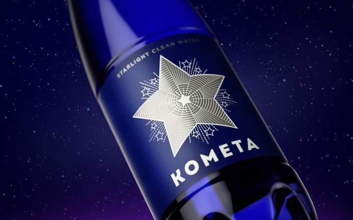
Space theme is continued in the design of the bottle, for which we chose plastic in saturated dark blue shade, that reminds us of the color of deep space. As a result, we have a style that can be called “retro-futurism”: it is not a modern high-tech, but rather retro science fiction, which refers to the past era when space exploration was a romantic dream of mankind. It is a simple design – pure as starlight.
Design: Unicorn Studio Moscow




Add to collection

