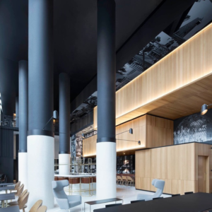

For a taste of New York in the Mother City, look no further than the fresh, sophisticated new offices of Urban Lime! Inhouse Brand Architects has unveiled a stylish redesign for the Cape Town branch of this international property management company. The commission was the second from Urban Lime; Inhouse previously refurbished the upper floors and common areas throughout the same building and due to the success of this initial project, was the inevitable choice to fulfill the client’s latest aspirations for the first and second floors.
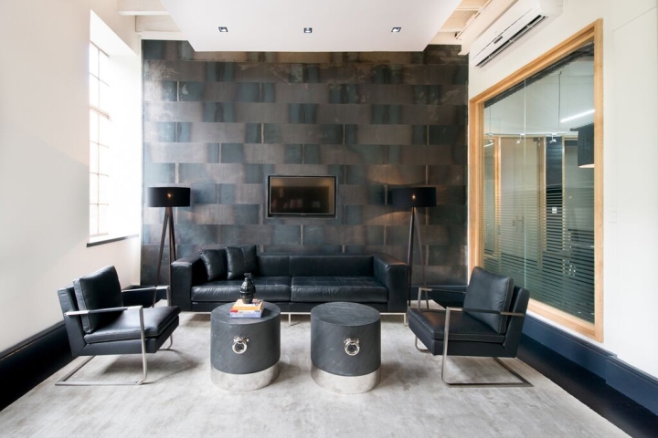
The client’s brief to Inhouse was to recreate the style of a luxurious New York corporate management office. It was important to steer away from the stark character of Urban Lime’s previous offices. The first floor of the Urban Lime building is dedicated to client-facing activities, and also functions as an informal meeting area. The Inhouse design team, led by Creative Director Aidan Hart and Associate Director Moiisha Visagie, introduced more luxurious elements into this area in order to reflect the importance of its function. Inhouse made the space more flexible by incorporating moveable furniture that could easily be adapted to accommodate groups of different sizes.
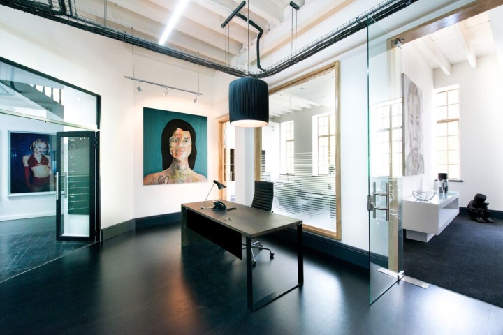
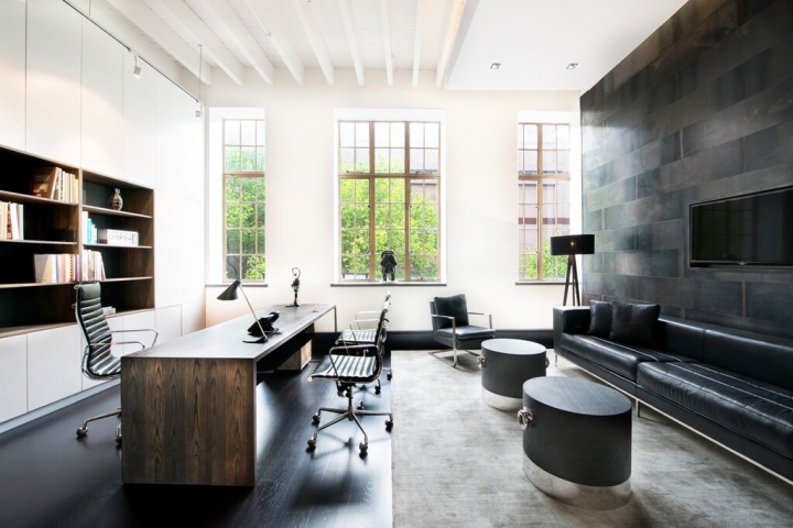
The second floor of the building houses the company’s different departments and offices. Inhouse incorporated luxurious touches here and there, but introduced functional yet contemporary elements to reflect the operational nature of these offices. While the end result appears seamless and successfully meets the client’s expectations, the building site and construction process presented unique challenges that required the Inhouse team’s full arsenal of problem-solving skills. With no easy access point to the offices, larger furniture pieces had to be reduced in size, or otherwise built on site, and other pieces had to be craned into the building. Glass that was too high to fit through the building’s main entrance was installed using external scaffolding.
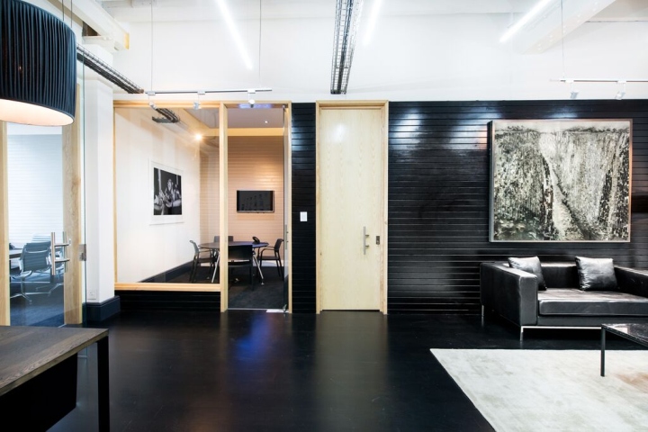
Spatial dimensions presented another issue that affected the design process, in that the offices are not overly large. The selected design scheme called for the inclusion of a deep, dark palette to create an air of sophistication. These elements were introduced via the wooden flooring, wall paneling and furniture used throughout. However, the Inhouse team was concerned that the dark scheme would appear to diminish the scale of the office by making it look smaller. In response, Inhouse specified different forms of lighting to create a more generous sense of space while managing to retain the deep palette.

This was achieved through track lighting, which was used to highlight certain standout features of the office, such as the artworks. A pendant light fitting was incorporated to illuminate and add impact to the reception area. Downlights were added to the meeting rooms and office areas, which already offered a decent amount of natural light due to the large windows. As soon as these few challenges had been resolved, the offices began to take shape. The last and final touch was the installation of carefully selected artworks throughout the space. This adds a burst of creativity and an element of edginess to the sleek, modern offices.

The client has expressed delight at the completed design. Inhouse has made best use of the play of light and shadow to maximize the limited space available. Now, not only do Urban Lime’s staff members have a comfortable, contemporary workspace but the company’s client-facing zones and meeting areas successfully reflect the world-class development work that has established Urban Lime as a leader in the field.


Add to collection
