
Natural Finland Shop by Yatofu Creatives, Helsinki – Finland
posted by retail design blog on 2016-12-16
Add to collection

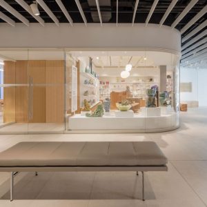
In designing the Natural Finland shop, Yatofu Creatives were set a different kind of challenge: To create the space before knowing its function. Positioned on a heavily trafficked street in central Helsinki, the storefront where the current Natural Finland store resides is a well sought-after location. When our client approached us with little to no idea regarding the actual function of the store, other than a signed lease and a clear idea of her clientele and the atmosphere she was looking for, we realized that we had a task that involved a very different design process. We had to reverse our thinking; put the descriptive qualities before the functional qualities; and create a design that would serve as an open answer.

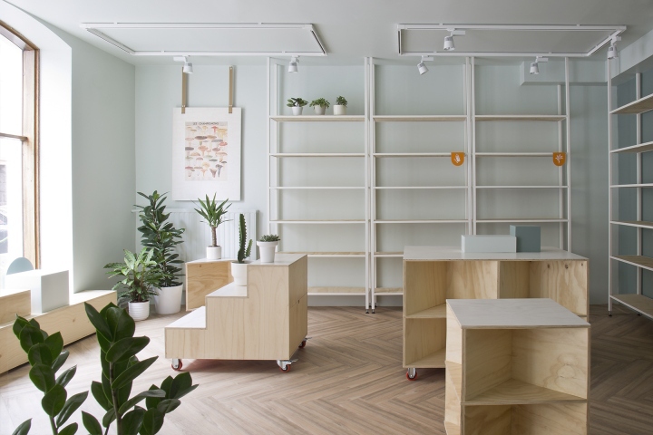
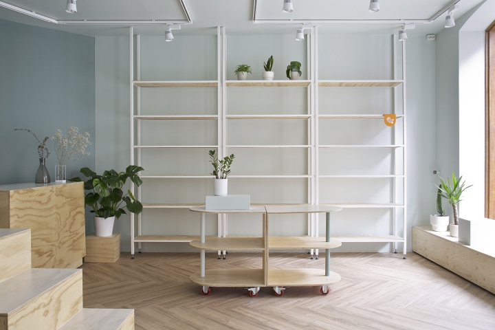
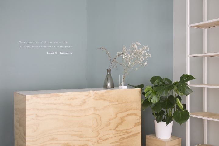
Through communication with the client, we set the brief to be an open and inviting retail space, with a bright and airy feel, while exuding the warm comfort of the Scandinavian attitude. The actual product category would be determined later, so functional aspects of the space were to be designed with an ethereal hand. In conveying the fresh and bright atmosphere we were seeking, neutral but impactful colors were chosen such as the soft pistachio grey of the overall space, the muted malachite green of the accent wall, and the punches of pastel tangerine that dot the interior and bring a playful feel to the overall atmosphere. We also sought to create more visual interest and texture through the natural materials chosen for the interior.

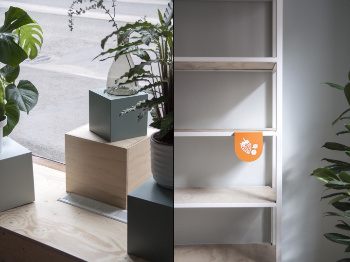
The herringbone wooden flooring set the backdrop for the birch plywood fixtures, which were oiled to emphasize their organic grain pattern. Plywood surfaces were also used on wall shelves and window boxes to provide a neutral stage for the products to be determined. The store fixtures were designed with versatility in mind, not only for merchandising, but also for spatial arrangement. Central displays were placed on brightly colored wheels for ease of rearrangement, and painted wooden volumes of various sizes allowed for different product display options. We essentially created pieces for the client to play with in the space, while also giving the space the opportunity to evolve around the product selection.

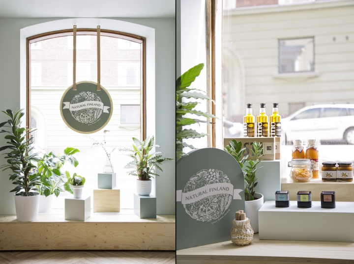
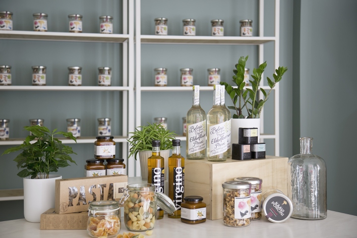
The brand design was addressed once it was decided that Natural Finland, a natural food store, would be the outcome. A logo with hand-drawn qualities and interior graphics were harmoniously incorporated into the soft hues of the space, and emphasized the light and inviting atmosphere. A poetic and suggestive quote is printed on the wall behind the cashier desk to imbue meaning and a richer narrative into retail concept. As a process and an end result, the Natural Finland project shows just how essential and effective colors and materials are when telling a story…even while the story is still being written.
Design: Yatofu Creatives
Photography: Esa Kapila


Add to collection