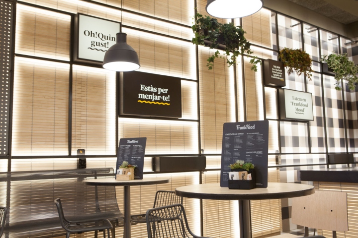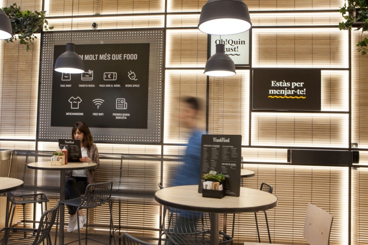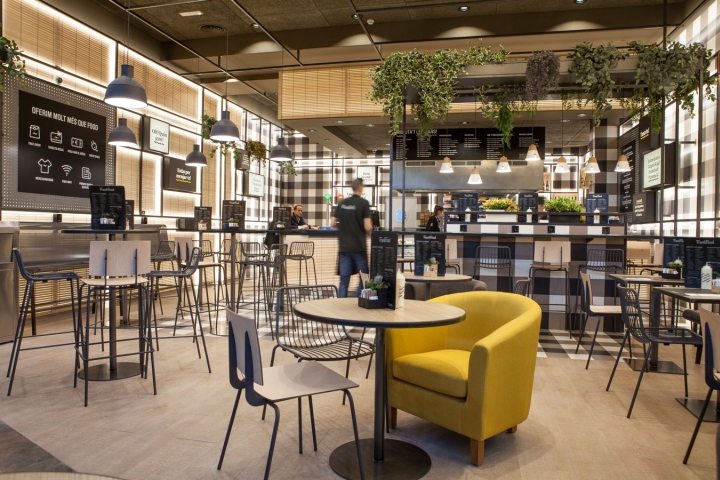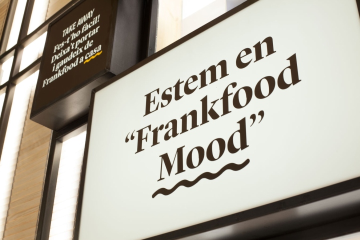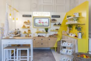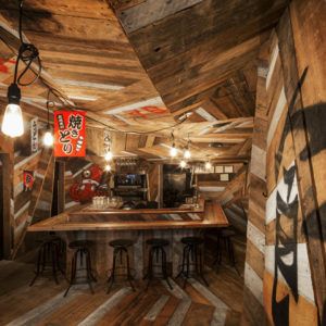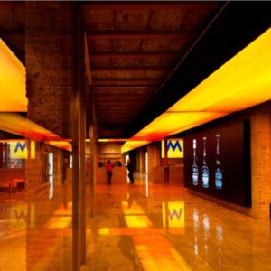
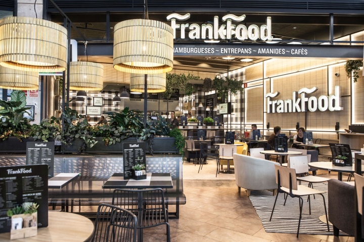

The goal for this restaurant placed in a shopping centre, was to create a warm, modern concept with its own personality. Starting with communication, we have tried to seek closeness with the client through the personification of the product, giving it its own name in order to create character with a clear and meaningful philosophy.

The use of classic materials, basic in their most natural state, has given us that touch of warmth and authenticity, but by means of a twist in its use and application, we have managed to give the space a modern air. The layered construction of different materials has led to warm textures contrasting with flat and geometric patterns.

All this covered by a backlit structure that runs across the premises, integrating all the communication and services and forming the common theme. This brings us dynamism and becomes an attractive feature that, together with the graphics, creates an easily identifiable brand image.
Design: Futur2
Naming and Graphic design: Bisgràfic
Photographer: Chus Sánchez
