
The new headquarters of ad agency The Keenfolks in Barcelona are a poetic example of how to achieve more with less. The outfit’s new digs, more urban jungle than office space, bring the wild world of advertising to the fore with a few simple elements – five, to be exact. The work of Spanish interior designer Guillermo Santomà, the 320-sqm office illustrates a strategy that puts furniture first. “I approached the design from an urban-planning perspective, by looking at the office in plan view,” he says.

The designer’s point of departure was his search for a key furniture piece. Santomà found the solution in his studio, in the form of a wooden table that he’d designed for an exhibition. “I made the table longer and painted it blue.” Having established the office’s two defining workstations, he was on the way to completing the furniture scheme with additional custom tables, a desk in painted white concrete, and a multi-tiered work surface in galvanized steel. “The idea was to create something iconic that could also change over time,” he says.
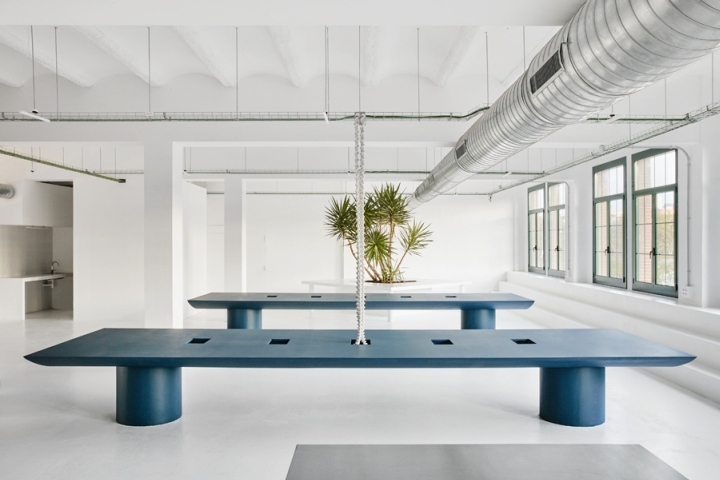
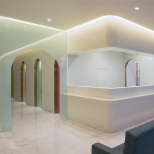
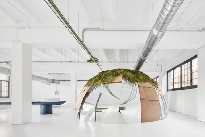
Conceived as an art gallery, the office has ivory walls that make an ideal setting for Santomà’s furniture. “It’s like an exhibition space,” he says. “The pieces really pop against the white backdrop.” Breaking the geometry of the space is a 2-m-tall hemispheric meeting room – or “cupola”, as the designer calls it – clad in 3-mm-thick MDF, transparent panels, mirrors and palm fronds, any of which can be detached and shifted to another position. Balancing the height of the cupola is a yucca palm, which emerges from the agency director’s concrete desk. “It all reminds me a bit of Miami,” says Santomà, smiling.
Design: Guillermo Santomà
Photography: José Hevia

http://www.frameweb.com/news/guillermo-santoma-fills-a-barcelona-workplace-with-the-magic-of-miami


Add to collection

