

The idea behind Massalud Pharmacy, and both the brand and the retail concept, arises from two unique aspects: The location -Massamagrell and its proximity to the only Health care centre in the town. The other differentiating trait is the proposal to create specialised product fields based on the target audience, thereby developing a strategic trajectory for the brand: Masschildren, Masselderly, Massbeauty, Massassistance, etc…
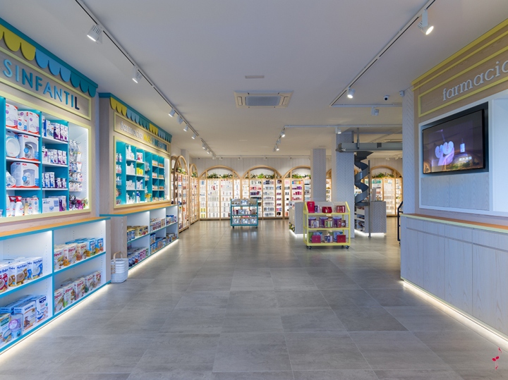
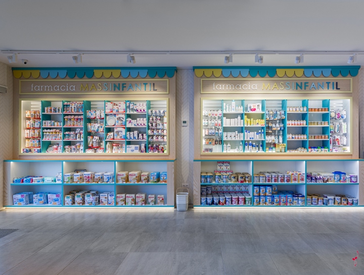
Massalud Pharmacy has a sales space of 250m2 that is open and available to browsing customers.The idea is that customers walk through the pharmacy as if it were a park, with both large open spaces and other more withdrawn areas. When customers enter, they are welcomed by the Masschildren area. This space is inspired by story tale houses with colourful roofs, open windows displaying products, and more extensive spaces below for milk and other larger products. Opposite this is a wall with a similar shelf dedicated to the product currently on promotion and digital signage.
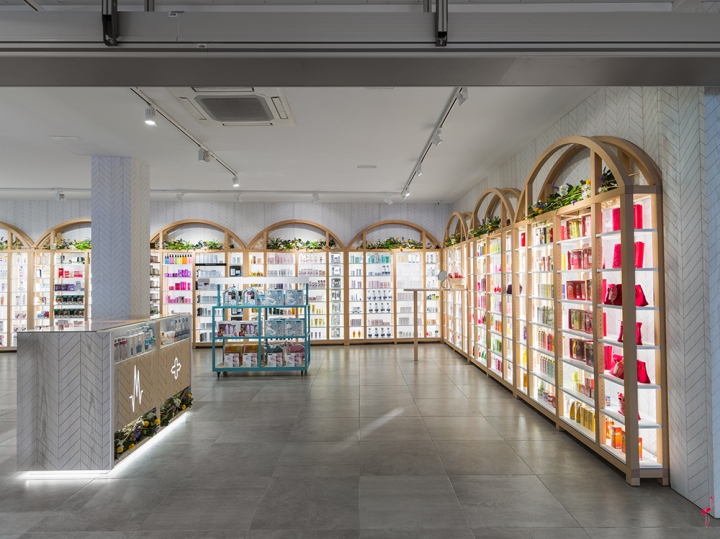
The Massbeauty Area can be found at the centre of the pharmacy, in a withdrawn space where products are presented on 10 individual shelves made from natural beechwood frames. Here customers can calmly and independently choose from the very best multi-brand selection of skin products in the area. Next to this are two copper display counters, shelves for impulse purchases and a robotic dispenser for comprehensive, fast and pleasant healthcare shopping.
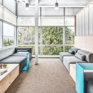
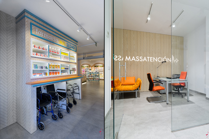
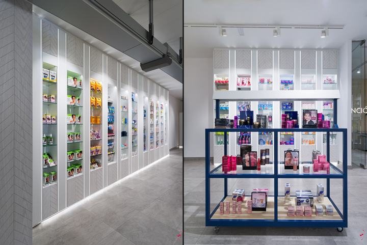
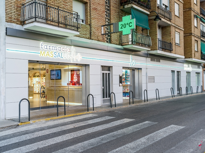
The premises offers two potential entrances, with the second located in the Masselderly area. This is the first sales area that we have specially designed for the elderly population. The imagery of the shelves is slightly reminiscent of the Masschildren area, yet the differences between the products and presentation soon become clear. There is a handrail for support and extra space for wheelchairs and walkers that is clearly labelled “elderly”. The Masselderly area is well thought out, located close to the waiting room for optimal comfort, close to the central area cashier counters and attached to the Massassistance room, where customers can receive pharmaceutical assistance. We have also designed a third area with a distinctive image and shopping experience for more strictly pharmaceutical products, such as the sale of both OTC and prescription medications. The pure and minimalist lines of this space provide the setting with a more professional image.
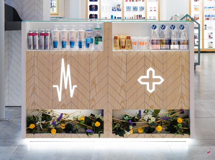
Regarding lighting, we have maintained our decision to use layered lighting. All the furniture has high quality white LED lighting incorporated and is reinforced with illumination provided by projectors located on ceiling tracks. This allows us to provide extra lighting accents on the front of products and to trace our customers’ trajectory and gaze.
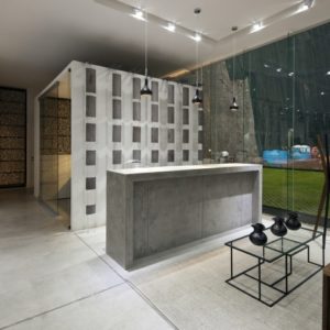
We have selected our materials to create the impression of being in a pharmacy that is at once “natural, intimate, professional and accessible”. The most distinctive finishing touch is the design of a corporate herringbone pattern which with we have manufactured MDF panels overlayed on natural wood to completely cover the walls and furniture. However, depending on the area, this herringbone pattern takes on a whiter colour when we are in the more professional area or a more natural wooden colour when in the rest of the retail space. The floor is paved with imitation cement made from large porcelain floor tiles.
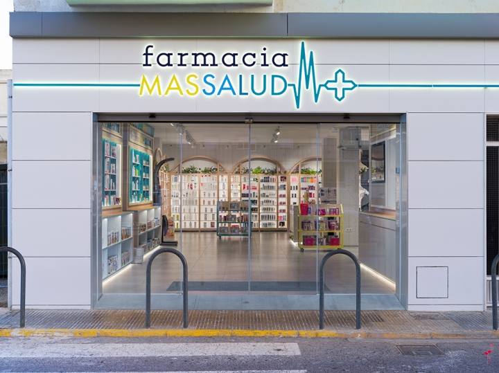
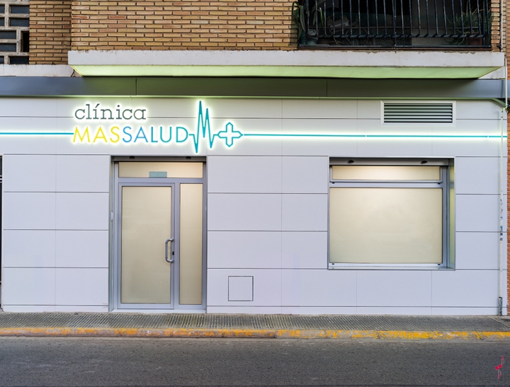
With regards to Branding, the logo is inspired by the line of a heartbeat with an irregular zigzag. In the interior of the shop, signs are typeset with the Massalud Pharmacy’s own naming: Masschildren Pharmacy, Masselderly Pharmacy, Massbeauty, Massassistance… which obviously represents the strategic plan to differentiate the retail areas and brand development.
Creative, design and general management: Carlos Aires / Marketing-Jazz
Illustrations and sketches : Elena de Andrés
Corporate image: Natalia Aires
Technical design: Xiang Sun
3D Design: Xiang Sun
Visual Merchandising: Massalud Pharmacy team and Silvia Bellisco.
Photography: Ikuo Maruyama


Add to collection
