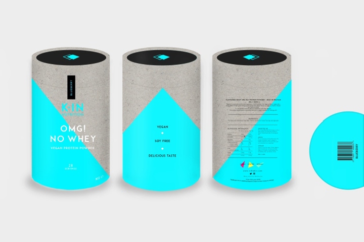

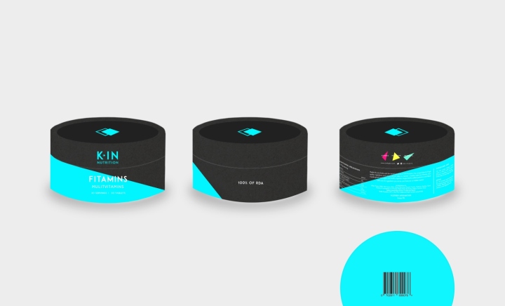
Global retail design agency Sheridan&Co reveals its latest work in creating the new brand identity for KIN – a range of premium nutritional supplements developed by renowned fitness gurus Kyle and Kelly Maslen, otherwise known collectively as KMPT. With a combined 17 years of industry experience, Kyle has trained GB athletes, industry execs and celebrities, while Kelly’s expertise lies in yoga; together, they run luxury fitness retreats in Ibiza that combine personal training, meditative balance and nutritional support for clients. To facilitate the business’ future growth – particularly within its own line of high performance nutritional supplements that include protein powders, fish oil capsules and powdered super greens – KMPT sought a brand overhaul to not only communicate the two personalities behind the brand but also create differentiation within an overcrowded category to secure its premium positioning, as well as standout on shelf.

Sheridan&Co were tasked with renaming KMPT’s nutritional supplements product line and redesigning the logo and product packaging to create a visual solution that reflected the brand’s expertise, wealth of experience and the founders’ complementary “Ying and Yang” skillsets. Ultimately, the identity needed to depart from the archetypically brash brand design that seems inherent in the category and appeal to a more understated yet health conscious demographic. As part of the creative process, Sheridan&Co delved deep into the brand’s current market position, analysed its competitor landscape and identified trends within the burgeoning boutique fitness scene to devise a strategy that strongly defined KMPT’s core point of difference. Playing on the kindred relationship between Kyle and Kelly and sense of a kindred community – a familial connection, if you will – between PT and client that underscores their unique and personable approach to training, the brand name KIN was conceived.
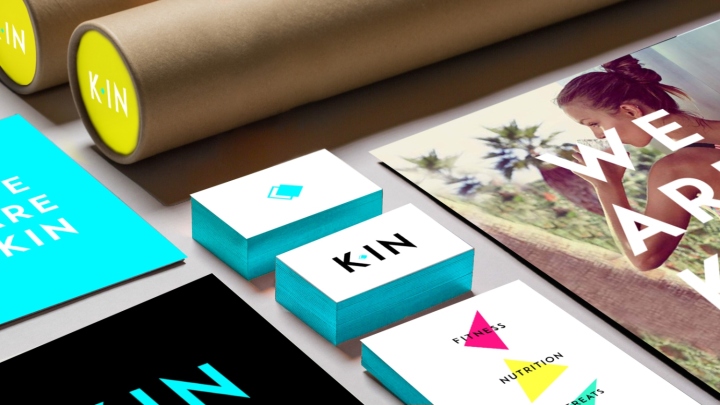
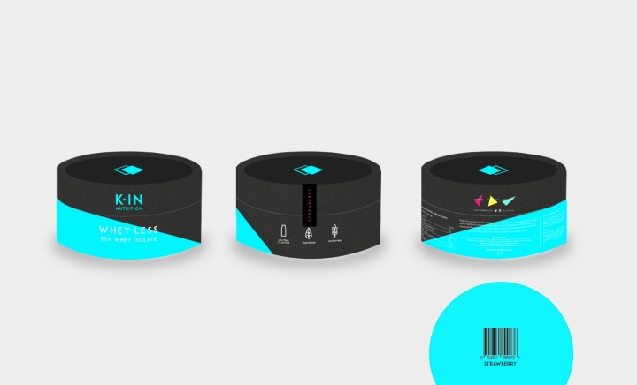
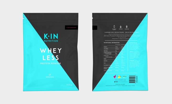
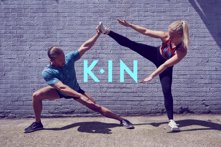
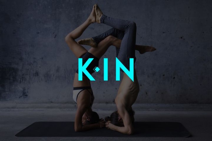
The logo was next developed to bring this line of thinking visually to life. Using a strong, stripped back monochrome palette offset by blue Pantone, the subtle spatial play that sees the upper case ‘K’ slightly separated from “IN” divided by a double diamond icon, represents the dual personalities of the brand’s founders – the same Ying and Yang dynamics that, although signifies difference, alludes to the duality of strength and wisdom. Building on the diamond brand marque that features in the logo design, the Sheridan&Co design team introduced a further three luminous coloured deconstructed triangular shapes in the brand identity that nods to the master diamond design, representing the “three arms” of the business. The overall look is bold, minimalist and modern. This visual language has been applied to KIN’s marketing collateral, with the logo transposed onto energetic lifestyle photography of people exercising in either an urban or natural setting.
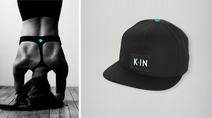
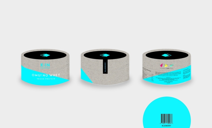
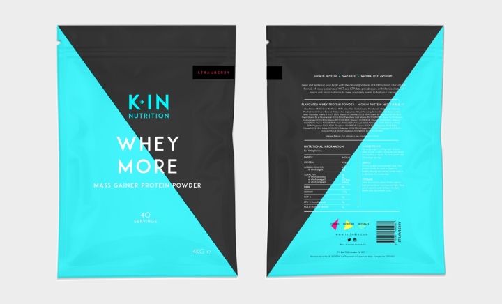
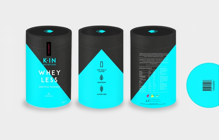
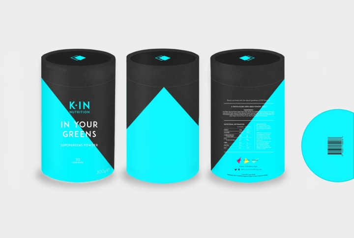
A combination of both group and individual shots used as a backdrop for the KIN brand mark reinforces the important brand value and message of kinship, and of “family” that both Kyle and Kelly uphold so passionately. It also communicates the strength of the individual – both when working out alone or as part of a group dynamic. On pack, the dichotomy of contrasting neon colour is striking in its arty, abstract look and feel. Despite the boldness, the design and labels are clean and simple – almost clinical and serious if it were not for the injection of pop colours and striking angular shapes. Michael Sheridan, CEO of Sheridan&Co, commented: “Brand identity design for nutritional supplements typically have a harsh, perfunctory, does-what-it-says-on-the-tin aesthetic that sets it apart from other food or confectionery products – given that the aesthetics serve to emphasise physical performance rather than reinforce a lifestyle or communicate taste.

On shelf, bold masculine-centric labelling fails to communicate meaningfully to a wider and more diverse health conscious consumer audience. On shelf, this translates into a brash cacophony of angry fonts and a clamour of colour; brand differentiation gets lost within this visual noise.” He continued: “The design we develop for KIN goes against the grain; its boldness lies in its vey minimalist aesthetic. It is genderless in composition, therefore instantly more inclusive. The vibrant abstract design is cleaner and edgier – making it instantly more impactful on shelf. We took our visual cues from luxury confectionery brands to infer the premium quality of the ingredients used in the product, as well as to tap into a clear trend: empowered consumers adopt a pre-emptive approach to their personal wellbeing, and as indulgence gains pace, there is still room in consumers’ diets for occasional treats. It was important that KIN’s identity communicated quality and goodness in equal measure.”
Design: Sheridan&Co



Add to collection


