
Design studio Biasol has transformed a 19th-century warehouse in Clerkenwell into a restaurant and bar with marble and velvet accents. The new 260-square-metre venue is the eighth addition to coffee bar chain Grind & Co designed by the Melbourne-based studio. Located within a grade II heritage-listed warehouse dating from the 1870s, the space comprises two floors divided into a cocktail bar, dining area and a basement bar for host night time events. Biasol removed existing partition walls on the ground floor to create two interconnecting spaces, with the bar and private dining area on one half, and the main restaurant on the other.
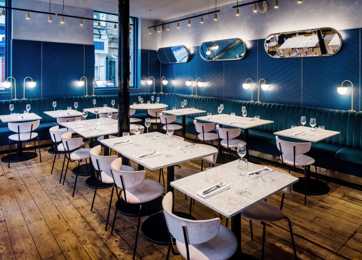
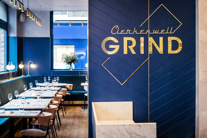
On entrance, guests are met with the Clerkenwell Grind brass logo which sits against a chevron-patterned timber wall, forming a backdrop to the host desk. Worn timber floors contrast with the luxurious aesthetics of the main dining room, including navy and pink velvet seating, marble tables and brass lighting fixtures.

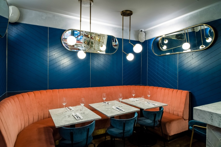
A velvet sofa curves around the walls of the main restaurant into the private dining area, blending with the navy-painted timber walls. “The main dining room is open and elegant, but we wanted the basement bar below to feel more fun and feminine. The materials, colours and lighting play a big part in that,” said the designers.

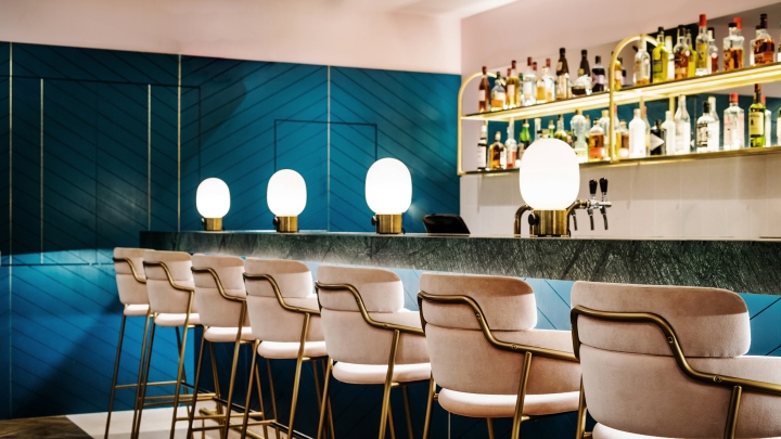
Pink velvet chairs accompany marble tables in the dining space, and continue into the basement where they complementing the matching pink ceiling. A long stretch of mirror and curved brass shelving dressed by colourful assortment of spirits sits behind a green marble bar.
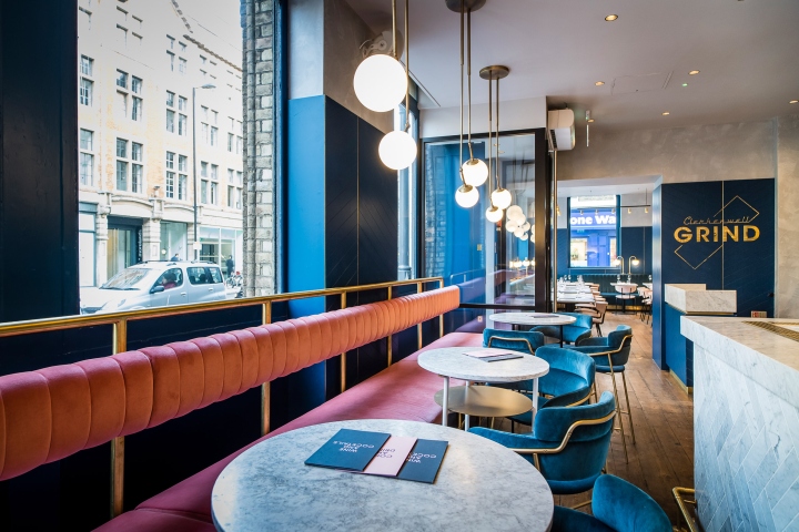
Parquet flooring in the basement bar reflects the chevron wall, while a small stretch of pale colour tiles surround the bar. “Behind its intricately patterned brick and terracotta facade, we sought to create a vividly coloured but elegant interior that would contrast with the architecture while respecting its heritage,” said the designers. A variety of brass lighting hangs from the ceilings on both floors, adding a warmth to the predominantly navy interior.
Photography by Paul-Winch Furness


Add to collection
