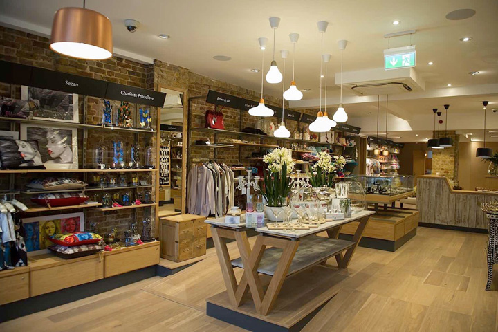

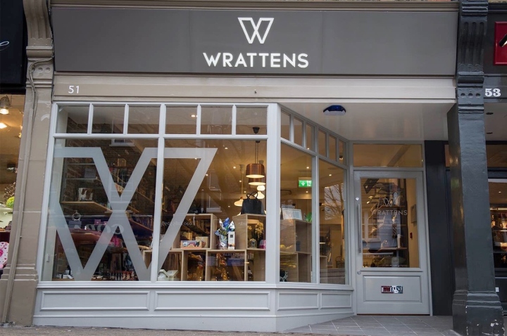
Wrattens has been an independent retailer at the heart of Chislehurst High Street since the 1930’s. The large double-fronted shop had been divided into a number of concession spaces in the 1990’s, based around a gift shop and café concept with an emphasis on antiques and crafts. Although Wrattens was still held in affection by customers, over time the offer had become confused and the interiors cluttered. The owners were looking to keep Wrattens sense of identity and history in the community while making a more contemporary retail experience. We were appointed to review the full project and develop a strategy, new brand and interior design, working on everything from initial concepts to implementation.
The Shop:
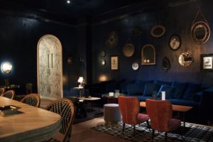
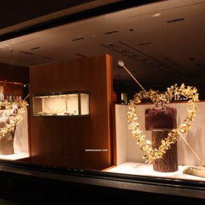
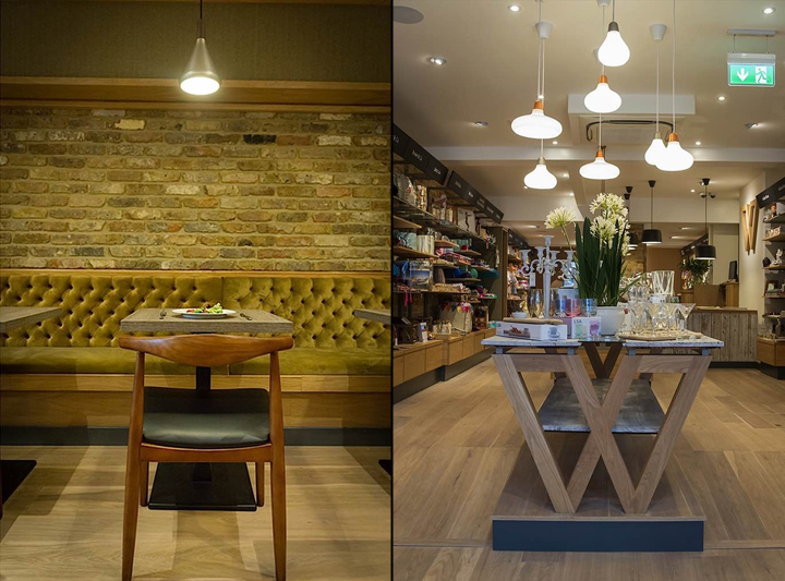
For the interior we aimed to create a warm, welcoming space that would provide a simple showcase for the products on offer. We used oak, rich metallic tones and slate grey, all enhanced by returning, where possible, to the original brick of the building. Bespoke display units, including signs, helped to provide cohesion for the wide range of concessions in the shop. Bespoke display tables carefully enhanced the brand while allowing the focus to remain on the featured products on sale.
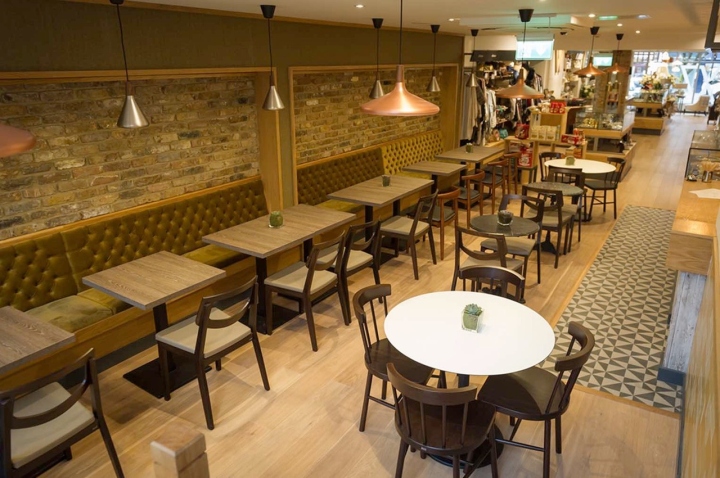
The Cafe:
“Visitors may browse and meander through each enchanting display or simple relax in the congenial atmosphere of the cafe”
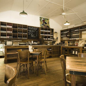
A follow up to a successful shop design was the cafe. As this was an existing part of Wrattens, we ensured that the design was complimentary to the vernacular of the shop.
Refurbishing with neutral and sophisticated use of colours, warm oak wood features and also keeping the original brick work that serves as a feature and memory wall with black and white frame photos mounted on it’s face, reviving it’s rich and respected heritage as well as improving the cafe’s ambience.
Designed by Nugget Design
Photography by The Urban Snapper


Add to collection

