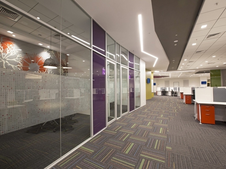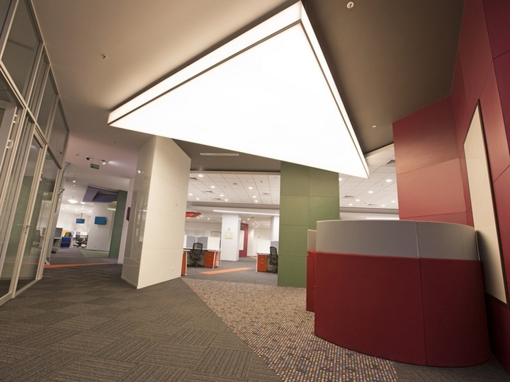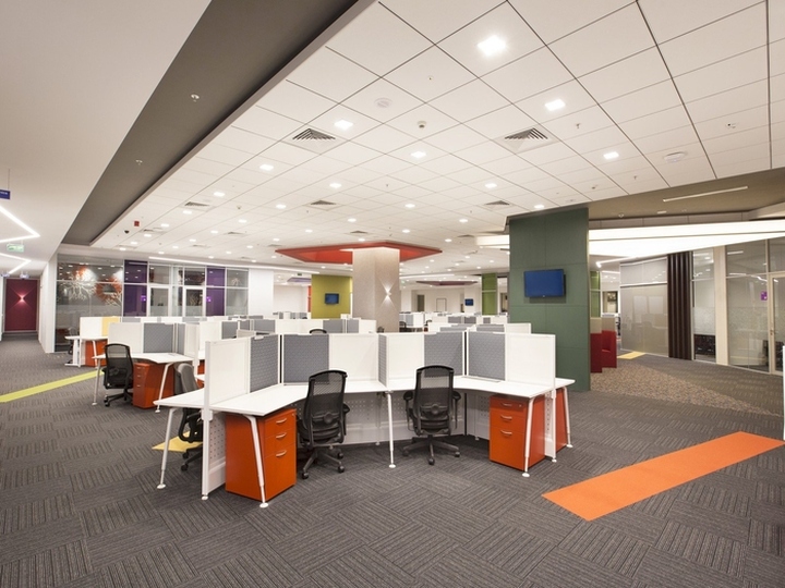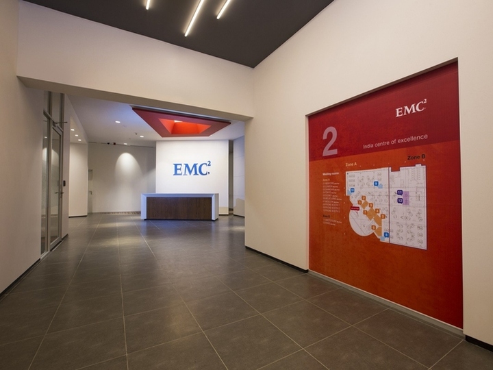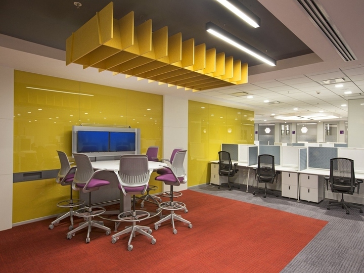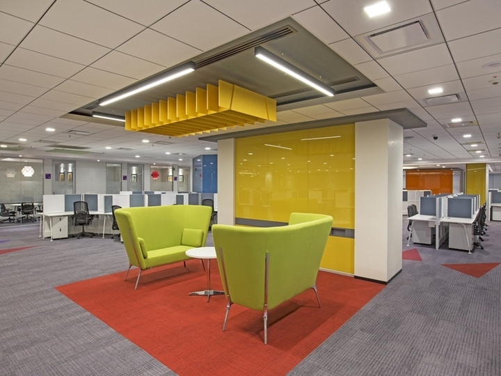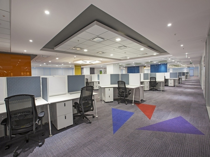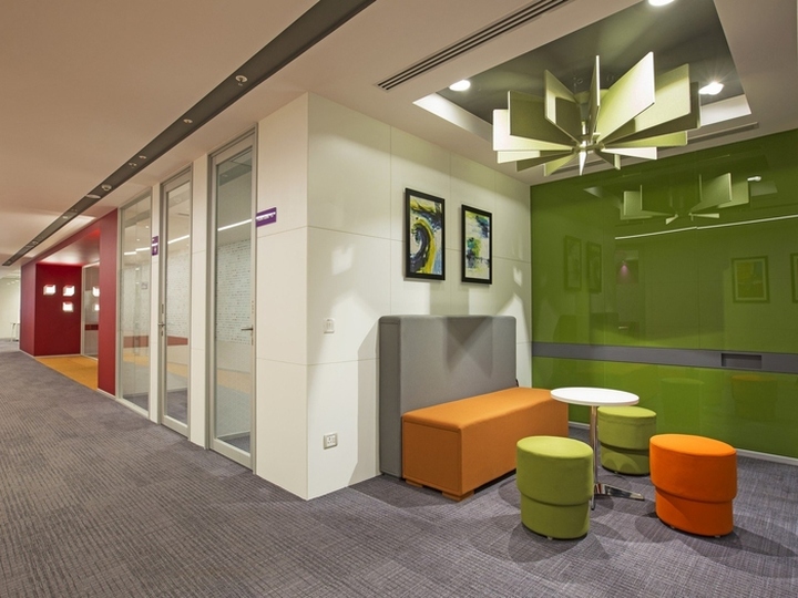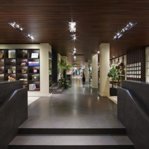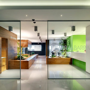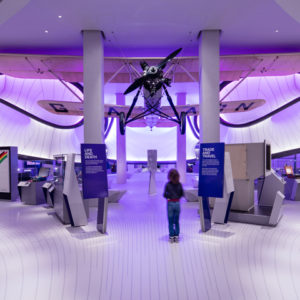


Symmetrics Development Services has designed the new offices of computer data storage company EMC located in Bangalore, India. Symmetrics has designed and built the new offices of IT storage and hardware solutions provider, EMC in Bangalore, India. The two companies have collaborated on several projects since 2008. Though every project is distinct in its structure, theme, colors, and flow of space, the biggest differentiating feature of this project spanning two floors is its uninhibited use of colors. The brief for this project was to limit physical barriers and create an open space that encourages collaboration.

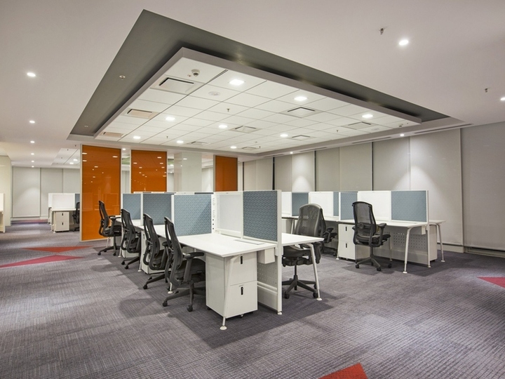
The underlying objective was to keep the space as fluid as possible and transcend the no-barriers theme into the way EMC’s employees work. EMC has adopted flex workspaces that give employees the freedom to work from anywhere across the floor without being tied to a specific desk. One floor spans 28,000 sq.ft while the other covers over 54,000 sq.ft. Both the floors are peppered with workstations, semi-enclosed meeting spaces, conventional meeting rooms, informal lounge areas, and wall-mounted acoustic Phone booths. While one floor is explosive in its use of color, the larger floor has an understated subtlety.

The striking aspect about the layout is that it is not a traditional cluster of ticky-tacky modular boxes. The work areas are a combination of low-walled linear-desk and 120-degree desk-based workstations. When the workstation is not large enough for a team of 3-4 to huddle, the discussion spills over to the meeting pods. Adjoining every cluster of workstations is a semi-confined informal meeting pod furnished with white boards and a couple of chairs. The pods foster quick group meetings closer to the workstation cluster. There are also several free-standing lacquered writing glass surfaces across the floor for all those ad-hoc brainstorming sessions.

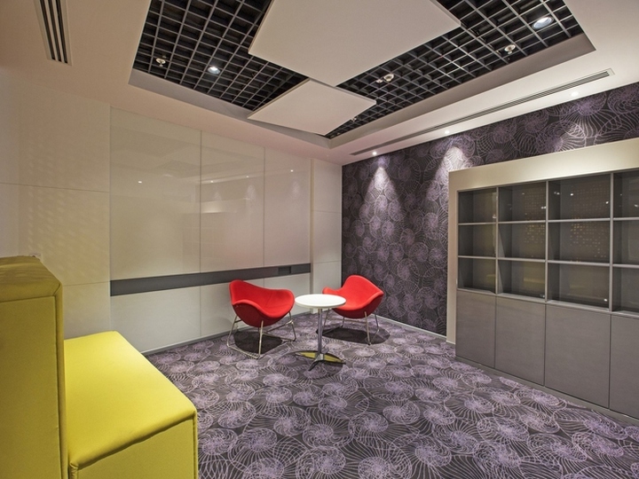
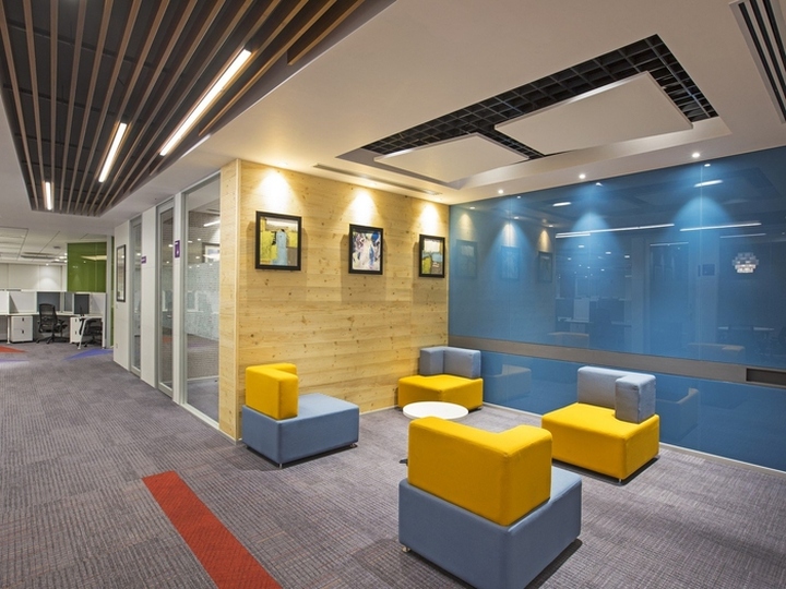
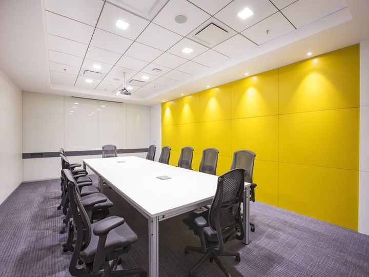
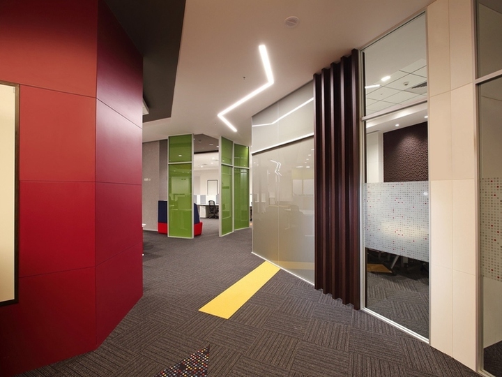
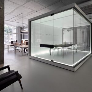
The floor-to-ceiling glasses are writable surfaces that beautifully punctuate the floor into zones. There are numerous colored columns all over the floor that can be used as writing surfaces.The meeting rooms are equipped with motion sensor lights, and designer wall and floor carpets with high acoustic properties. Some of the walls in the meeting rooms come to life with 3D wallpapers known for their acoustic properties with high NRC. In the larger floor, each meeting room comes with a display unit, an entire wall as a writeable surface, and a featured third wall with acoustic properties.

The writable wall has a solid acrylic band of a contrasting color running along with its width; this band has a small niche to hold pens and is one fine example of how functionality and looks are balanced. Integrated AV furniture is spread across this floor to facilitate video conferencing for small groups. The ceiling and flooring patterns transform radically throughout the fluid space. The ceiling is diverse featuring concepts from geometric patterns to suspended CNC cut letters. Acoustic panels in different shapes and colors have been used in the ceiling that adds to the aesthetics of the place as well as provides acoustic features.

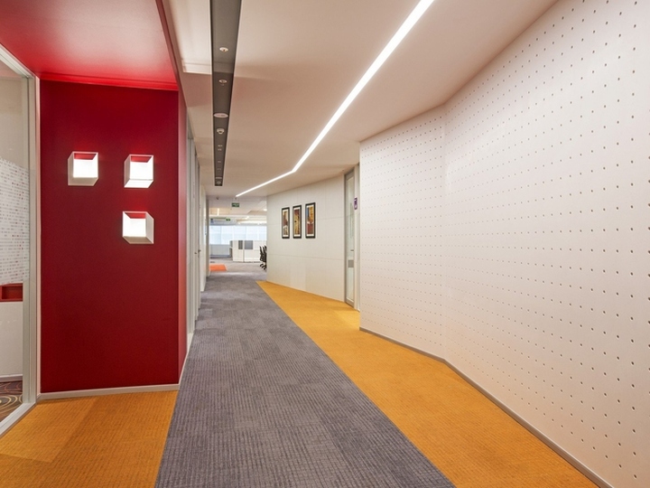
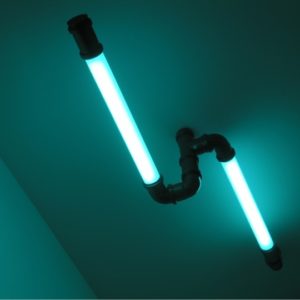
Light fixtures including technical and decorative have been designed to seamlessly integrate into the space with a LPD of 0.6 watts per sq. ft. Seamless linear lighting has been used in both the floors to ensure there ae no dark spots. Pre-stretched layers of customized fabric lighting panels have been used to change mood and ambience of the place. The passageways are a far cry from the narrow, traditional ones. The carpets have hues of yellow and orange geometric patterns run along their edges, while a thick lattice of perforated wall panels make the curved pathways easy on the eye. The walls are tastefully decorated with minimal modern artworks.

Each of the floors house a small cafeteria decked primarily in white with flashes of color coming from the furniture. A library has been designed in the workspace. Plaque diffusers that facilitate good ventilation have been used both for engineering performance as well as aesthetic appeal. There is nothing monotonous about this office. But, as Brenda Laurel rightly said, “A design isn’t finished until someone is using it.” When the doors to this office were open for business, it was embraced with fervor; a testimony that the design is finished and there is order in chaos.
Design: Symmetrics Development Services


https://officesnapshots.com/2017/03/03/emc-bangalore-offices-bangalore/
