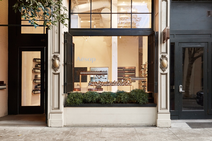

Thin copper shelves match cylindrical sinks at this store close to San Francisco’s waterfront, designed by New York studio Tacklebox for skincare brand Aesop. The boutique in the city’s Jackson Square neighbourhood opened last year, as did another Tacklebox-designed shop, lined with 30,000 sticks, in Washington DC. The studio, led by Jeremy Barbour, based the design on “fault lines and natural rifts within the area’s geological timeframe”. Walls of textured plaster hold a series of display shelves, which appear like metallic fissures in the surfaces. “Bracing, stitching, and splicing the surface of the wall terrain, forty-one solid copper shelves bridge the in-between,” said Tacklebox.

Copper was chosen in reference to the stills used to produce whiskey at the A P Hotaling warehouse – once the West Coast’s largest whiskey repository – in which the store is located. “This space is situated in one of a handful of structures that survived the 1906 earthquake and fire,” said the studio, “owing to the quick-thinking firemen and hundreds of citizens determined to protect the stores of Hotaling’s Whiskey – an endeavour that fortuitously preserved the architecture of neighbouring blocks.” The metal is also used for a trio of drum-like units placed in the centre of the compact space.
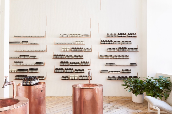
Two of these are wash basins, which feature in most Aesop stores to allow customers to test the different skin products. The pale walls are paired with rough wooden floorboards, while the light aesthetic is helped by large windows facing onto the street. Aesop works with a variety of designers worldwide in order to create unique store interiors, which founder Dennis Paphitis spoke about in a 2012 interview with Dezeen. However, some studios are called up more often that others. Along with Tacklebox – which also created a kiosk made from over 1000 copies of the New York Times for the brand at Grand Central – other repeat collaborators include Snøhetta, In Praise of Shadows, Frida Escobedo and Torafu Architects.
Design: Tacklebox




Add to collection
