Massimo Dutti flagship store by Sordo Madaleno Arquitectos, Mexico City – Mexico
posted by retail design blog on 2017-03-27
Add to collection
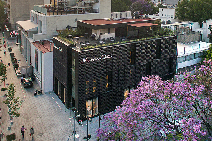

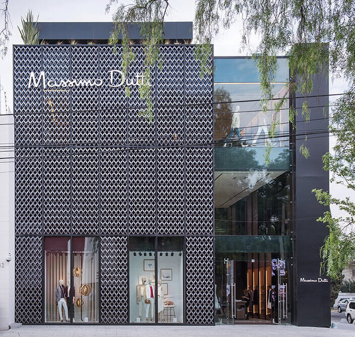
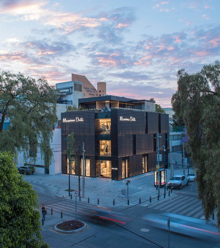
The new flagship store for Massimo Dutti is located on Presidente Masaryk Avenue, one of the most prestigious streets in Mexico City. Home to leading brands, it is considered the city’s “golden mile” and has recently undergone a makeover to improve its urban qualities. With the goal of turning the building into a veritable work of architecture that serves as an aesthetic reference point within this exceptional context, the scale and design of the project reflects a desire to integrate it into the Polanco neighborhood.
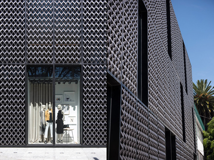
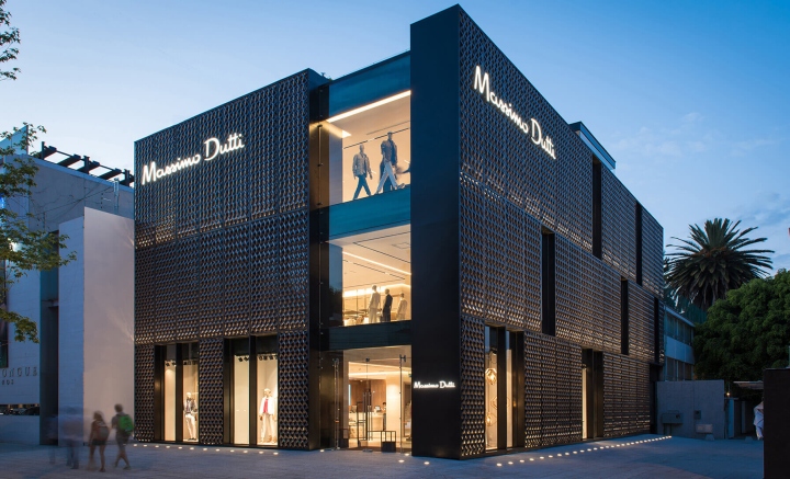
The building façade is designed to match the formal landscape of heights and voids found in the zone’s historical architecture. The rhythm of rectangular modules is formed by an orthogonal metal structure, while the texture of the façade is a screen inspired by a reinterpretation of the traditional wrought iron railings of Polanco. The screen generates a series of rectangular niches that are randomly repeated within the orthogonal mesh.
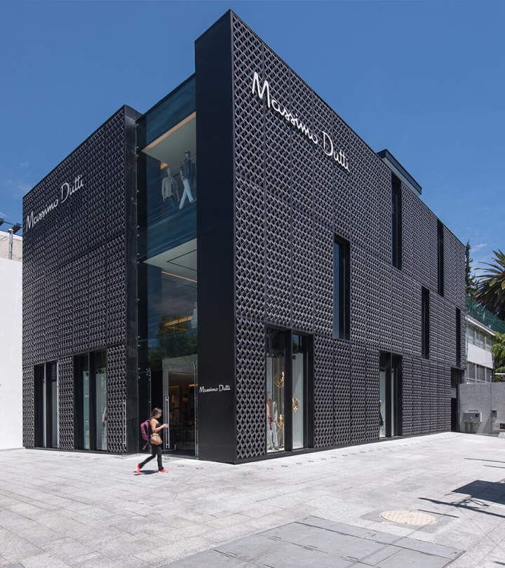
This is a lively and flexible architecture, thanks to the strong connection between interior and exterior. Each of these niches becomes a window, showcase or closed element, depending on the internal use. This system is only interrupted by the sheet of glass that frames the principal entrance, with a great triple-height vertical window. The screen was manufactured using molds, and employs fiberglass in its construction. It represents a superb collaboration between traditional local skills and sophisticated technology.
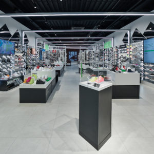
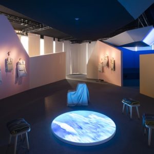
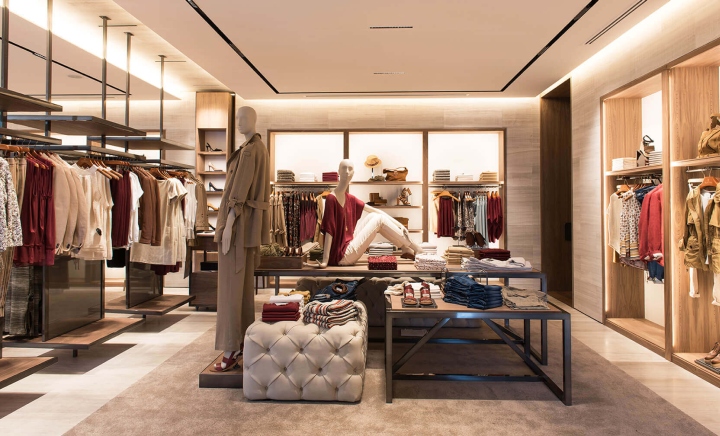
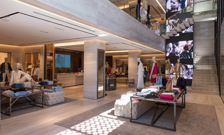
While the first impression of clients is of the building’s urban presence, upon entering users experience new sensations in the imposing double-height lobby space. Inside, the store is conceived as an urban and contemporary space with a minimalist style. With simple lines and purity of materials, a versatile and timeless space is created that does not interfere with the demands of fashion and ensures the product holds all the attention.
The vertical circulation nucleus was conceived as a sculptural element that welcomes clients as the visual backdrop upon entering the store. The furnishing is simple, with geometric forms in wood and steel detailing. Following the same scheme, the brand’s classic pieces were reinterpreted and simplified to be incorporated into this minimalist space. A number of original pieces were designed for the store, including the hanging showcases, exhibition tables, and payment area.
The rooftop terrace was designed to complement the experience of the store for clients and their partners, where they can relax and enjoy a coffee or refreshment. It will provide a versatile space with kitchen and washroom services that offers superb views over the skyline of Polanco, and will also serve to host brand events. The selection of materials was focused on the classical but innovative essence of the brand to create a neutral setting. Pale stone employing different treatments was used, together with accents in wood and metal.
The combination of these architectural elements together with the use of a sober palette for the interior were the tools to achieve the elegance required by the site, and which the brand represents.
Designed by Sordo Madaleno Arquitectos
Architecture: Fernando Sordo Madaleno de Haro y Boris Pena.
Interior Design: Enrique Ralph


Add to collection