
Fusion of jet black and culture.
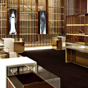
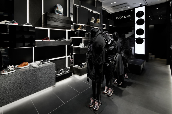
Renovation of the flagship store, a shoes brand “RUCO LINE” from Italy in Ginza Namiki st. It’s a joint project collaborated with Mr Tetsuya Chihara from ‘Lemon life’ who’s appointed as an art director. With Japanese traditional ‘Black (which is one of the colors symbolizing Japan)’ as the concept, “RUCO LINE BLACK” was raised. I made identify ‘BLACK’ by creating display shelves as if blocks were stacked randomly using materials of various textures of black (Natural stone, lacquer, paper, wood etc…)

In the center, is a story like runway show by aligning mannequin that wears haute couture created by Mr Chihara himself. Furthermore, as a staging attraction catching peoples eyes, motion graphics of a black dot that represent Japanese Hinomaru (Icon) is displayed on a digital signage installed vertically elongated effectively using heavenly height.

It is risky to create black space as it could read as an casual image depending on the balance and I was concerned that it might be far from the brand image but aimed for a delicate and modern space like Japan by arranging Japanese traditional colors such as SHIKKUI, AISUMICHA, BINROJI-GURO, choosing precise materials and directing in-direct lighting which is consciously represent Japanese ancient ‘WA = harmony’

The key factor of this store was the branding arranged to collaborate with Italian bland to blend into the Japanese market, to let customers visiting from overseas as well as for Japanese consumers to feel the beauty of Japanese people and the likeness of Japan, rather than just expanding overseas brand as they are in Japan as is.
Designed by Hiroki Hakamada / acca Inc.
Photography by Satoru Umetsu / Nacasa&Partners


Add to collection
