Lloris Gonzalez Pharmacy by Marketing Jazz, Borriana – Spain
posted by retail design blog on 2017-04-15
Add to collection

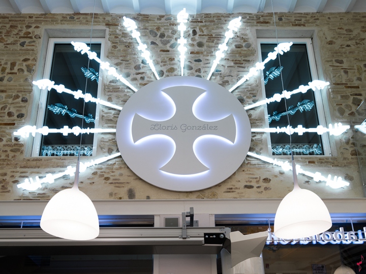
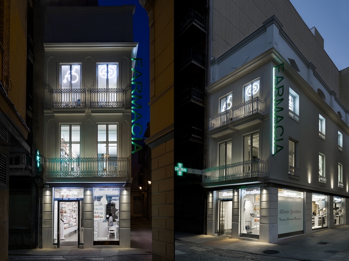
True Comprehensive Health, that is the idea that supports the brand project and the development of the retail space. This idea is represented graphically on the logo using a “Big Wheel”, where each of the spokes includes each of the health areas that make up Llóris González brand range: Laboratory, Pharmacy, Orthopaedics. Verticality, that is the characteristic that defines the planning of the commercial space. One of the challenges of the project has been to integrate into a narrow vertical surface all the laboratory, pharmacy and orthopaedics range, that until now was developed at the three premises on the ground floor.
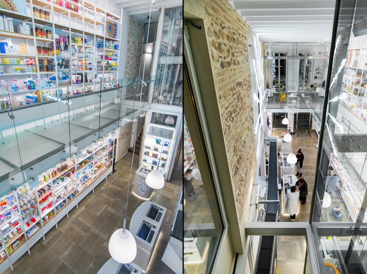
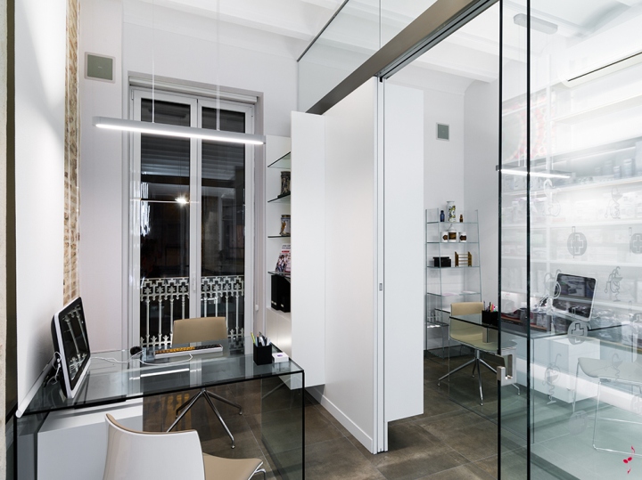
The Layout is designed to harness the specialisation of each one of the sales areas based on the target market, the product and the clarity of image. Thus, the customer will find on the ground and first floor, visible from the entrance: Senior Citizens, Medications, Wellness, Beauty and two pharmaceutical care rooms. An elevator and glass walkway invite one to rise and discover the beauty, orthopaedics and laboratory range, training rooms and other rooms that are on the other floors. The idea that we wanted to develop behind the lighting project was to create an optimal combination between the use of natural light and artificial light.
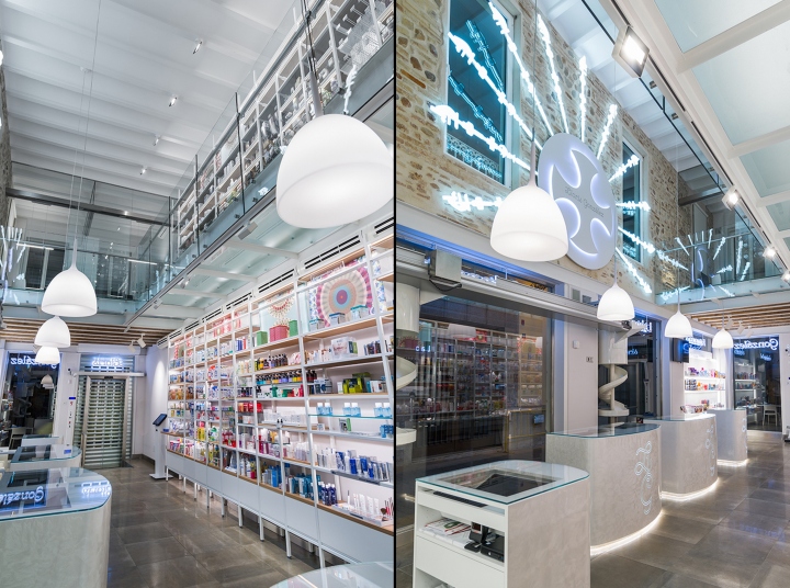
Large windows spread over the three floors of the building offering natural light, something that certainly strengthens the feeling of wellness in the customer shopping experience. In addition, all the furniture incorporates warm white LED illumination to improve the visibility of the product. We have provided accent lighting at the front of products thanks to the positioning of located adjustable LED projectors in the front of each of the walls with product. The touch of decorative lighting is provided by 4 lamps made in white backlit PVC and suspended from the ceiling.
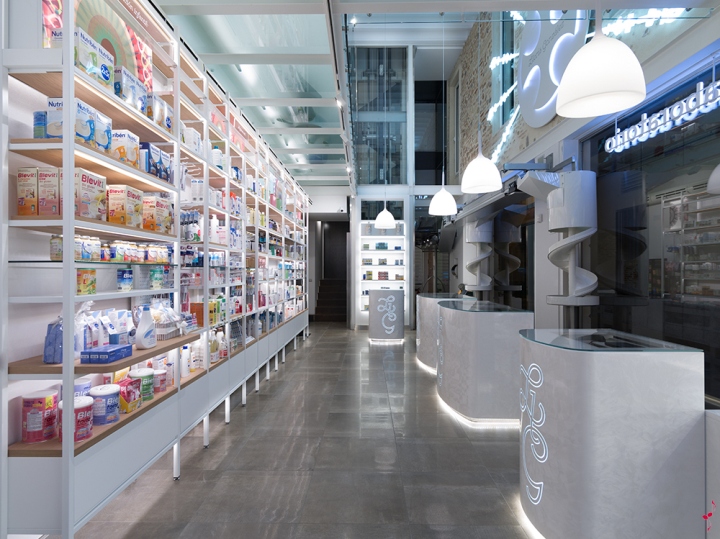
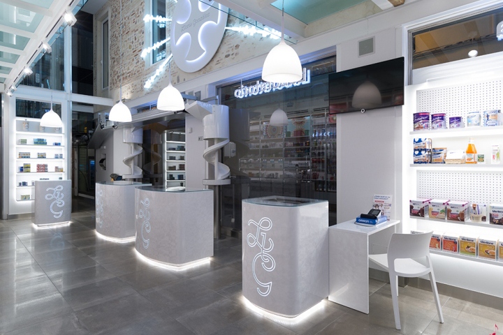
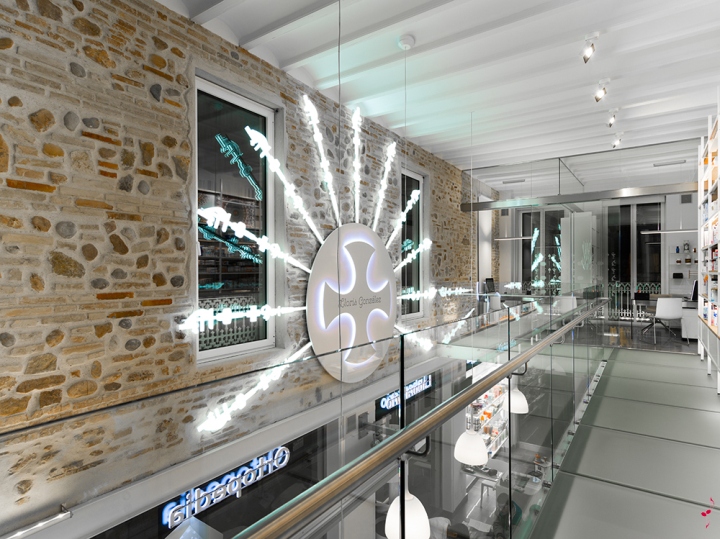
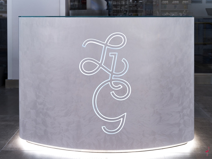
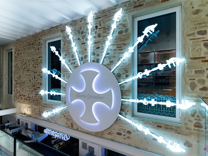
And to finish, the most spectacular piece of illumination in the project, a lamp in the form of a logotype presides over the right-hand wall. WOW! is usually heard when one discovers it. The materials were selected to create an impression of being in a “professional, technical, contemporary pharmacy with a sophisticated tradition.” Neutral colour porcelain floors that mimic the tissue of a bandage, a nod to patient care. Furniture made of metal brings lightness and wooden shelves, a warm touch. White lacquered counters with ice effect feature an image of sophisticated, elegant and thoughtful service. Open space, floors, railings and glass elevator bring modernity to the array.
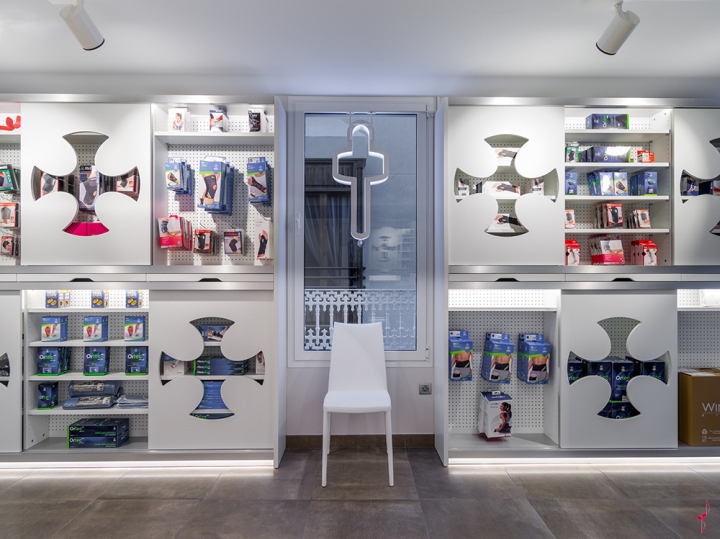
Wall brick and restored masonry arches speaks to us of sophisticated tradition. Iconic communication. We have represented the Lloris Gonzalez brand range using a series of icons. And we played with light and its scale to convey a clear image both outside and inside. On the other hand, we have developed a graphic line inspired by the world of cells with bright colours and kaleidoscopic shapes to add cheerfulness to the salesroom, combined with the colouring of the product and conveying the scientific vocation of the brand. Using the concept “True Comprehensive Health”, the space and brand attributes, we have differentiated the following product setups or presentations.
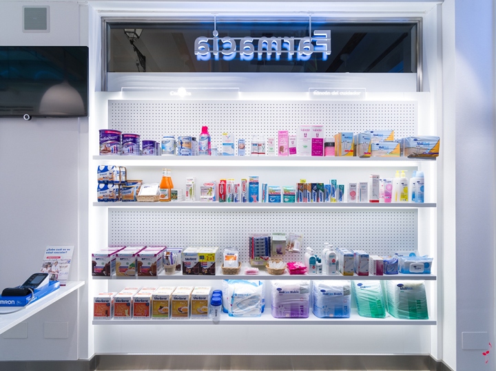
1)Senior Citizens Corner: located right at the entrance on the right, we want senior citizens to not have to move and to be attended to comfortably. The corner is formed by a seated customer service counter where one can measure blood pressure, a bench for waiting and shelving made up of 4 shelves where it is very easy to see and take the product. A detail of this shelving is that its rear has holes in it, which makes it possible easily to change the product presentation.
2) The Medication Area: present thanks to two Robot slopes that provide the prescription medication to the counters allowing the pharmacy staff to not have to move towards the interior of the warehouse and spends much time as possible with the client.
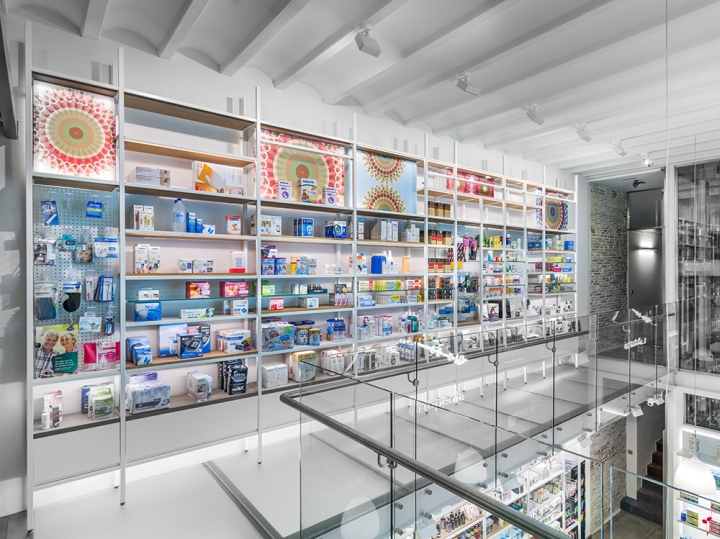
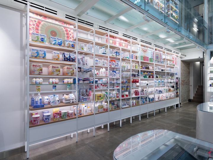
3) The Wellness Wall: Shelving, 7 metres in length and 6 metres high divided into two shelves, nothing else it makes an instant impression. We have sought Verticality, lightness, capacity. Wooden oak shelves combined with perforated metallic and back shelves are combined to offer the maximum flexibility when designing the presentation of the Wellness product: Children, Hair, Dermo, Nutrition…
4) The pharmaceutical care rooms. The service and personalised treatment vocation is one of the values of the Lloris Gonzalez pharmacy. We designed two adjoining pharmaceutical care rooms using a partition which allows, depending on the activity, time of service, having the rooms connected or isolated. The use of the glass on both doors and the furniture provides transparency, simplicity, modernity and lightness to the set.
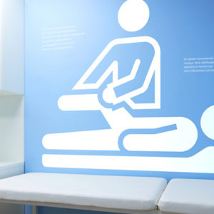
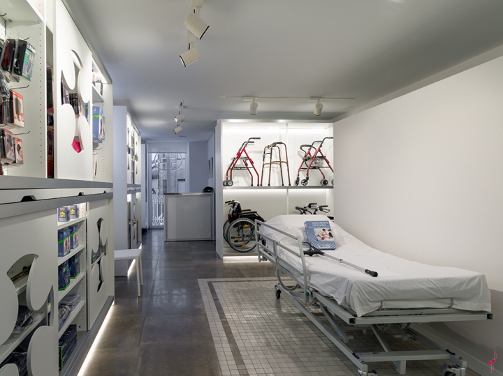
5) The Orthopaedics floor. We have dedicated an entire floor of the building for the presentation of the Orthopaedics category. Lloris Gonzalez offers specialised and deep orthopaedics based on giving true mobility solutions, from beds, to walkers, wheelchairs, walking sticks. The general idea of the presentation was to create a fictitious room using a partition that divides the sleeping area from the toilet area. A carpet made with mosaics helps us locate the bed. Shelving with sliding doors and with the anagram of the trademark punched reminds us of where we are and the power of images in commercial presentation.
Design: Marketing Jazz


Add to collection