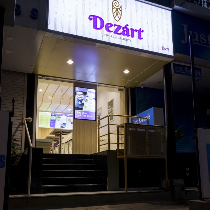

The clients approached us with the intent of creating a unique experience surrounding crafting some amazing dessert experiences centered around ice cream rolls. We wanted to design an experience that is in line with their premium dessert offerings. We came up with the name Dezárt as an amalgamation of two words that beautifully defined the entire concept; dessert + art.

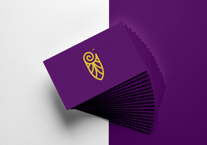
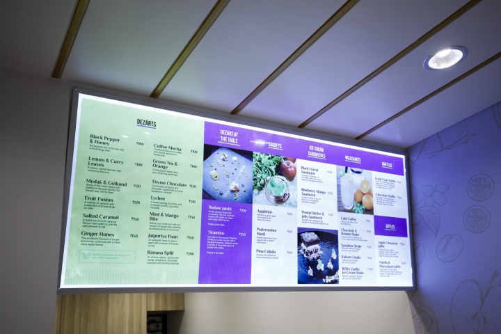
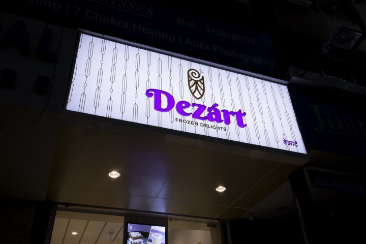
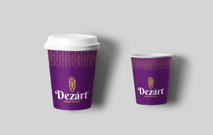
We wanted to communicate to the customers that the desserts themselves are a piece of art. We identified a colour scheme where purple is the dominant colour and golden/golden yellow is the secondary based on physical and digital applications. The golden yellow would primarily be used for the logo and in cases of highlight elements.

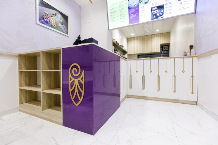
The logo is an art deco form inspired from two main elements; the ice cream roll and a traditional cone with an non-traditional application. The outline form of the cone is again used as a pattern to the logo space. We also created a pattern inspired from the logo that adds necessary detail.

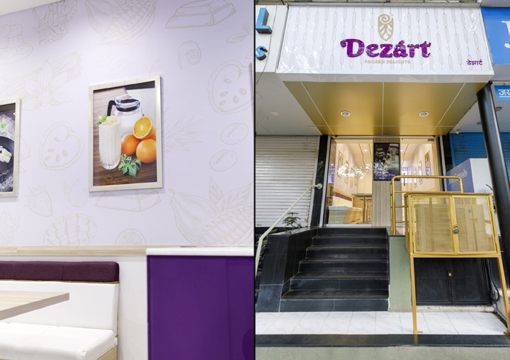
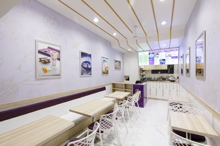
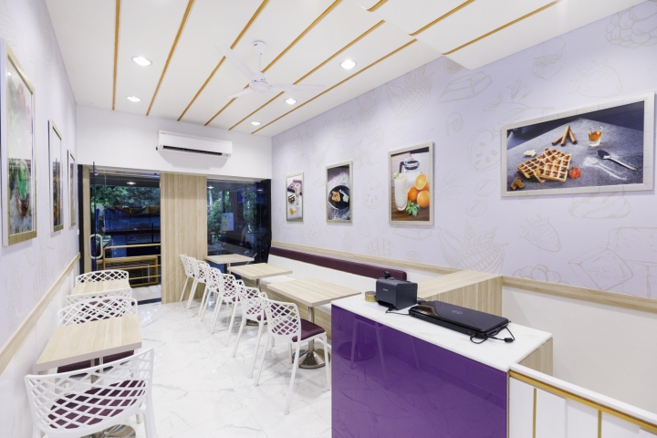
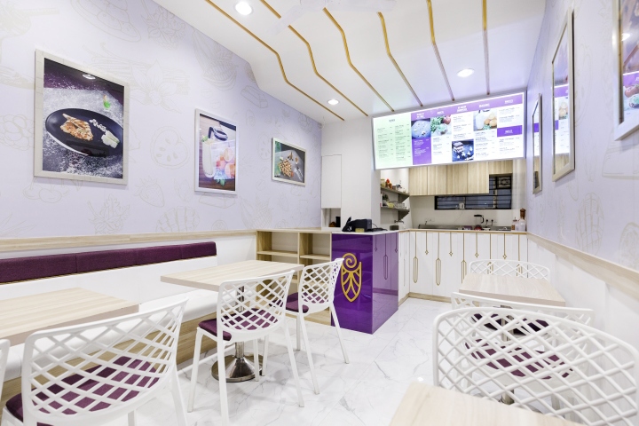
For the interior, we wanted to create a white space with splashes of the brand colours and textures. The space is meant to give a bright and cold setting to tie in with the dessert experience. We also added the food photography in subtle golden frames to represent them as pieces of art as per the brand promise.

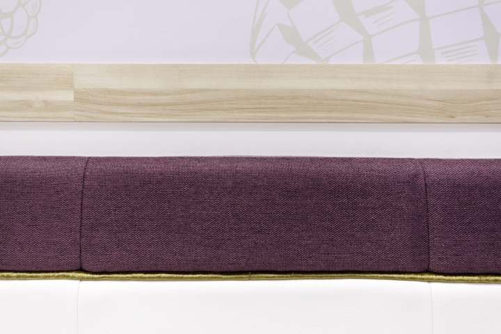
The brand pattern was also incorporated in the space at the ice cream roll counter and a simple line detail in the ceiling. By creating simple contrasts in elements such as fabric and faux-leather, we were successfully able to accentuate the brand colours without losing out on the essence of the brand story.
Design: Worksmith Design Consultants
Photography: Chinmay Morgaonkar
