Add to collection
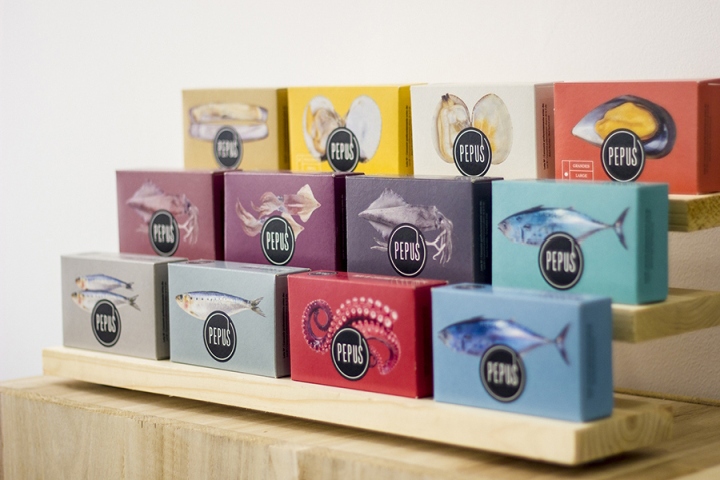

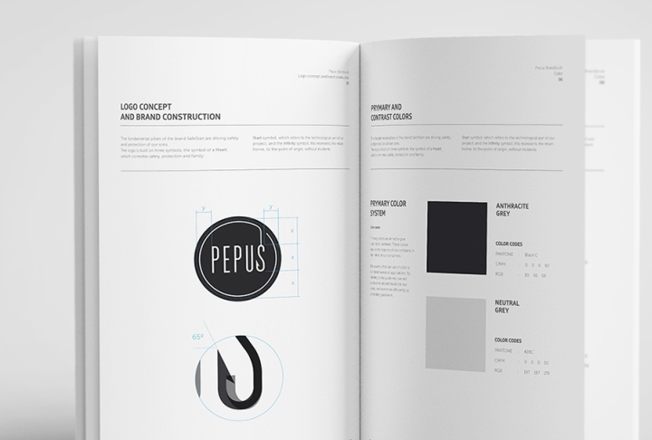
In 2015, Pepus re-launched its brand with a new and comprehensive corporate identity, revolutionizing packaging in its own market and increasing sales through eye-catching shelves visibility.
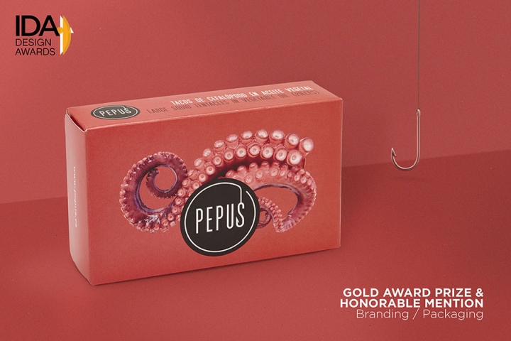
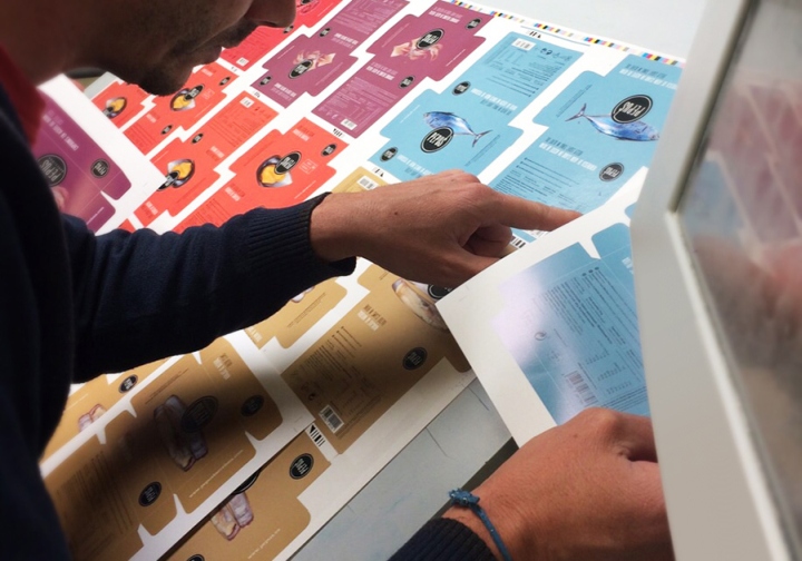
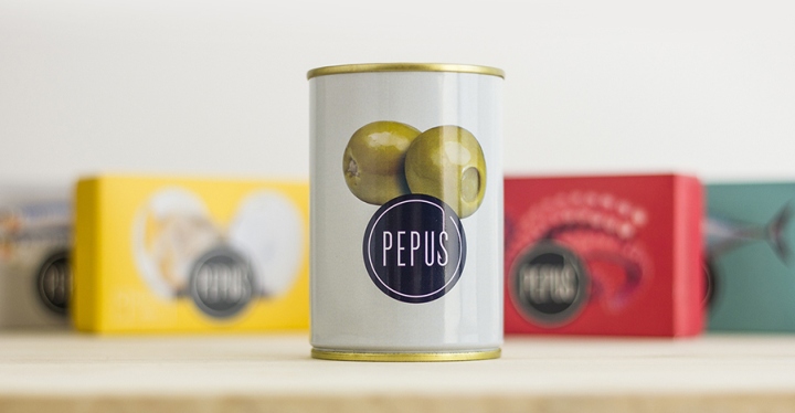
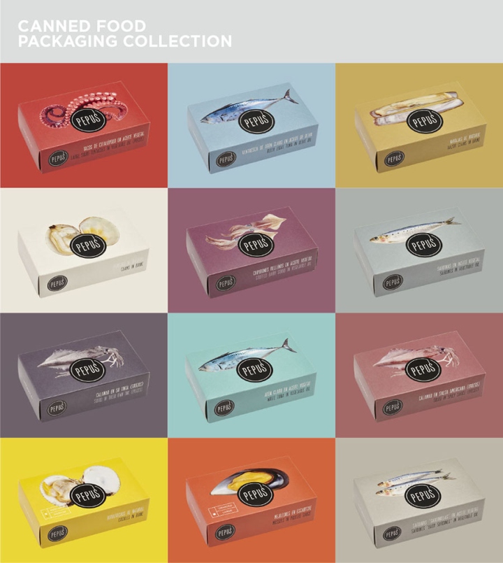
Both the new brand image and packaging present a fresh, colorful and modern design, with the aim to project Pepus to larger markets, both national and international. MOS developed the logotype, its brand identity and the packaging set for the canned seafood products, the canned olives and the vegetable products.
With this new daring and colorful image, Pepus initiates a trend in the field of canned seafood, betting on “out of the box” design boxes. Emphasis was on the creation of an attractive palette of colors, each reflecting a color element in the product photo displayed.
Design: MOS BCN
Photography: David Rosello / MOS BCN


Add to collection