
Add to collection
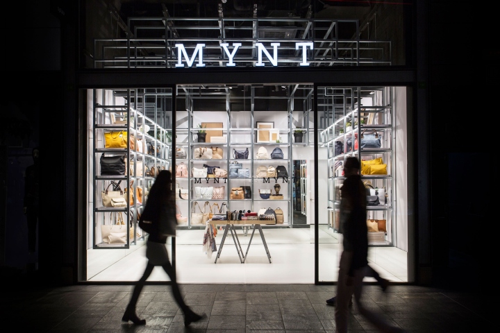

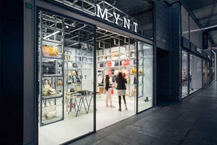
DearDesign has unveiled the design of the second MYNT store, which has 22m2 and is located in the SPLAU shopping center in Cornellá, Barcelona. The premise for the design was to create an iconic space that reflected the fresh and cosmopolitan spirit of the brand, following the thread of the first store, with a concept adaptable to any property and versatile when exposing the product. It should also be a design that could be quickly built and with a moderate cost.
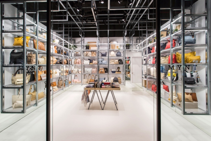
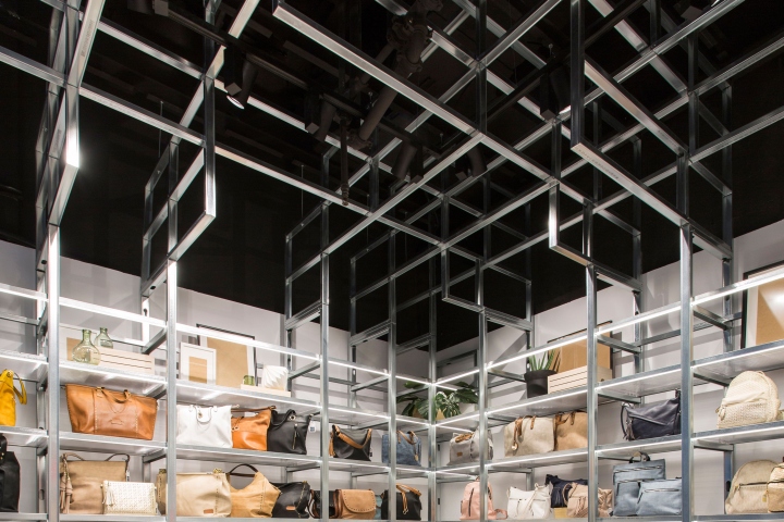
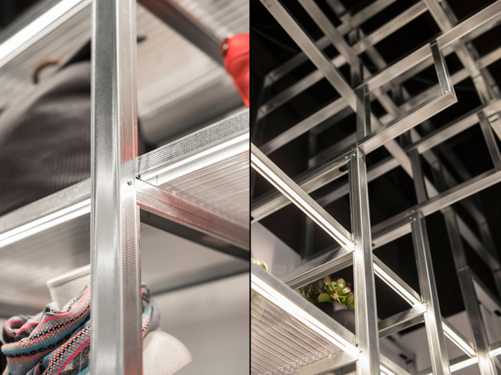
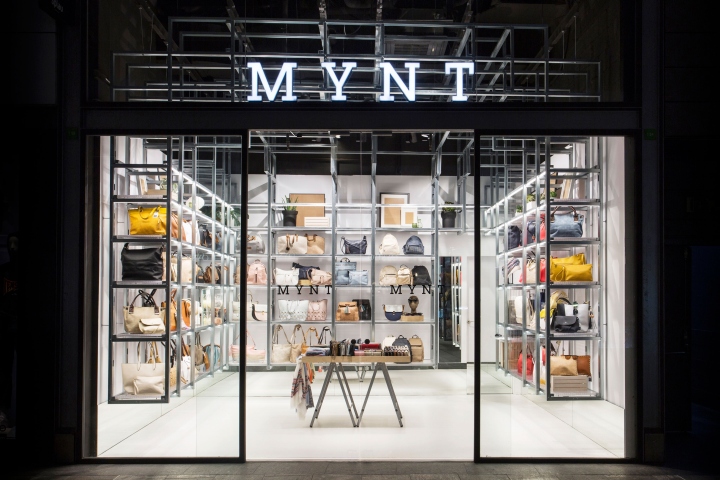
To reach this goal, DearDesign has designed a very bright and open store, with a structure that, despite its rigid and orthogonal look, solves flexibly of the product display. The design of the store is based on a three-dimensional grid inspired by the Fibonacci sequence, which creates a variable rhythm in a permeable volume, ordering the space by generating niches to exhibit the product along its perimeter.
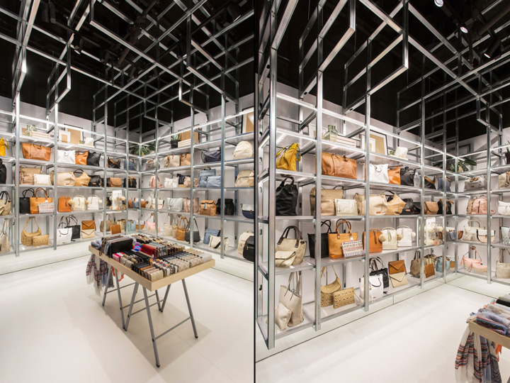
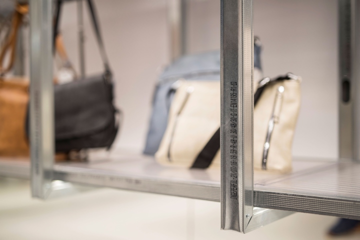
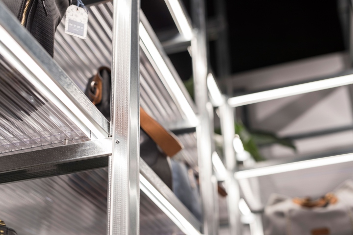
The structure is entirely solved by the use of a single element, which is chosen for its constructive possibilities, as well as for its lightness and affordable cost. Bare plasterboard structure profiles are used for a new purpose. By being fitted, folded and screwed together, they work as studs, shelf supports and slots for recessed lighting. Linear light acts as a compositional element that emphasizes the rhythm of the grid and also highlights the steel structure.
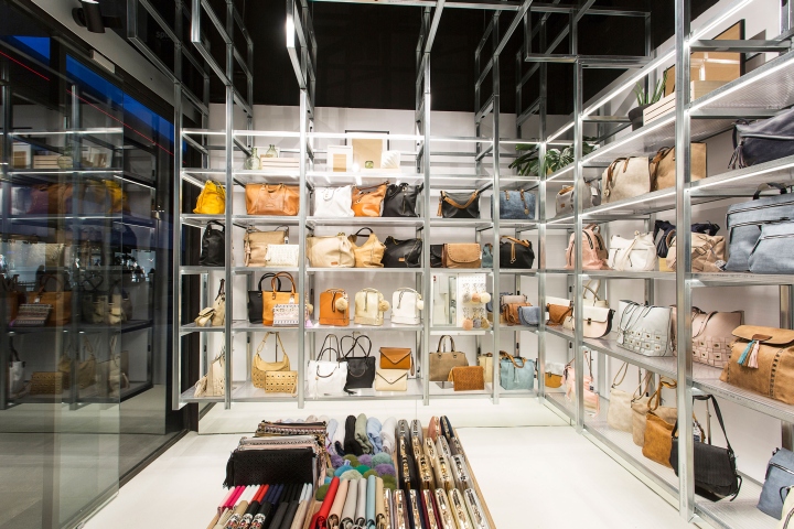
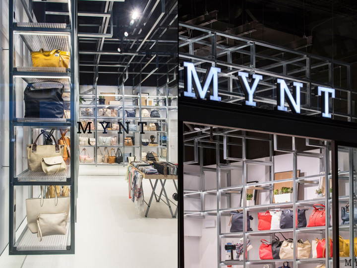
In order to provide the space with visual lightness and amplitude, the entire perimeter grid of the store is suspended. A mirror in the lower perimeter stripe emphasizes this effect, reflecting the continuous pavement and causes the store to run beyond its limits. The cellular polycarbonate acts as an ideal complement to form the shelves. These give lightness to the space and allow the light to pass through so that the product is well lit.
The cash register is integrated in the same structure, becoming part of the grid. The central island of the premises, generated by a birch tray resting on a construction trestel, aims to provide the store circulation on its perimeter and at the same time solves the display of smaller accessories in an informal and welcoming way.
The store itself works as a showcase window and acts as a lure for the visitor. The double height façade allows the visualization of the structure that once inside wraps the visitor. To strengthen the grid and achieve a bigger contrast, the ceiling was painted in black so that the galvanized steel structure is emphasized. In contrast, the lower area was painted in white so that the product gains relevance.
Design: DearDesign
Creative director: Ignasi Llauradó
Collaborators: Juan Verdeguer, Anna Garreta, Adriana Camps.
Photography: Xavi Torrent


Add to collection