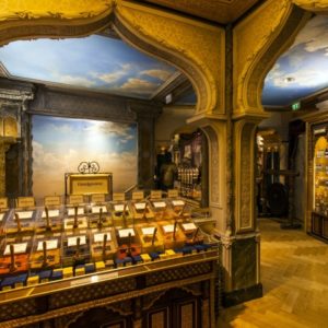

Askona store by Weavers, Moscow / Krasnodar – Russia
posted by retail design blog on 2017-07-26
Luga
Add to collection
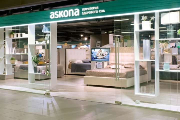

Askona is one of the biggest vertically integrated retailer in Russia, specialising in production of goods for healthy sleep such as mattresses and bedroom furniture. The transformation of Askona store concept and rebranding project tasks have been assigned to Weavers Brand Consultancy. The new strategy of Askona retail network development means the shift from the mono-product shop of mattresses to the integrated “sleep” solutions retail concept that would include beds, sofas, upholstered furniture and interior design products for bedroom, different accessories and gadgets for sleep, textiles and so on.
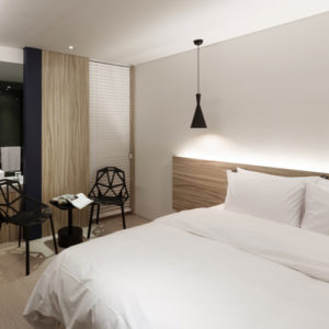
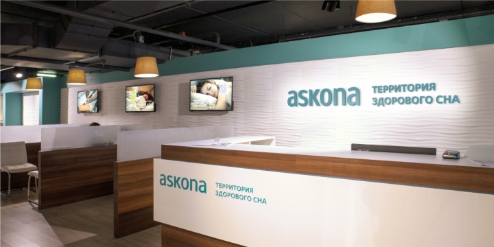
Askona store space has been increased from 150-200 sq.m up to 700-1000 sq.m. The new business model has resulted in the creation of a new stores format – “supermarket for sleeping”. It appears in a new name – “Askona territory of healthy sleep”. The coordinated retail concept of the new store format became the basis for the development of the renewed visual identity of Askona brand and for the new retail space design. The store consists of two main spaces: an interiors exposition area and a functional “sleeping space”.
The idea is following the new business concept and proposes to customer to pass through the interior area, to get inspired by new ideas for a bedroom and then to enter the mattresses model choosing area. Such a customer journey increases an impulse purchases and gives an opportunity to spark clients’ interest in integrated solutions for healthy sleep. The previous identity of Askona was based on the bright medicine-style turquoise color, which has become softer and “interior-look-like” for the new concept.

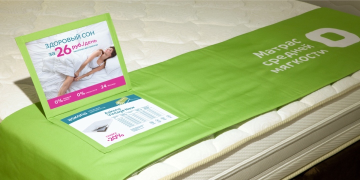
The important visual part of the new brand identity is the unique graphic illustrations communicating the bedroom comfort and friendly character of the brand. The key ideas for the retail space design were “comfort”, “fashion”, “easy and friendly”. The selection of decoration materials, illumination. architectural and visual accents, style-forming graphics and using of wording on the walls – all these elements communicate the new brand values.

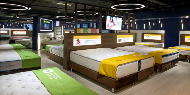
The solutions for “sleeping space” where the customer chooses the mattress are light twilight, rhythmically arranged vertical lamps on the walls in combination with accented illumination for mattresses. All these elements create a thematic atmosphere for mattress testing and shopping. The pictogram system together with the colour coding simplify navigation by softness range of the mattresses. The “creativity zone” has all you may need for the choice of various materials for furniture.

The modern and convenient service and cash zones visually emphasise the brand’s high standards. The retail space also includes a zone for kids where young customers may play, draw and watch cartoons. The result of the project was highly evaluated by the jury members of the XIV All-Russian professional award for shopping centres RCSC Awards-2017 and was nominated as “Rebranding of the Year”.
Design and photography: Weavers


Add to collection