
One of the most surprising things about travelling to Japan is discovering how diverse its culture is.
There’s no shortage of the calligraphy-and-tatami-mat minimalism celebrated to the point of cliché in Australia’s sushi restaurants, but walking the streets of Tokyo or Osaka, you’re just as likely to end up snacking on tempura-battered fish or charcoal-grilled chicken skewers in a grungy hole-in-the-wall off a busy side street.
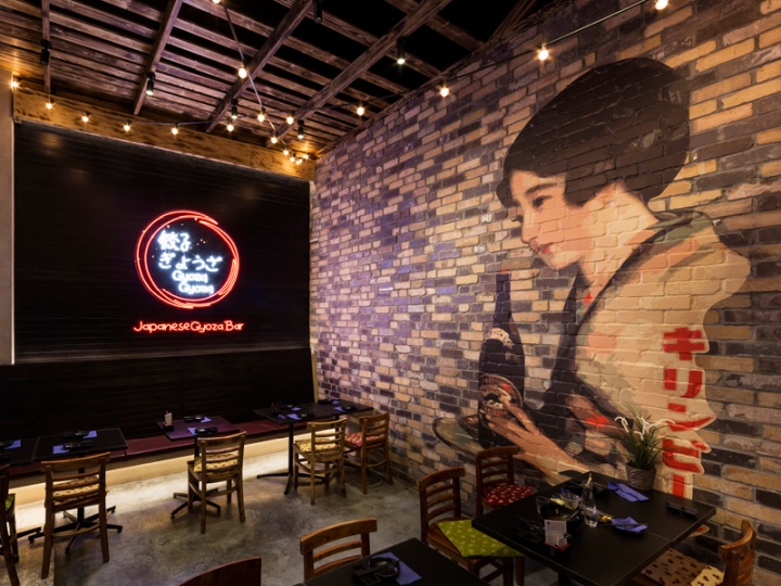
These dining experiences are fast, tasty and exciting, so it’s no wonder that Melbourne retail designers Studio Ginger used them as a reference point for their new fit-out for Japanese izakaya-style eatery Gyoza Gyoza.
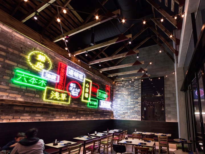
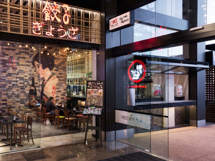
The restaurant sits on the outer edge of Westfield Doncaster, where it can’t rely so heavily on shopping-centre foot traffic, so Studio Ginger’s challenge was to make it an enticing destination that would draw patrons from within the centre as well as the surrounding area.
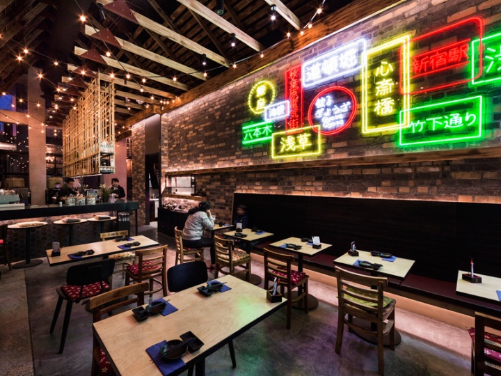
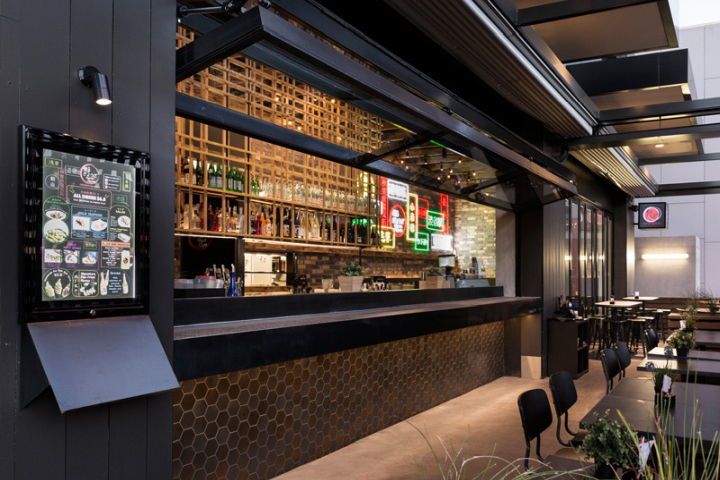
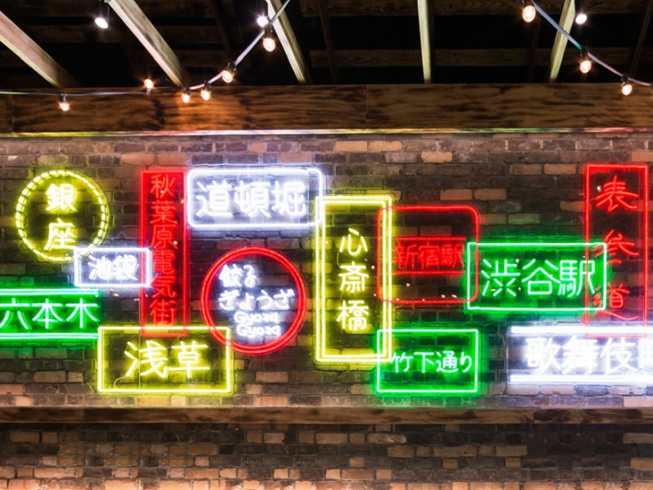
A wall of neon signs inside the main dining space glows through the windows and out into the carpark, doing some of the work to attract passers-by, but as Studio Ginger Design Principal Luke Cannon says, “the real strategy here is to provide a unique experience that creates intrigue and allows local customers to see Japanese cuisine from an unfamiliar perspective.”
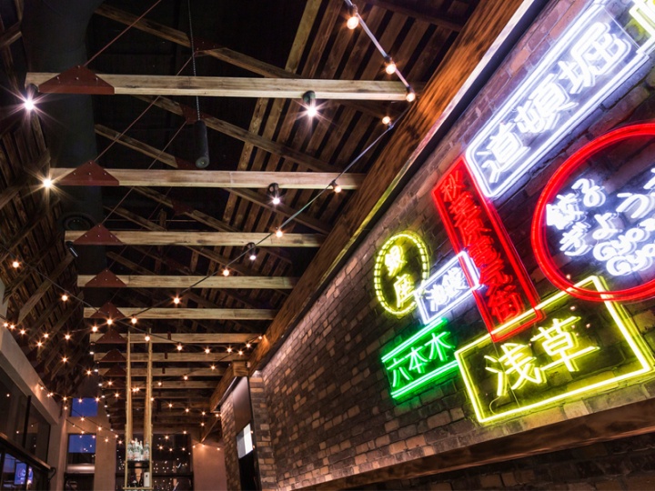
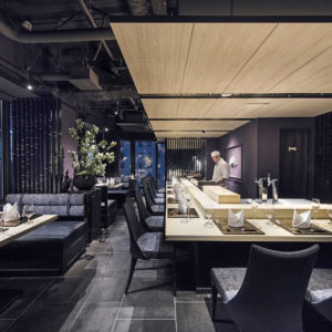
The fit-out Studio Ginger has delivered is dark, moody and textured, with a materials palette characterised by motley-brown raw brick, wall tiles that look more “salvaged” than “showroom”, and a bar-top fabricated from oxidised copper.
The colour palette of blacks and browns resonates with the prevailing trend towards darker interior treatments in food courts and malls, but this project goes deeper than that.
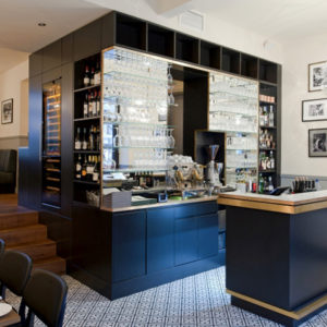
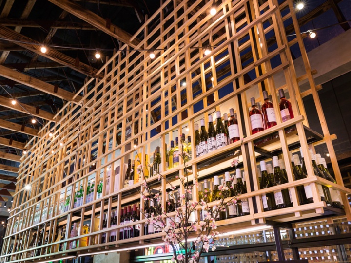
Architectural elements, such as exposed charred-timber beams in the ceiling and an intricate timber bottle-storage structure over the bar, make it clear that this is no simple retail volume dressed up with finishes and coatings; as a result, the sense of place here is strong, the feeling authentic.
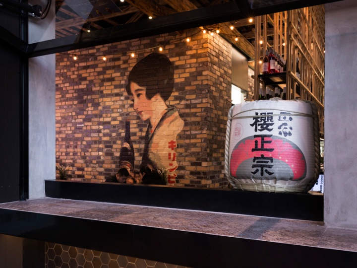
On one wall, there’s a paste-up graphic of a Japanese lady holding a bottle. It looks great, but it’s also emblematic of the way that the design of Gyoza Gyoza links Japanese street food culture and Melbourne’s own much-loved laneway culture.
And this, in turn, is central to the success of the fit-out. Studio Ginger has created a dining environment that’s at once exotic and familiar, exciting and comfortable. Precisely the combination of feelings that will make customers want to return, again and again.
Design: Studio Ginger
Photography: Lynton Crabb


Add to collection
