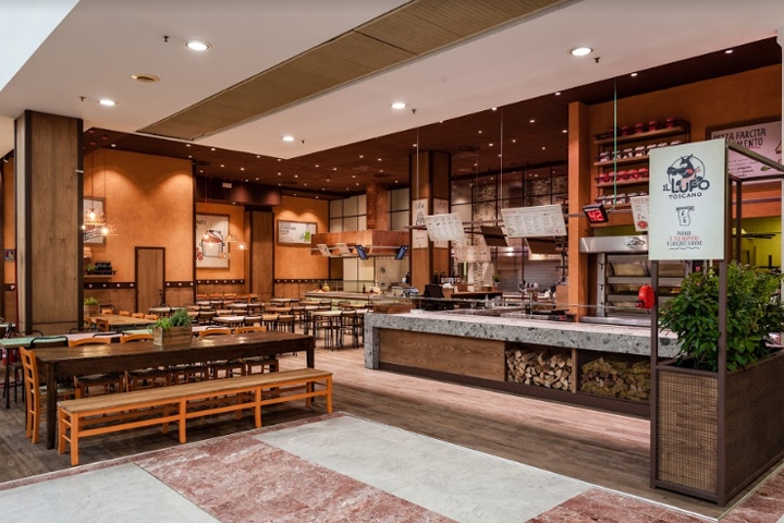

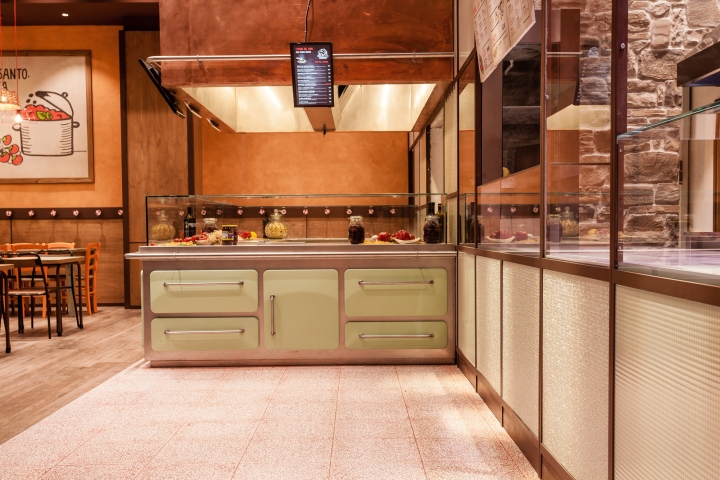
Materials from tradition, a simple design with a domestic flair, a renovated brand design characterize the new concept for Il Lupo Toscano, a classic benchmark for Tuscan home-cooked food offered in a fast-casual context. The main challenge has been to reinterpret an already winning layout. Area-17 faced it maintaining the warm and welcoming atmosphere that had always been typical of the brand’s venues and yet providing a greatly superior functionality and usability.
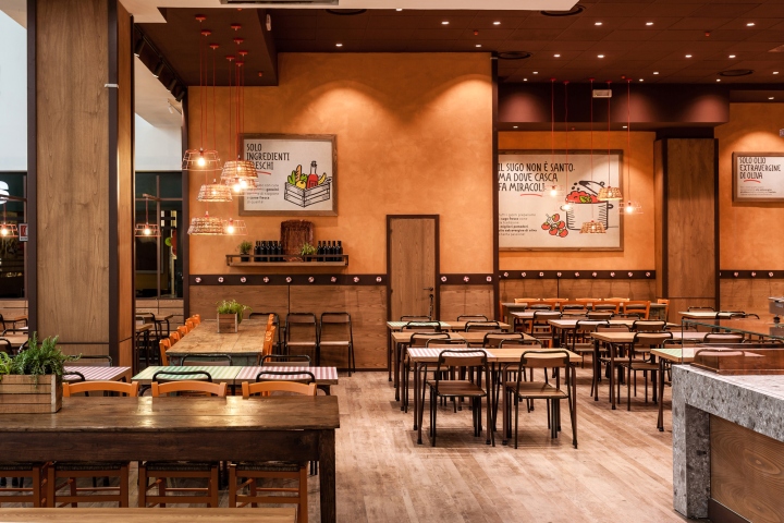
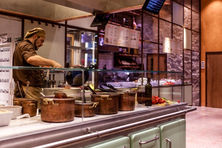
Interiors are a modern take on a traditional environment of Tuscan countryside: the farmyard. There is the big fireplace, wooden benches to sit on, the pantry on one side, and, far in the back, the house with the kitchen. The stylistic metaphor strictly guided a substantial spatial reorganization, especially as concern workstations. The fireplace/pizzeria has a prominent position onto the commercial gallery, as it operates all day long. At the opposite corner, the kitchen island for the cooked-to-order first courses expands into the dining area becoming a live show cooking.
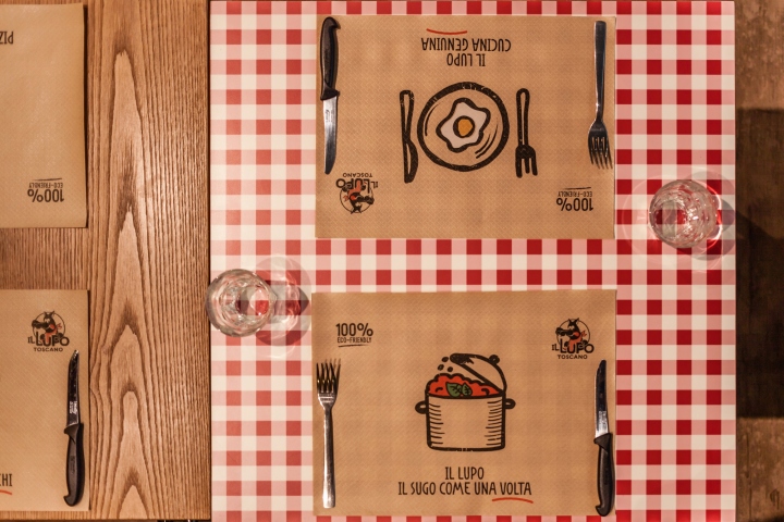
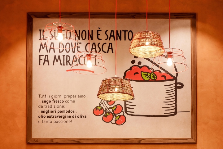
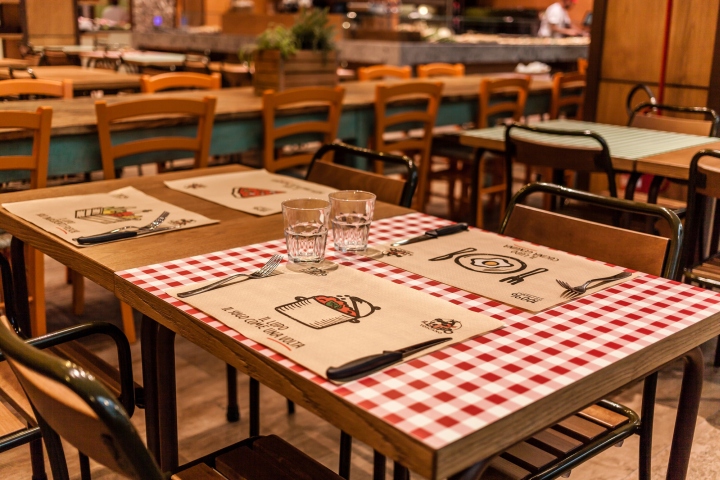
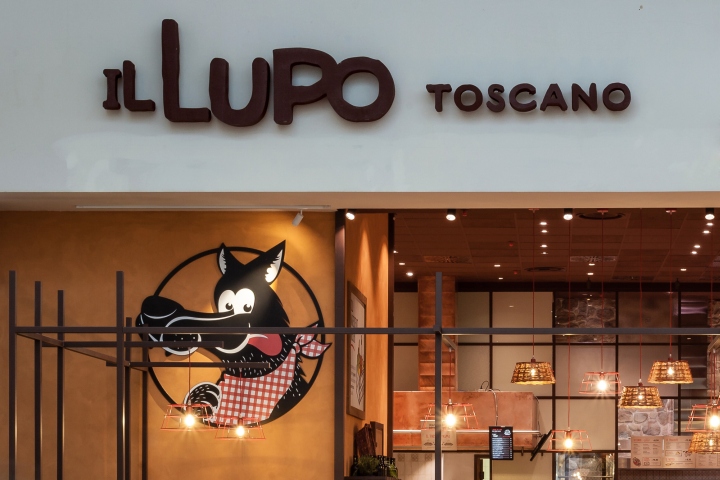
Food high quality and freshness are the focus of the new brand image too. Traditional Tuscan proverbs related to food and conviviality become an excuse to talk about Lupo Toscano’s core values and how they cook at the restaurant. The rebranding interested several aspects, from environmental graphic to menus, form placemats to employee uniforms. Humble materials, basic furnishing, and playful details round out the environment keeping its pop spirit without gourmet snobbery.
Design: Area-17 Architecture & Interiors
Photography: Maurizio Picci


Add to collection

