

St. Emiliano – Honey And Herbs packaging by noon branding+design
posted by retail design blog on 2017-10-12
Add to collection
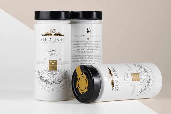

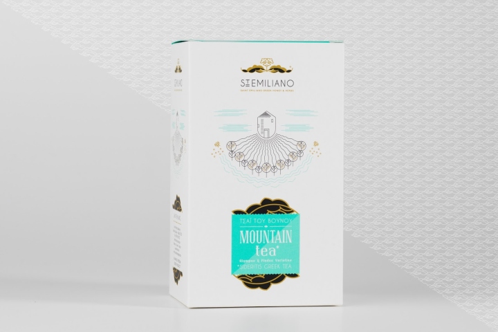
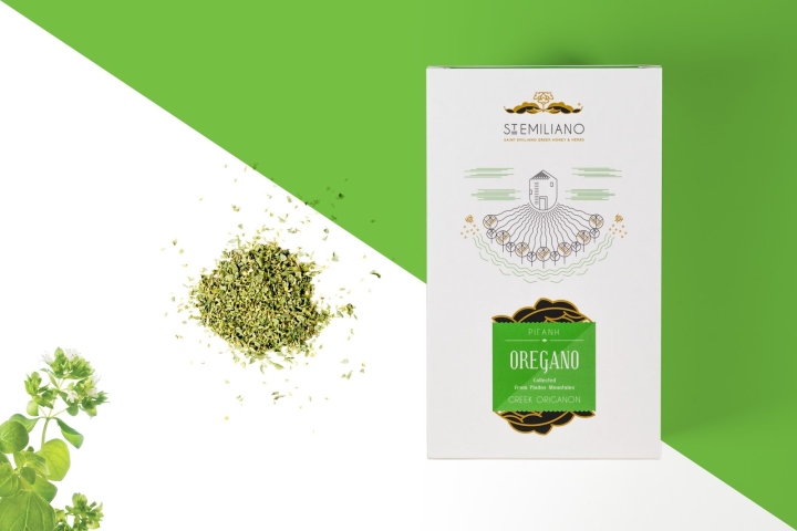
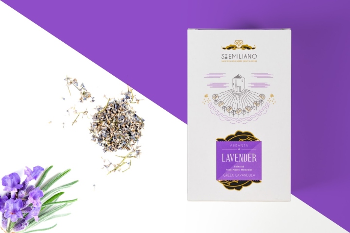
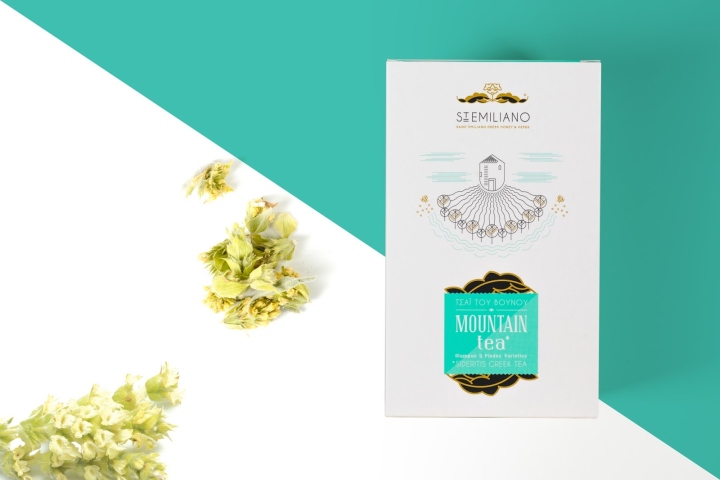
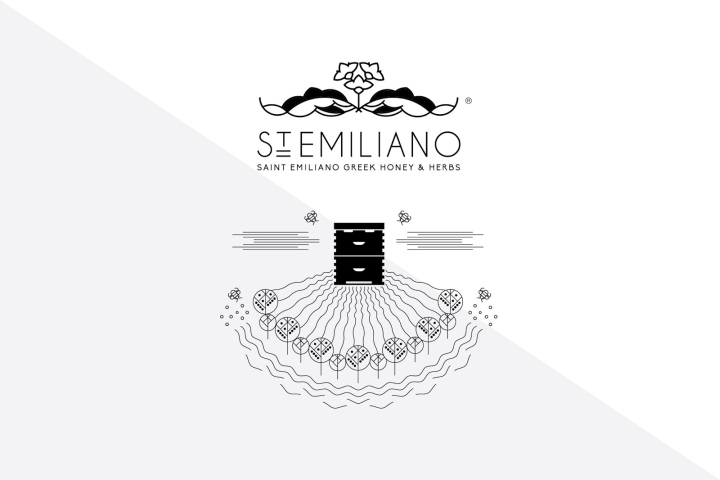
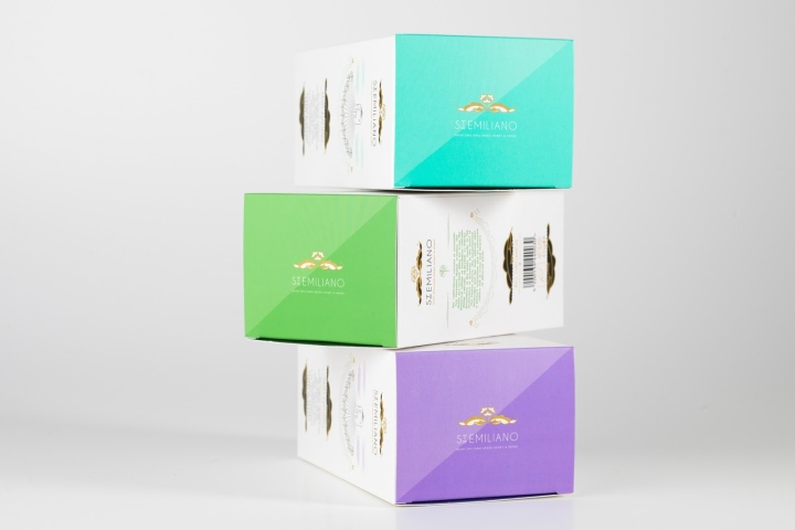
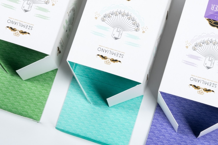
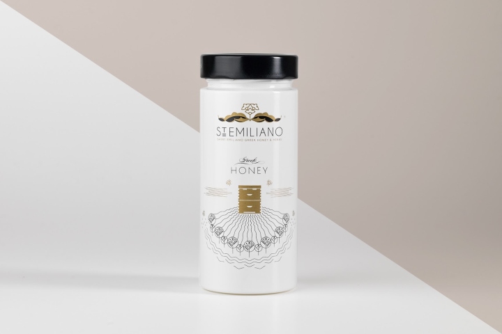
The main inspiration of the St. Emiliano packaging was the natural setting of the small village of Emilianos. There, the producer created an apiculture park and expanded the small family vineyard and planted aromatic herbs with organic certification.
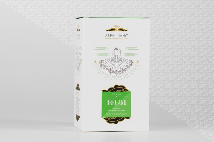
Illustrated on the white surface of the packaging are the main elements of the village; the characteristic hill with planted rows of trees, water of the river and the lake, and a house of bees, who pollinate the plants and collect honey.
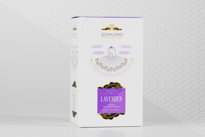
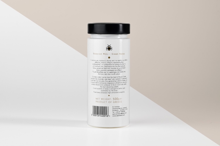
A minimal colour palette is used to complete the visual identity, with the combination of black, gold and a specific colour for each product that matches its content. This visual clarity and poetic narrative of the illustration intents to communicate the organic properties of the St. Emiliano honey and herbs.
Design: noon branding+design
http://www.packagingoftheworld.com/2017/10/st-emiliano-honey-and-herbs.html


Add to collection