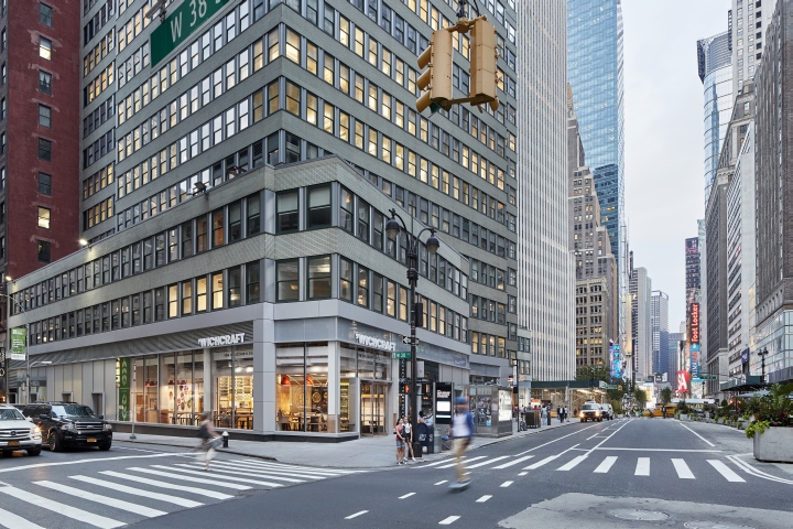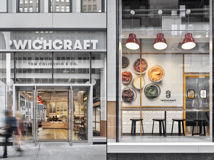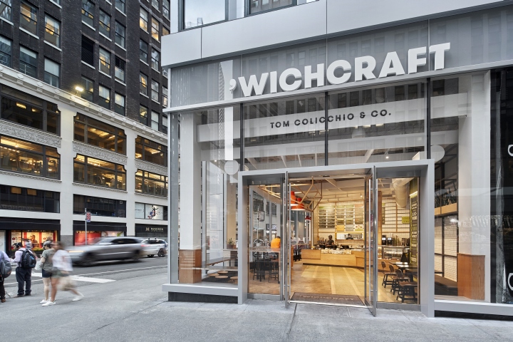

In the summer of 2016, following a year-long collaborative design process with ’wichcraft founders Tom Colicchio and Sisha Ortuzar, the first new ’wichcraft location opened in the Tribeca neighborhood of New York City. Concepted and designed by Mapos, it served as the prototype for several more locations in New York City and beyond. Shortly after the Tribeca Opening, ’wichcraft asked Mapos to apply their new concept to a flagship location in New York’s historic Garment District on 38th Street and Broadway. The second location was almost the exact size as the first, and also on a busy corner, though ’wichcraft would be expecting considerable more traffic in this midtown location.

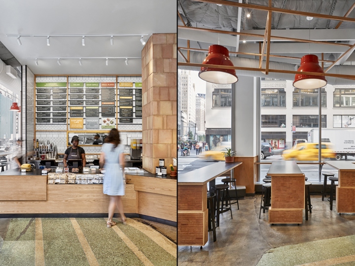
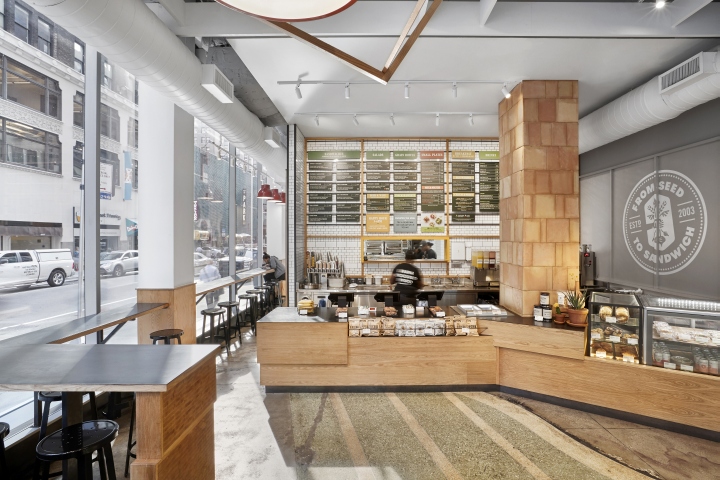
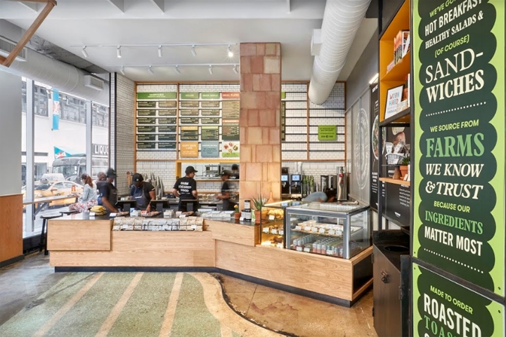
The goal would be to employ the same successful design and brand experience as before and include more seating and open space for the larger crowds. The Mapos-designed ’wichcraft opened in the base of an iconic midtown tower in June 2017. As before, the space revolves around an easy to navigate layout with the sales counter at the back of the dining room with the menu board overhead. The center of the dining room was left open to accommodate the higher volume traffic, increasing visibility of the menu board to ensure its visibility and allowing new entrants to quickly grasp the fast-casual format and the food and beverage offering.

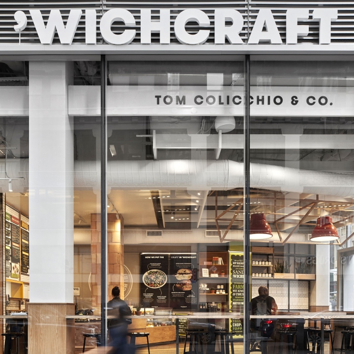
To enhance legibility, we also set the menu against white ceramic and oak; the board’s tiled signage can be reconfigured quickly to reflect seasonal items.Standing within the sales counter is a large base-building structural column. Mapos wrapped this column in terra cotta tiles and branded graphics turning what may have been an impediment into a centralized brand design object. Immediately to the right of the central open space sits the modular Market Wall which places branded merchandise and graphics at the most prominent wall, and easily seen through the storefront from the sidewalk.

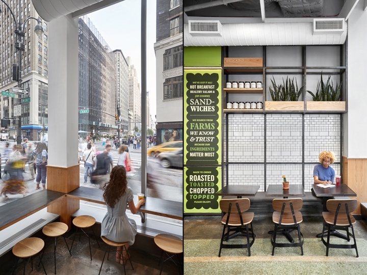
Cookbooks, packaged goods, and other branded merchandise add to the food offering and sit adjacent to the ordering queue for impulse buys. Integrated at the base of the Market Wall is a banquette and 2-tops for a comfortable seating option.To the left of the central open space are a series of counters in the storefront windows for individual diners. Extending out from the storefront counters are three large bar-height tables with seating on both sides for informal communal dining. The combination of seating places most of the dining area against the windows with access to views and natural light and maximizes seat counts.

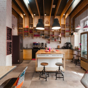
Hanging overhead is the Mapos designed barn-frame central lighting pendant. Given the diverse conditions of ’wichcraft’s existing locations, we built on the learnings from the first location and completed the second restaurant with an eye to how that concept could adapt to a variety of spaces. Materiality is one effective means of achieving consistency: ceramic and terracotta tiles recall bread ovens, and the irregularly stacked oak forms of the counter and dais pedestal suggest produce crates; natural steel melds natural elements to integral refrigeration units, POS touch pads, and beverage taps; planters remind guests of natural ingredients’ seasonality.

Key brand colors were added as highlights, and ceramic pendant lights round out the palette.Our approach to the ’wichcraft design continues to support rollout. The key branded elements – sales counter and menu board, terra cotta column, Market Wall, and barn frame ceiling pendant – proved to be flexible and modular from first location to second. As Mapos starts to design ’wichcraft’s third location, the system and design strategy from the concept promises to reshape fast-casual spaces for the industry.
Design: Mapos
Photography: Garrett Rowland
