

Add to collection
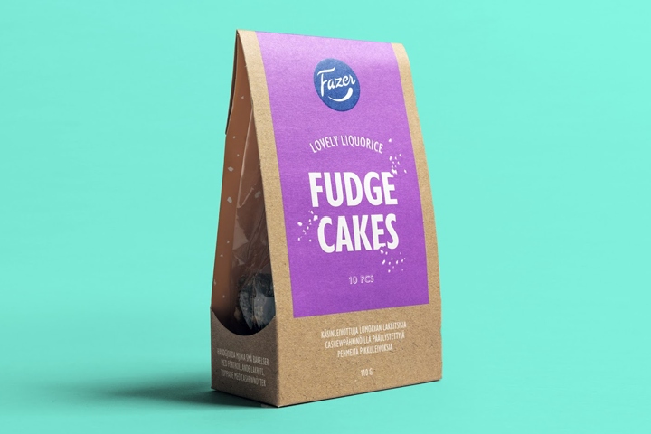

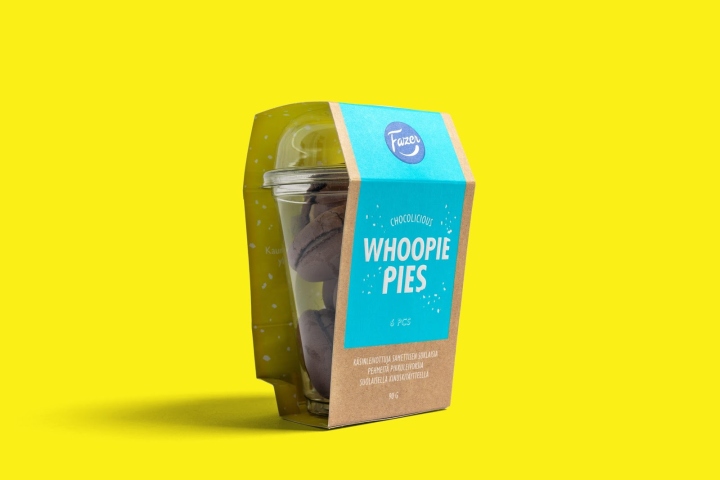
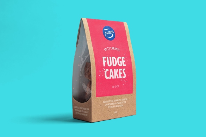
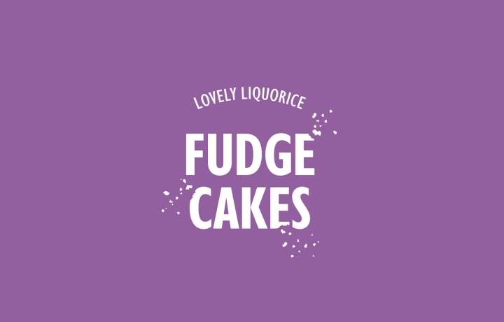
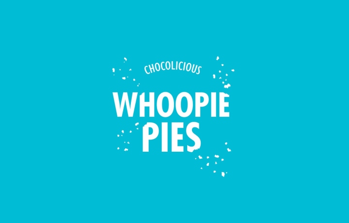
Fazer is a Finnish icon with dozens of products that are household favourites in Finland. Kuudes was given the task to design an appealing look for their new product line, hand-made premium treats. The idea in the communication is “less but more”: how such tiny treats can produce big, intensive flavours?

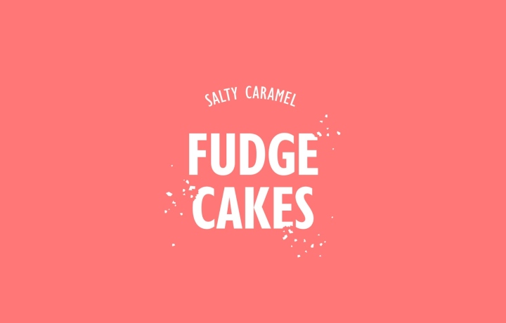
The first thing you see is an eye-catching, vibrant colour on an earthy cardboard material. Just like in the treats, there’s a sweet surprise: you find another cheery colour on the flip side of the cardboard shell. The crumbs chipping off the typography give a playful touch to the design together with the slightly witty copywriting. The result is a simple but tempting and fun design that’s definitely “less, but more”.
Design: Kuudes Helsinki

http://www.packagingoftheworld.com/2017/10/fazer-premium-treats.html


Add to collection