
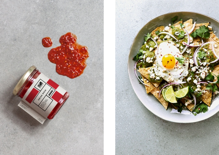
Chill Kills is a restaurant and take away based in Mexico City. It sells only one dish: The very traditional and delicious Chilaquiles. It is one of the most basic and simple dishes, but loved by every Mexican. This restaurant dedicates its whole menu to them and offers a lot of varieties, using the best ingredients and turning this rather basic and usually unspectacular looking dish into an unexpected high class lunch option in one of the most important business areas of this city.
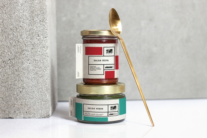
The logo imitates this concept by using the image of the Mexican Xoloitzcuintli dog, a traditional pet that was already domesticated by the indigenous people of this country many hundred years ago, and giving it a very abstract and geometrical shape. The simplicity gives the logo an elegant and at the same time typically Mexican appearance.

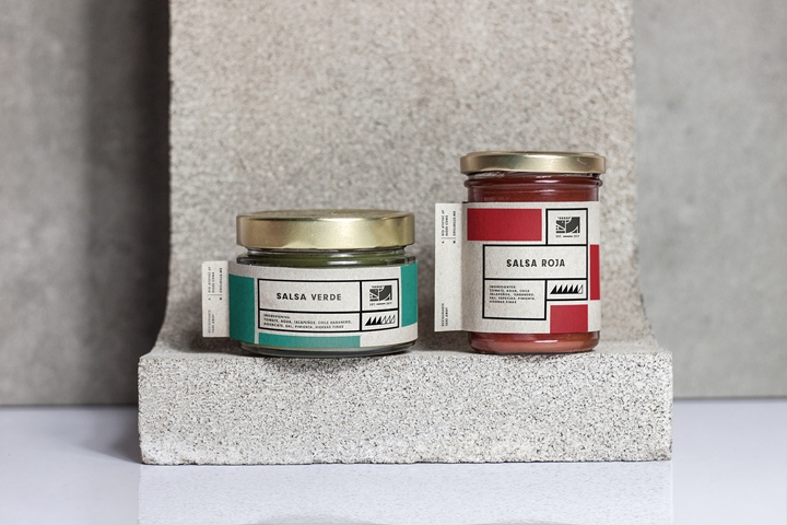
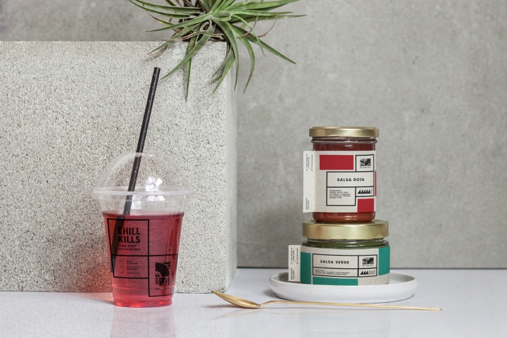
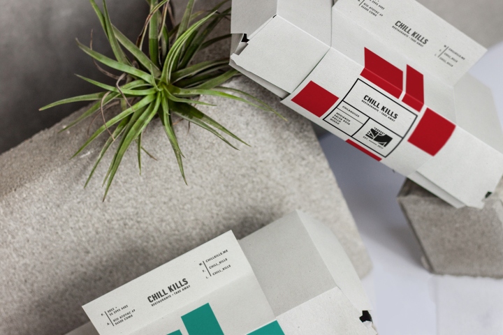
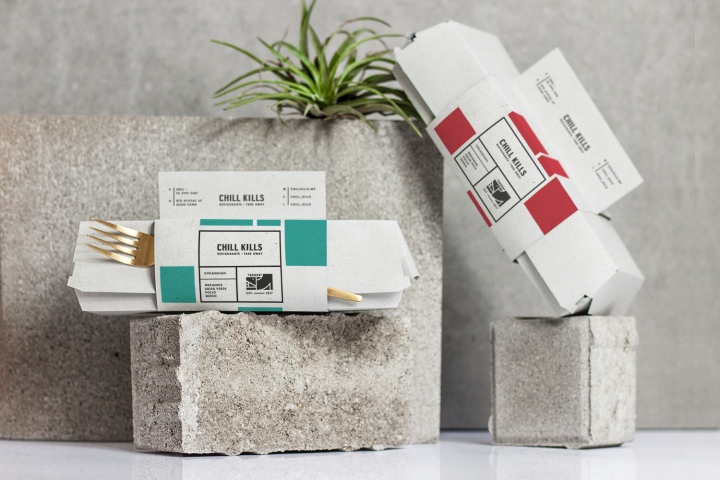
The colors of the brand are inspired by the colors of the dish: Gold for the tortilla chips and red and green for the two options of salsa it comes with. The design communicates the simplicity and elegance of the brand by still maintaining the rustic character of Mexican street food.
Design: Alessia Sistori




http://www.packagingoftheworld.com/2017/11/chillkills.html


Add to collection


