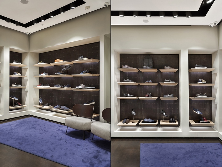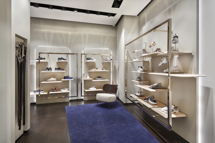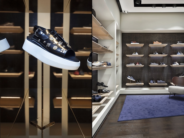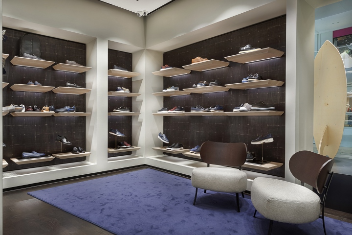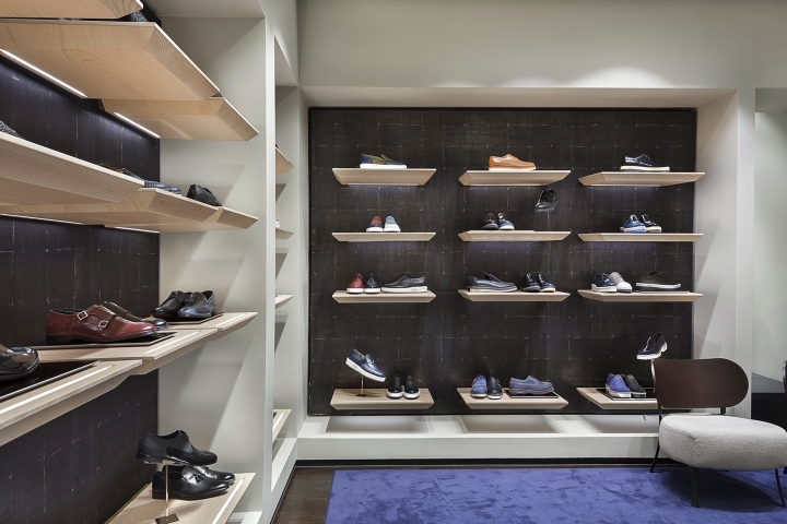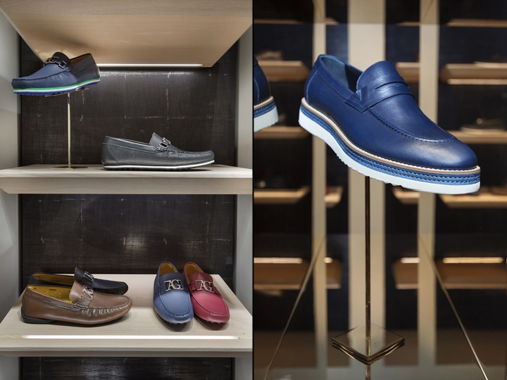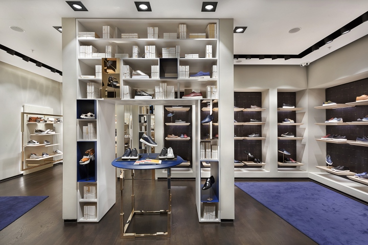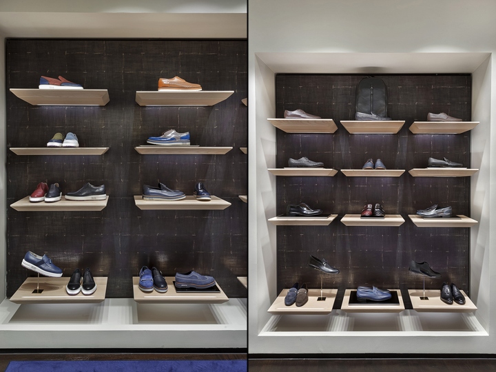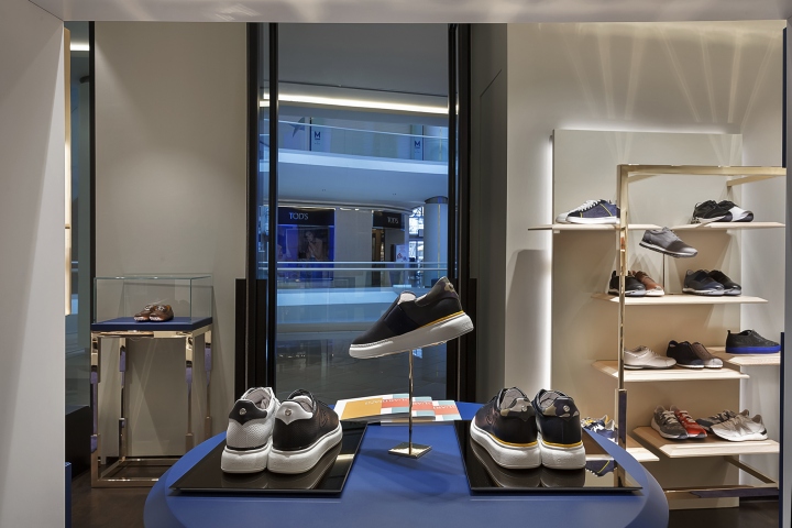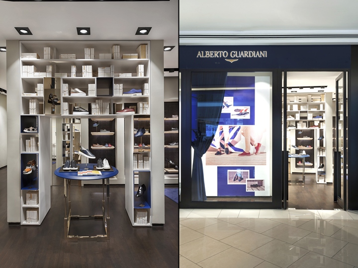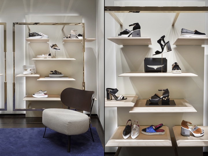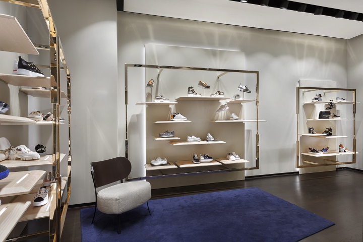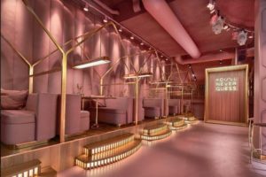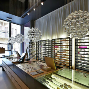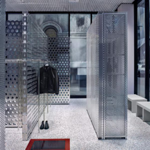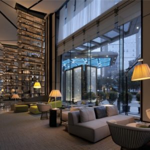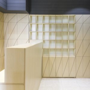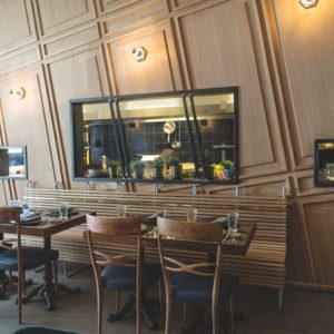
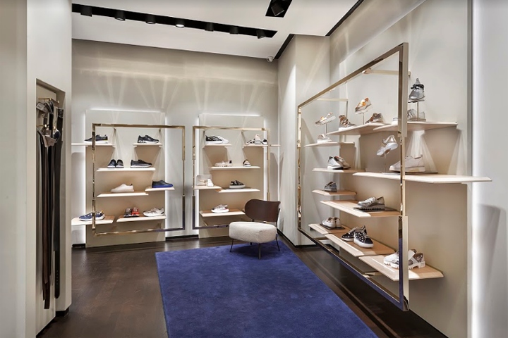

Effectively they create a perfect dichotomy. Starting precisely from this reflection, we have identified as the topic of the new concept the “BINOMIAL – DICHOTOMY”. This dichotomy is the base of the choice made in the project and it has generated his guide lines. The union of binary elements appear even in the store layout, characterized by a continuous comparison between different elements that joined, creates assonances: shelves and frame, niche and plane, bookcase and boxes.

These elements determinates also a binomial on a functional level: inside the store there are two selling area apparently different (niches | shelves) but designed as a unique part, becoming complementary. The same binomial is applied to the visual level: materials follow the same rule: gold and black, wood and steel and leather and wood. The matching between them, create an elegant perfume but cosy, with the feeling and perception of being in a space that reveal and call to mind an house, a living room.”

Demarcating the brand peculiarity, the feeling inside the new Guardiani’s store will be the feeling of being inside an elegant and cosy space that underline various aspect, apparently opposite, DICHOTOMIC: elegant BUT casual, relaxed BUT glamour, modern BUT traditional, artisanal BUT experimental, functional BUT luxury, dynamic BUT trendy.
Design: Giacomo Ortenzi / Ossigeno Architettura
Photography: Alberto Guardiani
