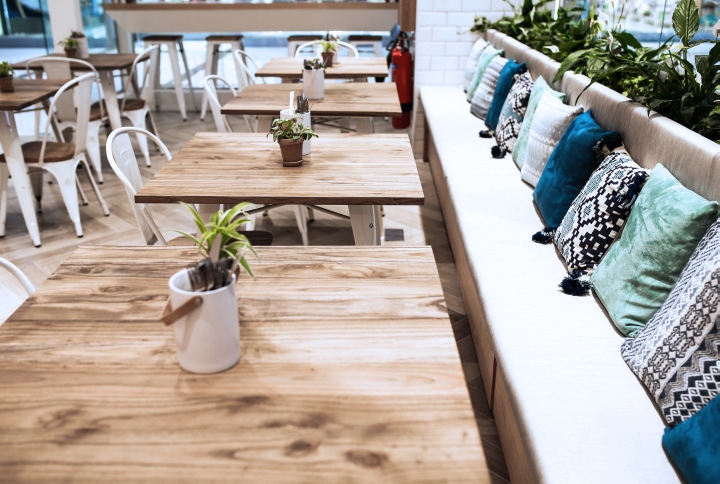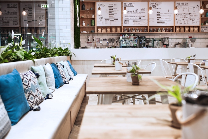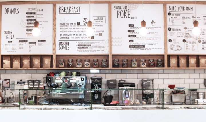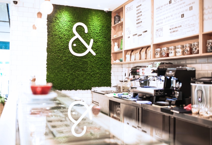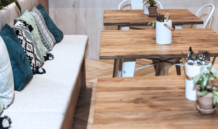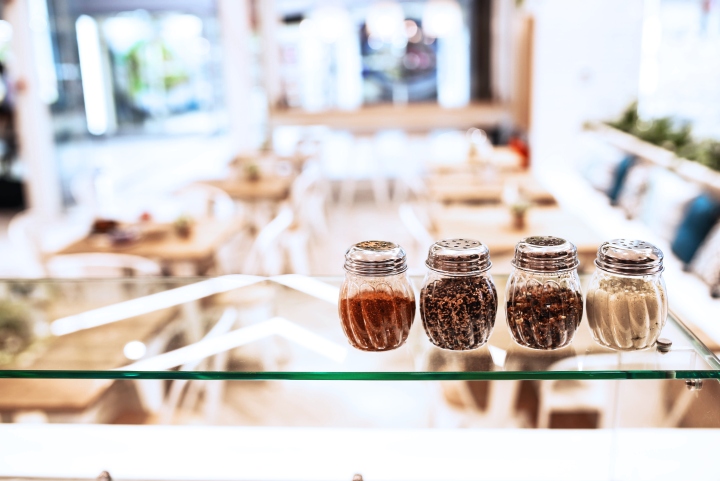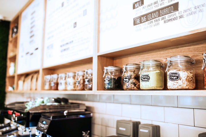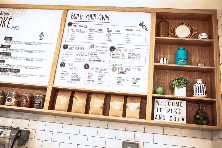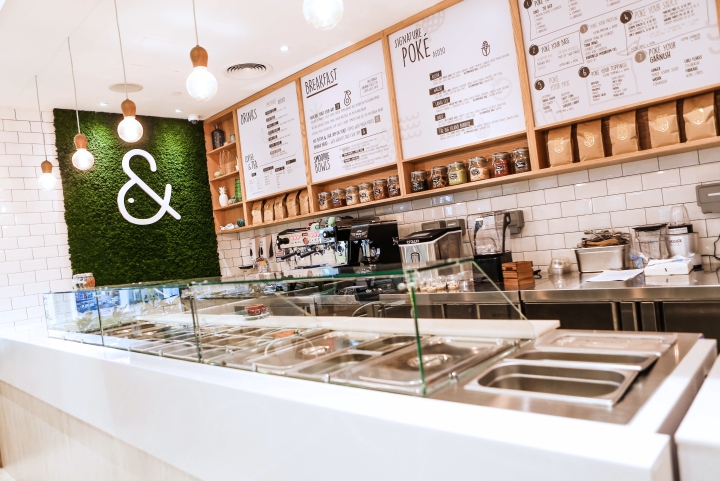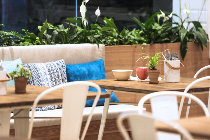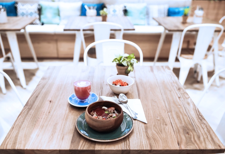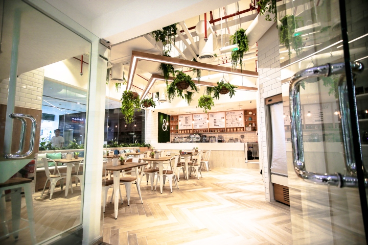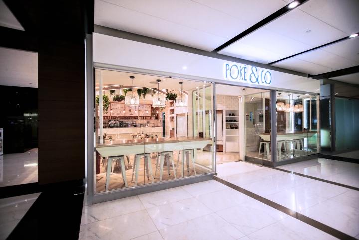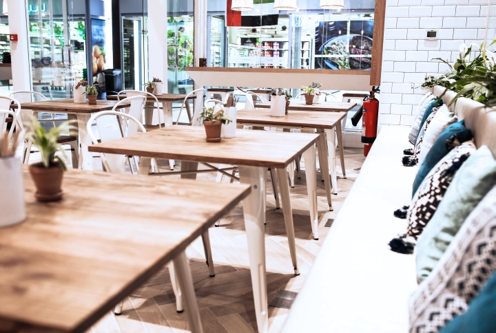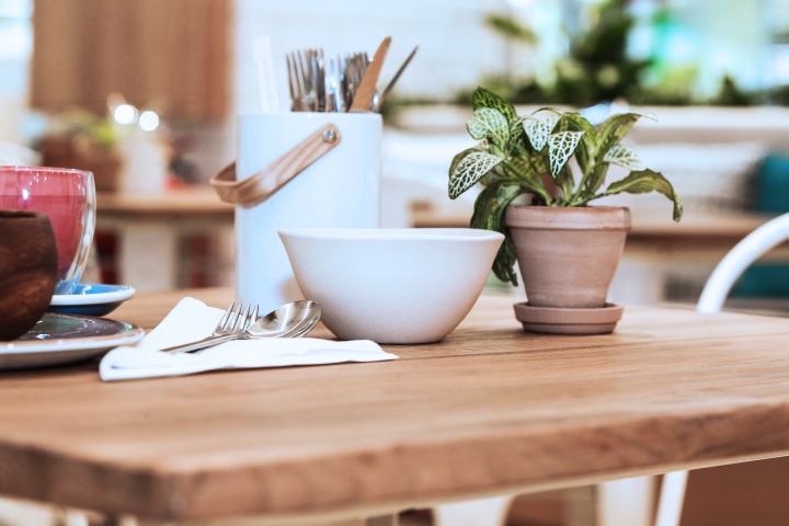
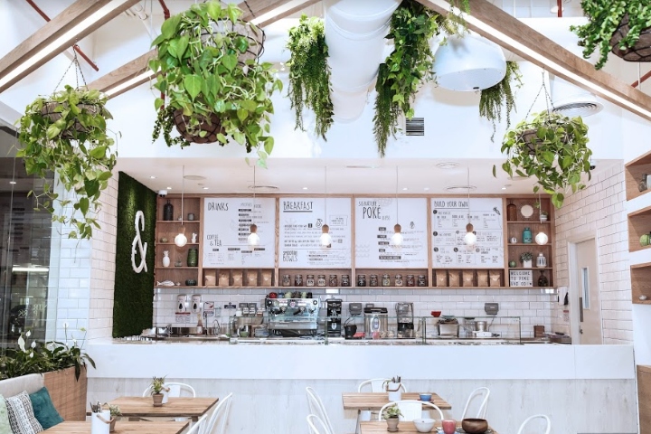

Tasked with the brief of creating an earthy, organic, bright and calming interior with nature at the heart of the design, Studio EM took on this 80 square meter space with the aim of creating an airy, fresh and welcoming design that belies the small space. We kept the palette very neutral with earthy tones coming through the use of greenery, the woods we used and the white tile. Essentially we broke the design down to 3 main components, greenery, timbers and tiles.

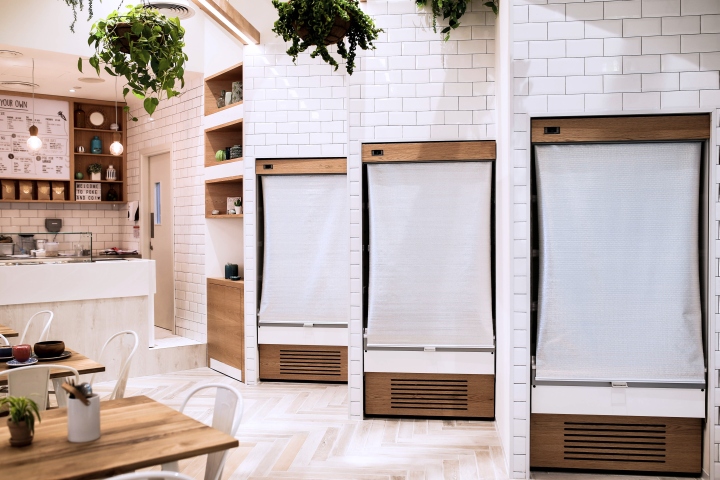
As a “make you own” grab and go concept, a strong emphasis was put on the customer flow as well as the central main counter. To combat the queues and ease customer flow, three grab and go fridges were placed to the right of the entrance. In order to fit seamlessly into the design and allow for the kitchen space to be optimum, these fridge’s we designed to be built into the wall and set at an angle, a design feature as well as a space-planning feature.

The store foot print was quite small and tight, however, we did have a rather high ceiling, with such a high celling in a small space, the proportions were off and we didn’t want to create a drop down gypsum celling or close the ceiling off, this is where we developed the timber ceiling feature, this allowed us to build light strips into it as well as to hang some more greenery and create a really pretty design feature that tied in the rest of the design.

The end product being a beautiful organic and earthy store that really feels and presents as being so much bigger than 80 square meters that it is. The design is quite subtle, allowing the vibrancy to come from the beautiful food that Poke & Co Dubai serves.
Design: Studio EM
Photography: Sarah Sargent
