
Add to collection

Project context
Russian tea market is highly competitive and have been in decay for a couple of years. Companies have to come up with new solutions in order to increase their market share. A tea company with years of experience, wide tea range and strong price positioning have decided to enter a B2C market. Previously the company has worked only in B2B supplies of tea and coffee.
Agency task
The company asked us to develop a new B2C tea brand from scratch – strategy, concept and design system. The brand had to communicate the following attributes: a unique storage technology, wide range, high quality and the attention to the consumer’s need.
Strategy
Our analysts conducted a series of interviews with the company’s top-management, analyzed competition and retail shelf, thus narrowing down potential positioning territories for the new brand. An express consumer research allowed describing a primary target consumer segment based on the emotional motivations behind tea consumption. The research also showed that the tea lovers are keen to share their experience via social media. This learning transcended into a creative brief – we had to come up with a truly unique and emotional package and other media design in order to motivate consumers to share more.

The core brand idea that sums up the brand platform is “Well-flavored tea. Outside and inside.” The tea is produced using classic recipes and advanced European technologies. The package is pleasant to the eye and makes you anticipate a teatime. In other words, it is the tea for those who prefer beautiful lifestyle. Afterwards based on the brand strategy we developed a system of brand’s verbal and visual identification, including packaging and promo materials.
Creative work
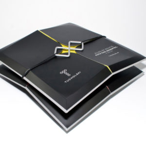
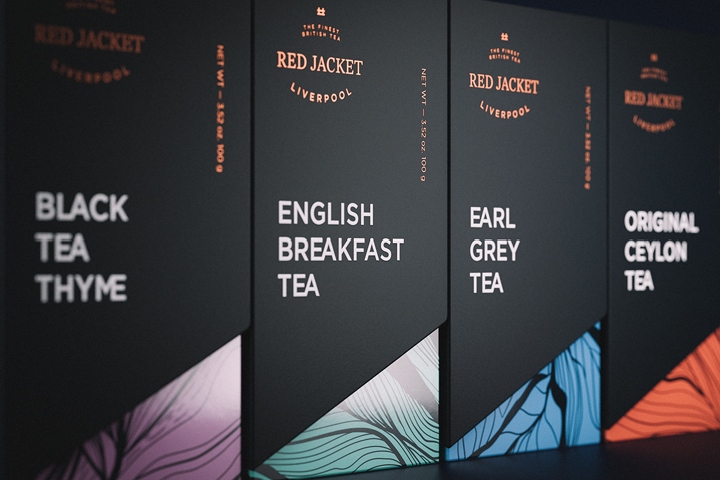
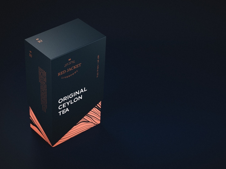
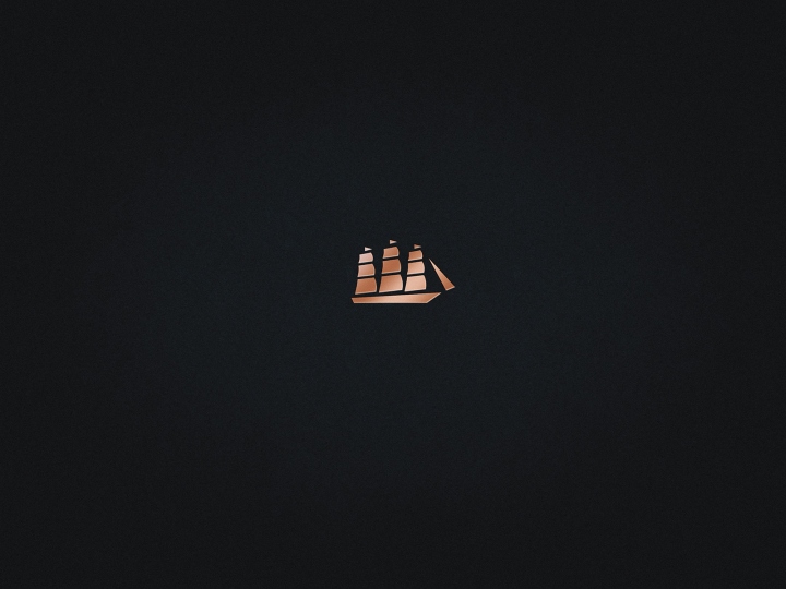
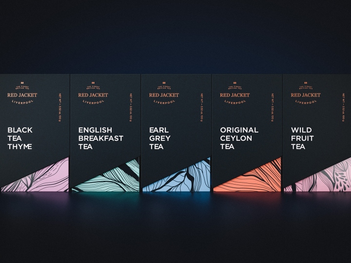
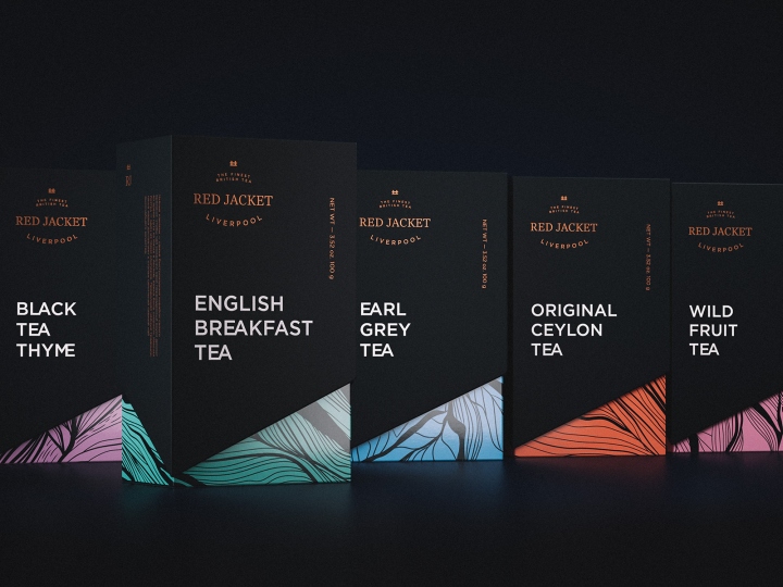
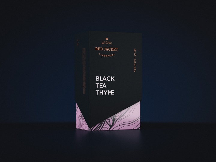
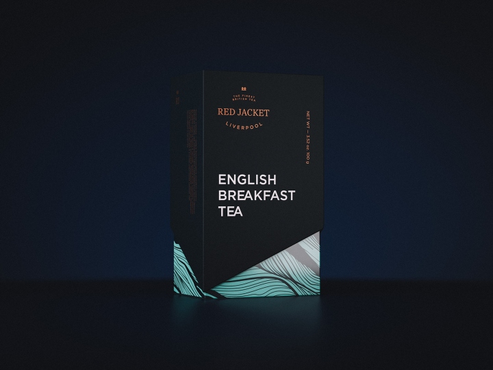
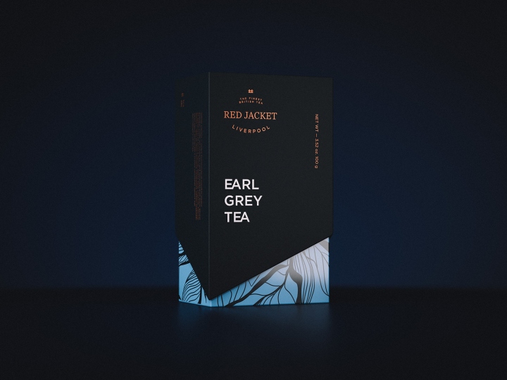
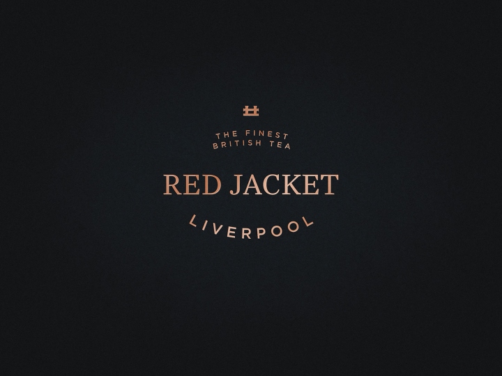
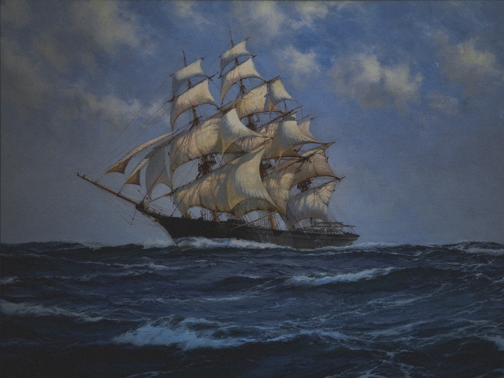
The creative process started with a legend “An ocean of tea pleasure” and a brand name – Red Jacket. It as the name of the fastest clipper of its times, the Champion of the Atlantic, the ship that had always been delivering gold, tea and passengers to a destination on time. Brand’s logo represents how this name could look like on a shipside. Additionally it contains the port of registration and a graphic symbol – stylized image of a berthing bollard.
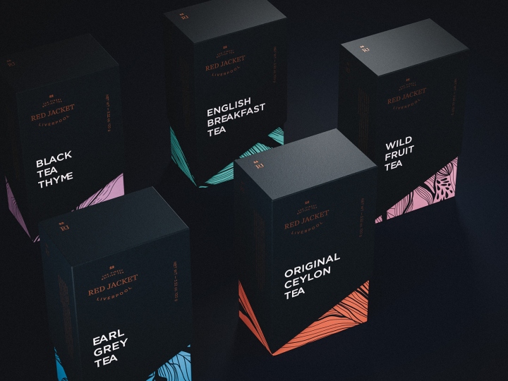
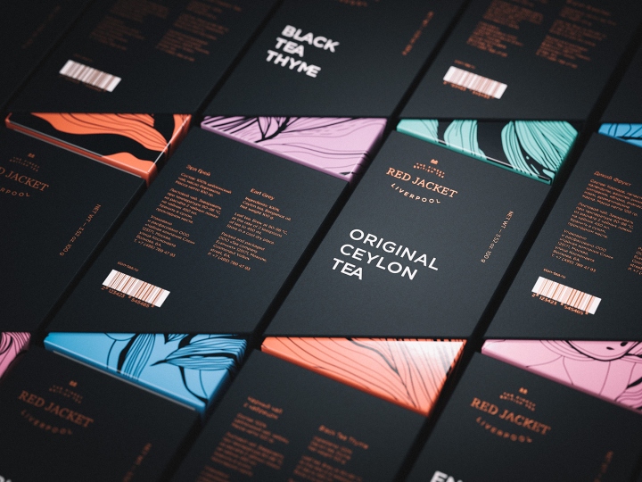
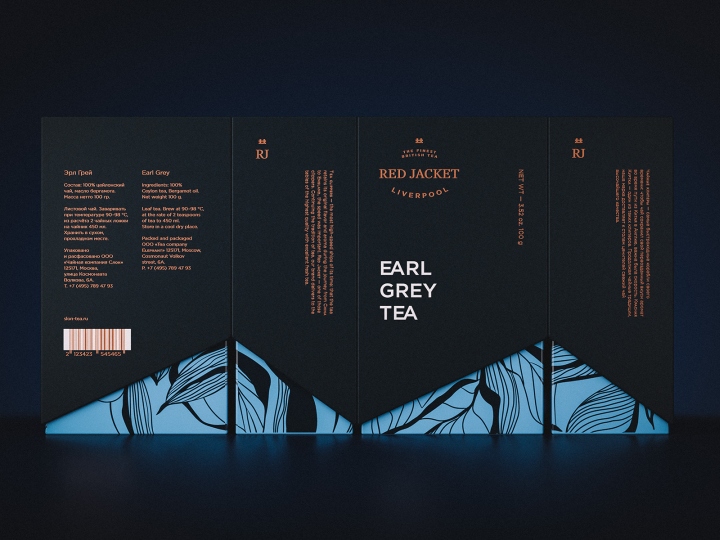
Package design, following the legend, is a hard case that consist of two parts and has a “valuable cargo” in it – on of the tea flavors. Case cover has a ship nose shaped cut-off, while a contrast color is used for the inner part representing a ship hull below the floatation line. Each SKU has its own color and its own hand drawn pattern. The package design and the graphic guidelines reflect the brand character – traditional and monarchic, but at the same time modern and a bit snobbish.
Design: Plenum


http://www.packagingoftheworld.com/2018/01/red-jacket.html


Add to collection