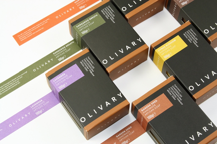

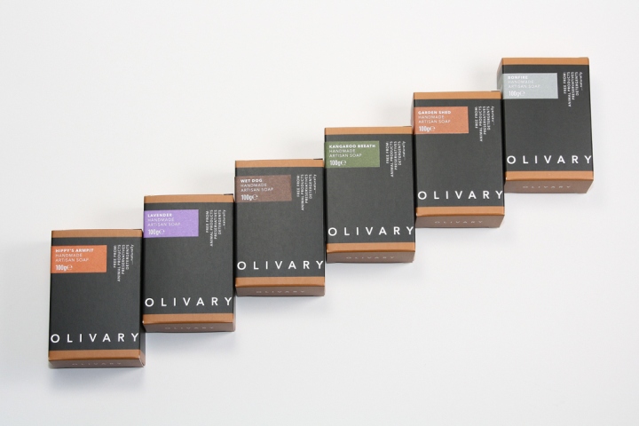
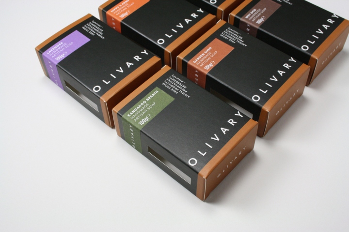
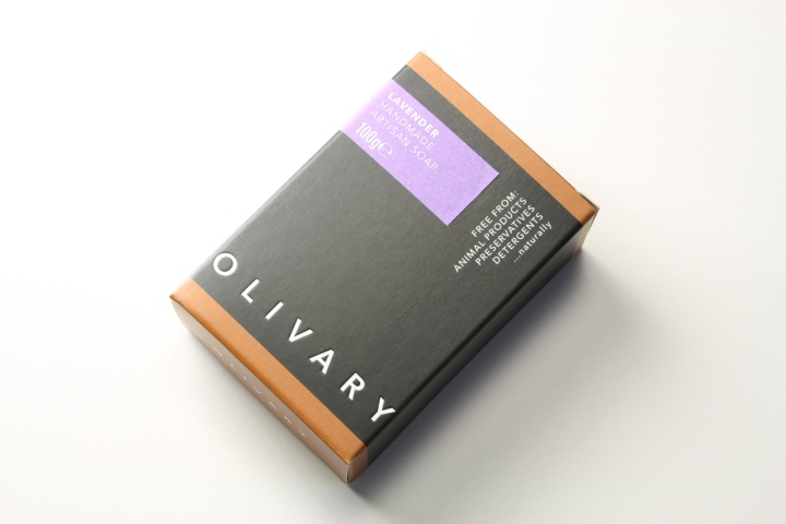
The client contacted us to help create an identity for their already popular range of quality, handmade soaps with the intention of making the leap from farmers’ markets to online and high street retail. Moving away from a traditional, homemade aesthetic, the new carton has a wrap-band effect and is designed for maximum flexibility by featuring only the generic details of the product – the specific description of the soap being added through the use of self-adhesive coloured labels that wrap around the carton.
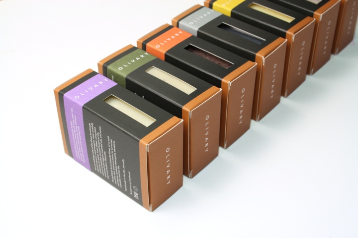
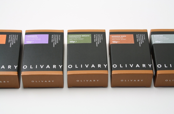
This enables greater economies of scale when it comes to printing the carton and experimentation with alternative fragrances for the price of a few labels. The new ‘Olivary’ logo appears de-bossed on the uncoated board, at the full width of the carton allowing it to be merchandised either horizontally or vertically. An aperture allows customers to see the colour of the soap itself and sample the fragrance without opening the carton. The client’s marketing copy and descriptions of the fragrances are quirky and amusing and add to the overall quality of the brand.
Design: Paul Cartwright Branding
http://www.packagingoftheworld.com/2018/02/olivary-fine-soaps.html


Add to collection


