

Add to collection


The i+care Pharmacy opened in December at 200B Livingston Street in Downtown Brooklyn. The store, combining a boutique pharmacy with high-end optical service, represents a new concept for the owners, who run several pharmacies in the New York metro area. The high-end feel of the store targets the evolving audience of its rapidly developing, increasingly upmarket location across from Macy’s, adjacent to Fulton Mall, and nearby City Point.
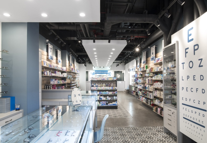
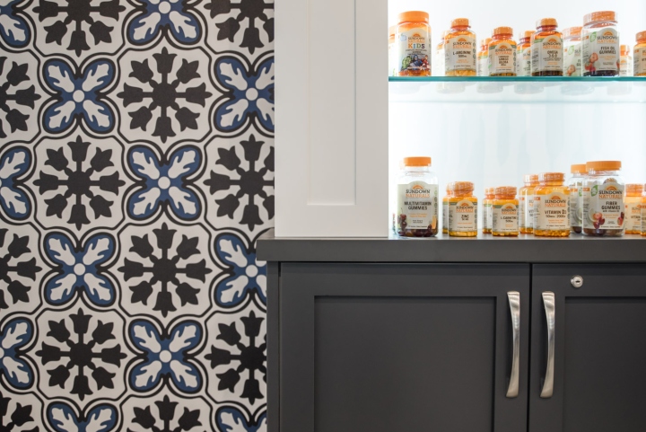
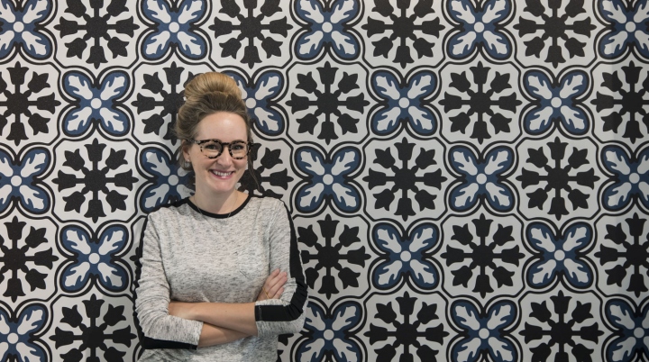
Focusing on an aesthetic experience and customer service, the upscale, custom design by studioBIG is a departure from the chain’s ten other locations. studioBIG’s owner and lead designer Leah Plevrites designed the interiors, branding, and signage to convey a clean, modern aesthetic. Whites and blues create a cool, hygienic-looking palette, while touches of wood provide warmth and a nod to the pharmacy’s natural, organic focus.
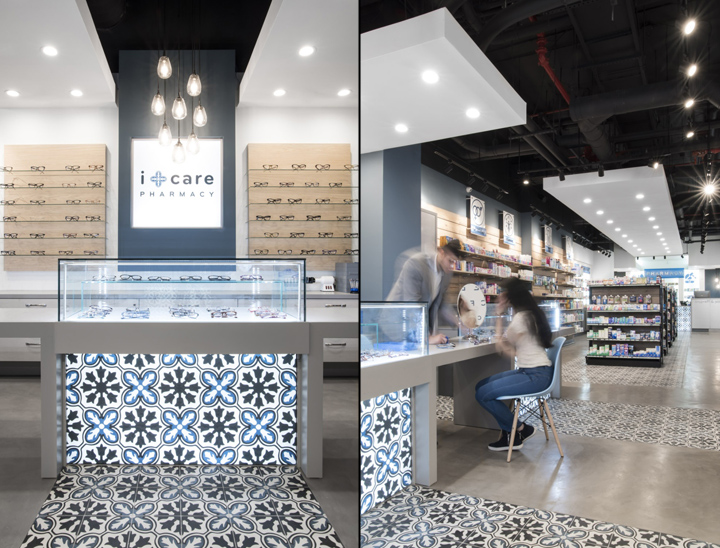
From the outside, custom signage and a striking optical department draws clients into a long space featuring optical displays and service in the front and the pharmacy in the back. Visual cues, like distinctive blue and white floor tiles and floating white ceiling planes, lead visitors through the space. The pattern of the floor tiles continues onto the optical display cases and pharmacy desk to draw attention to points of customer service.

To develop a fully custom look within an efficient budget, studioBIG ingeniously derived the flower and cross logo and pattern from the stock Cement Tile Shop floor tile. The pattern was carried throughout the space in restrained but impactful touches—on backlit cases, wallpaper, signage and wall graphics, and on the design of the pharmacy’s business cards. The result is a fully custom look without the high price tag. All pharmacy shelving was dropped to no higher than eye level to maintain visual connection from the front of the store to the back. The L-shaped floor plan allows for back-of-house pharmacy space to be hidden from view.
Interior Design: Leah Plevrites of studioBIG
Branding: Leah Plevrites of studioBIG
Custom Signage: Leah Plevrites of studioBIG
Floor tile: Cement Tile Shop
Lighting: WAC Lighting via Wayfair
Chairs: Wayfair
Millwork: Amadi NY
Photographer: Harriet Andronikides


Add to collection