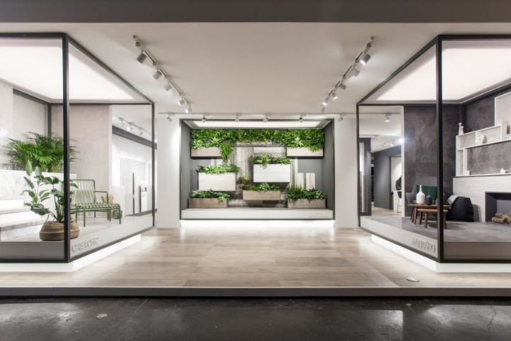

A 300m2 stand was designed by VXLAB at Cevisama fair 2018 with the aim to create an exhibition space that encompass the two ceramic brands: Durstone and Q. Durstone is the main brand of the company, that includes their floor tiles collections and it’s identified by minimal architecture.
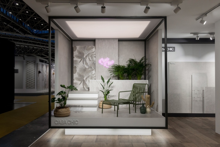
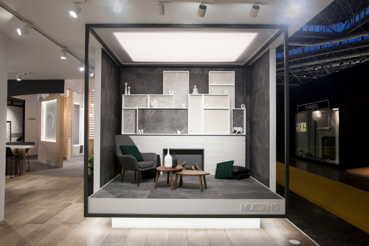
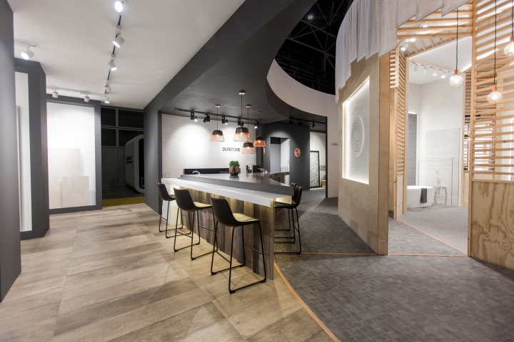
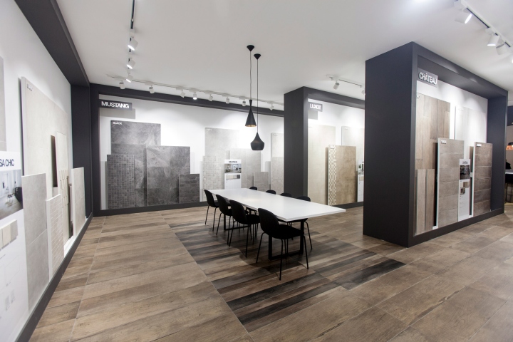
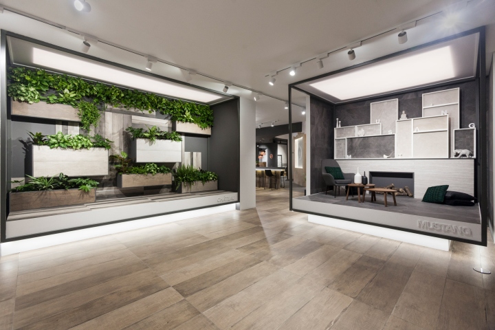
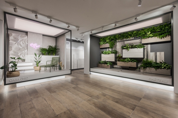
The open-space concept designed for Durstone zone was characterized by the black on white contrast and clean, sleek lines. Definitely the attention is focused on the three original mockups designed for casa chic, château and mustang collections. A series of elevated platforms with light boxes on and below the three exhibition areas that emphasized the sensation that the mockups remain suspended from the ceiling. You can also find a product exhibition area with all the displays divided by collections and also a formal meeting space.
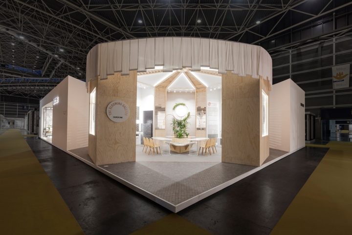
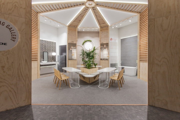
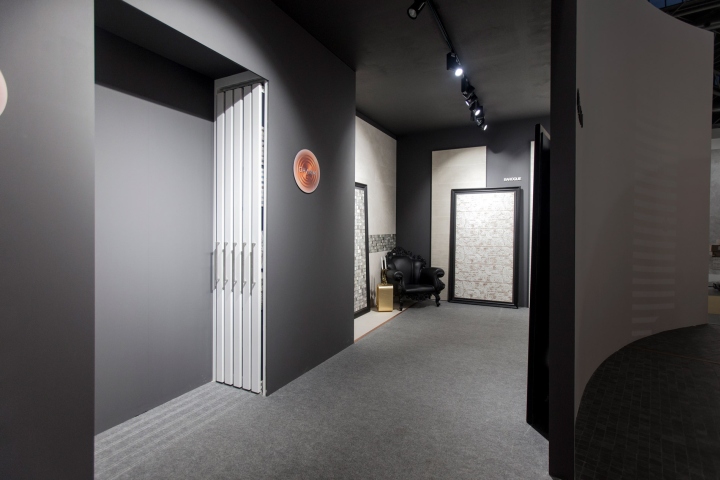
On the other hand, we find Q: a “young soul” brand that manifests itself into the stand as “The Blooming Galley”. Japanese inspiration is found in that space due to the simple shapes and materials such as pine wood, fabric and cooper. Its composition is radial, starting from the “Q” placed on the top of the roof, following through the stripped latticework and ending on a central meeting area. That space became the main entrance to the Q zone in the stand.
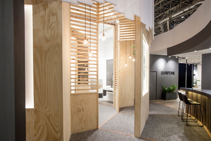
To create the link between both spaces and brands, the Spanish studio designed a circular corridor around the “Blooming Gallery” that drives the visitors along the space and takes them to the central element of the stand: the bar. This bar is a structural component with an aesthetic function but it also works as a practical meeting point for visitors and costumers. In essence, the stand presents a cohesive space that showcases the main product line, Durstone, as well as the company’s “Q” collection, focusing on youthful and contemporary styles.
Designed by VXLAB Branding & design direction


Add to collection
