Maka identity by Anagrama Studio
posted by retail design blog on 2018-03-23
Add to collection

The Client
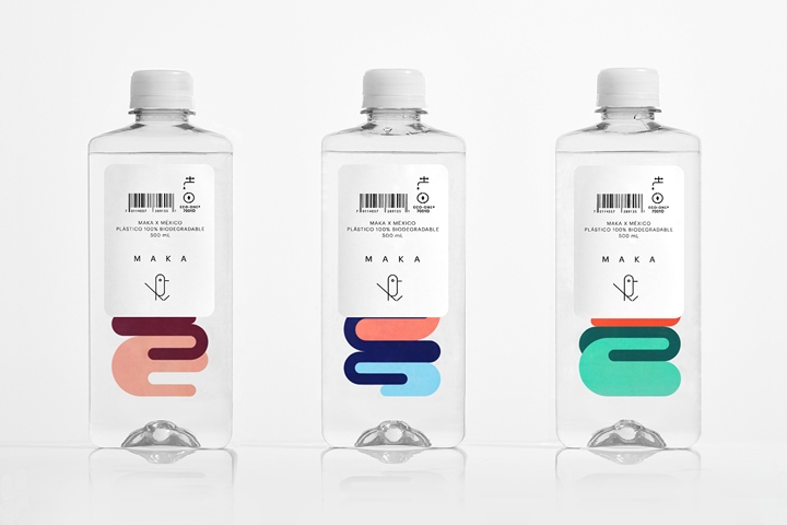
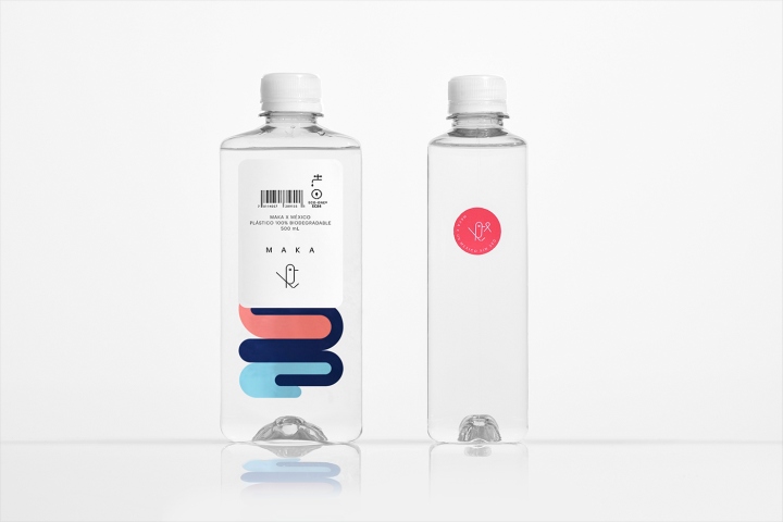
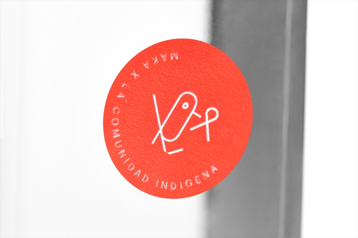
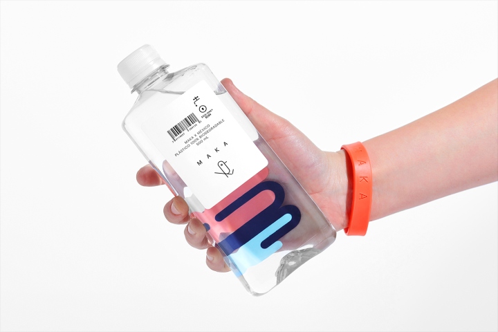
Maka is a conscious water selling company, with strong Mexican roots. As an eco-friendly and altruistic brand, they only use biodegradable materials for their bottles and support the local Nahua community in Mexico.
The Objective
Create a clear identity that reflects Maka’s Mexican heritage and effectively transmits their ecologic statement.
The Solution
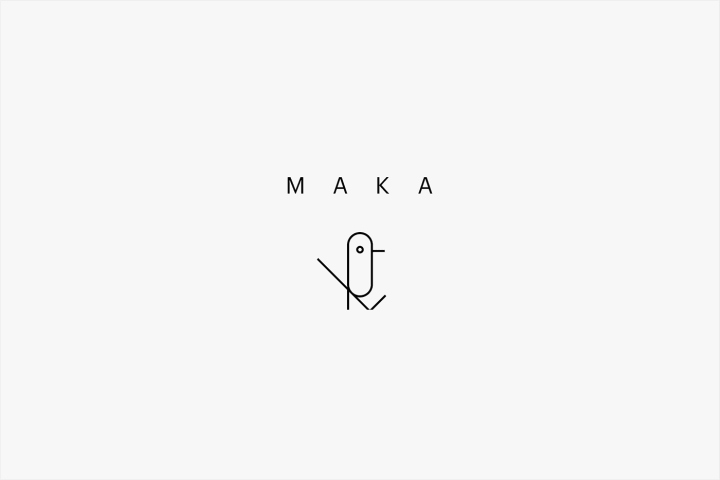
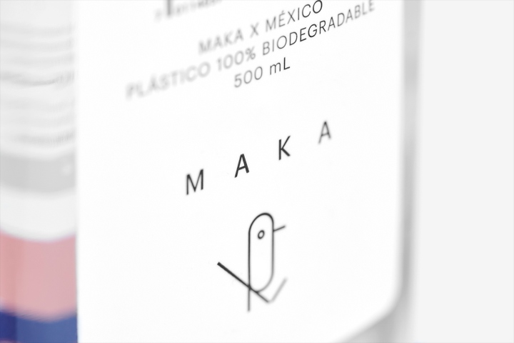
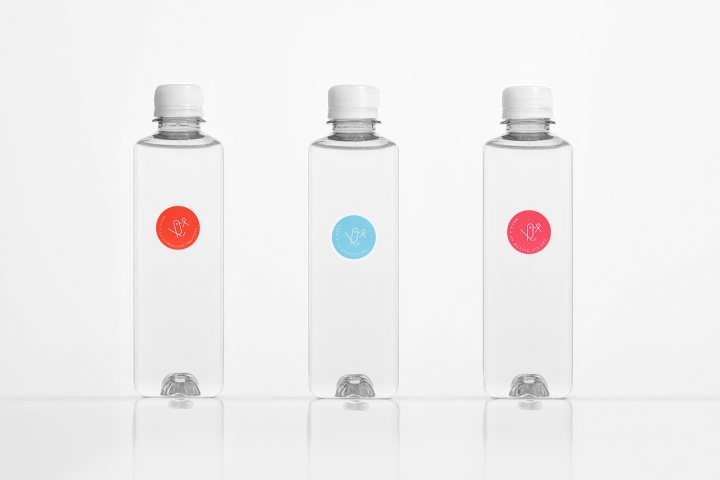
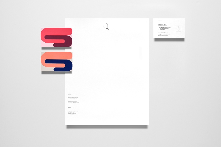
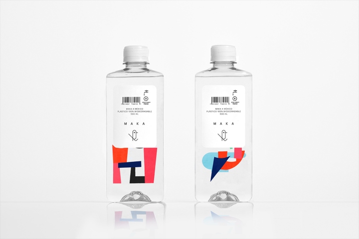
We designed a clean and singular identity focused on distinguishing Maka as an all-Mexican brand. The project started by taking Carlos Merida’s artwork as inspiration. For the icon, we created an abstraction of a tzinitzcan, one of Mexico’s most colorful and beautiful birds. The bottle design displays balance and transparency and works as a white canvas that allows different artwork to be included without altering its visual aesthetics.
Designed by Anagrama Studio


https://www.packagingoftheworld.com/2018/03/maka.html


Add to collection