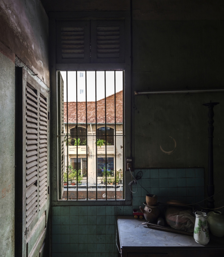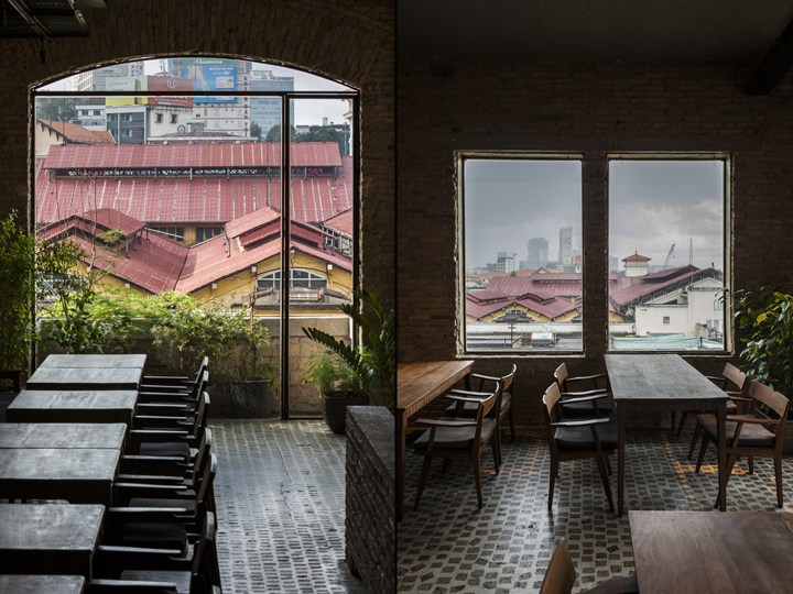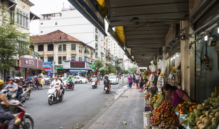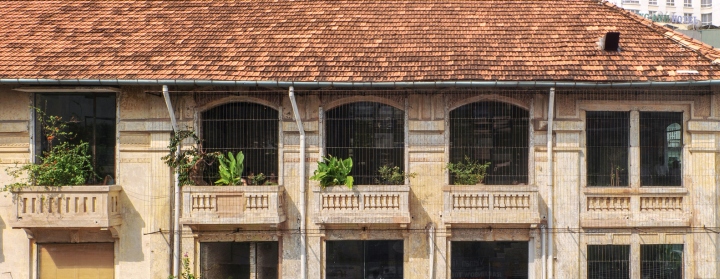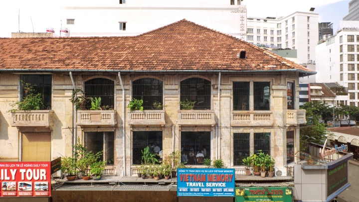

In the heart of Saigon (also known as Ho Chi Minh City), stands the touristic landmark of Ben Thanh Market and, right next to it, the renovation project of a French colonial style building. Built at the beginning of the 20th century, the edifice is a substantial piece of the city’s heritage and participates in creating the distinctive ambience of Saigon.

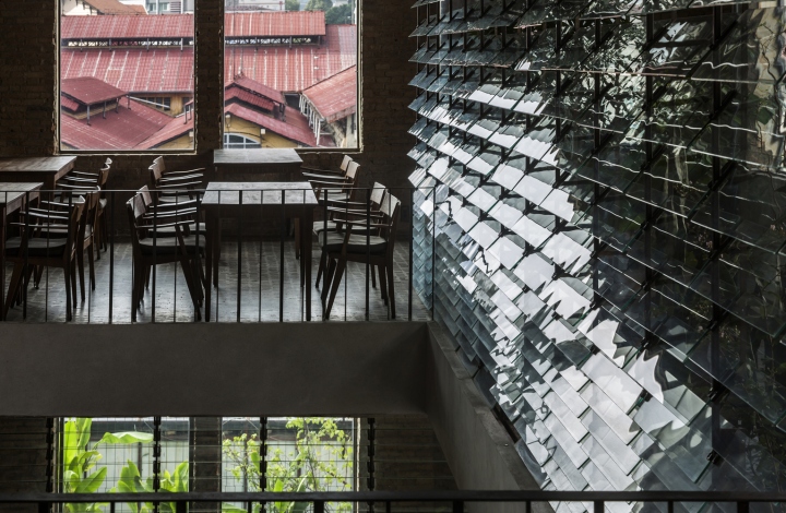
From a preservation perspective however, efforts to keep the architectural heritage consistent with its original form have reached a critical point in the young and tumultuous developing city. For example, the symbolic large tiles of the Market’s roof have been replaced by thin red-colored metal panels, lowering its aesthetic quality at first glance. Likewise, the enclosing buildings, which were developed together with the Market, have been divided into striped plots. Over the years, several 7-to-8-storey hotels were erratically inserted in-between, breaking the homogeneity of the fabric.

On the other hand, if we take a close look at the ordinary activities, we can notice that Saigonese happily take advantage of the city’s development. In fact, people are confident that they can freely participate in the upgrade of their own urban environment, even if it is recognized as part of the local heritage. That particular feeling gives them further fondness for the city and creates lively urban spaces – naturally reinforcing Saigon’s attaching humane atmosphere.

We finally hypothesized that it is an “urban intelligence” specific to Saigon (and South East Asian cities in general, unlike many European cities) to intuitively manage to preserve its historical records and simultaneously adapt the urban form to contemporary functions or lifestyles. Most importantly, this is what, consciously or not, Saigon dwellers have been demanding for their city. And through this angle, we can somehow appreciate and find beauty in the new metal roof of the Ben Thanh Market.

Based on the above analysis, our design objective was to “update the space in a sensitive way, where both past and present times flow smoothly and continuously enrich the space”. We understood it was essential to introduce a more dynamic conception of space, for different temporalities to inhabit the building without hindering each other.

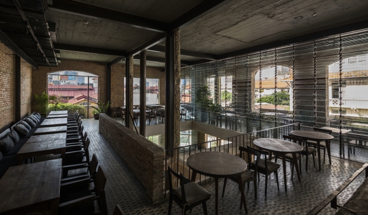
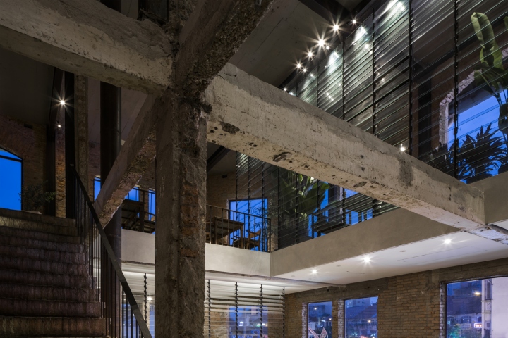
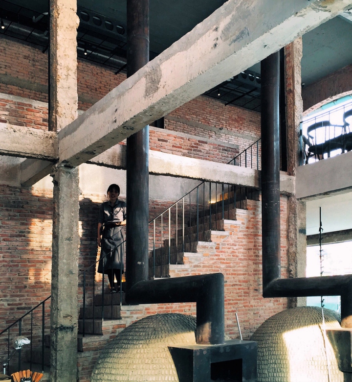
Firstly, in order to revert the structure back to its original components, we stripped down many partitioning layers, such as decoration walls and covers, which had totally concealed the building. Then, taking inspiration from the aesthetic qualities of old-days construction techniques, new materials were chosen for their compatibility with the original building and assembled in small-scale and portable-weight. To create a harmonious blend between old and new elements was our priority and we refused to use even and flat industrial materials. Instead, we chose to transfer the handcraft know-hows from old materials to new ones and let them permeate the space’s spirit.

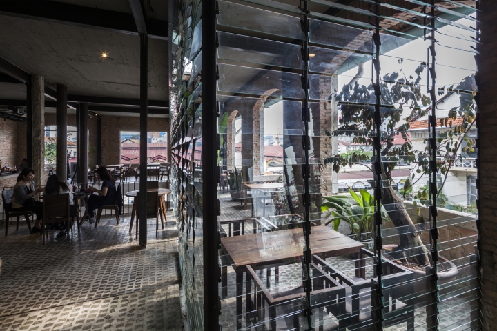
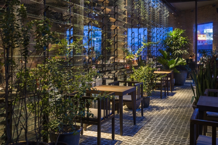
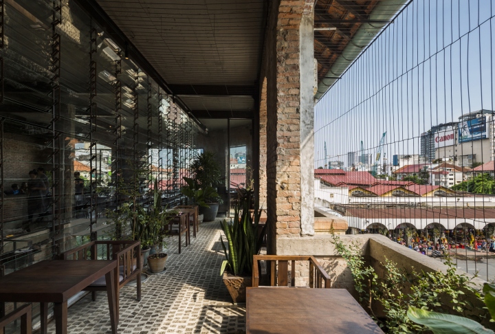
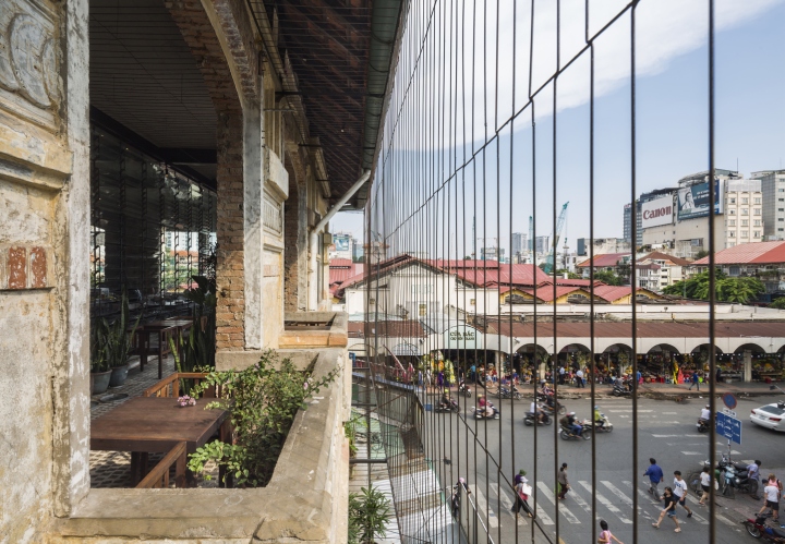
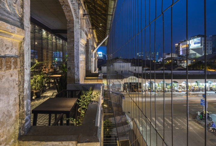
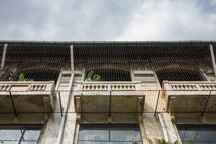
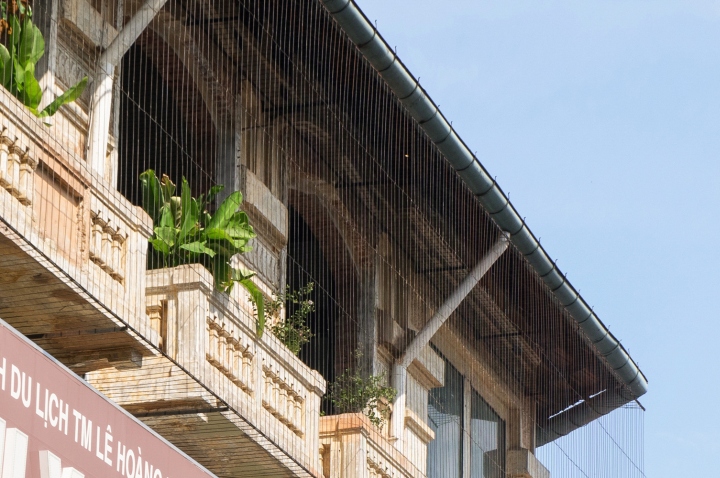
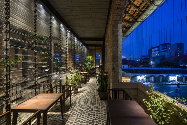
Secondly, according to our intention to “update” the building in tone with the urban context, we added two new half-transparent filters. With one inside and another outside the original exterior wall, we transformed the space in-between the two layers into a “Loggia” that opens the inside to the surrounding townscape. As a result, the strong identity of the Ben Thanh Market area melts into the architecture and smoothly spreads into the interior spaces.

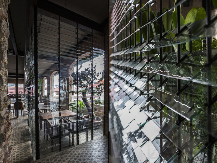
The inside filter, inspired from the high-side windows of the Market, is a large glass-jalousie partition composed of about 1,000 pieces of tempered glass. It breaks the reflection image of the neighboring cityscape and changes its visual appearance with various conditions such as the glass angles, the sun direction, the weather or the seasons – inscribing the building in a slow rhythm. The outside filter, inspired from the steel fences that we can find everywhere in Saigon and re-composed of round steel bars of 4mm-diameter, is a very subtle fence that even swings with the wind. It not only enriches the space’s experience, but also gives it a slightly abstract effect to differentiate the “Loggia” from the building facade and the surrounding scenery.

Through this project, we realized that, in the context of the rapid modernization of Saigon, it is critical to be attentive to the city and its inhabitants, define what kind of “urban intelligence” we choose to highlight, and re-consider how to update our present and future times to flow in co-existence with its historical backgrounds.
Architects: NISHIZAWAARCHITECTS
Architects in Charge: Shunri Nishizawa, Vũ Ngọc Tâm Nhi, Nguyễn Đỗ Hồng Quân
Photographs: Joshua Breidenbach, Nishizawaarchitects, Hiroyuki Oki


https://www.archdaily.com/891971/ben-thanh-restaurant-nishizawaarchitects

