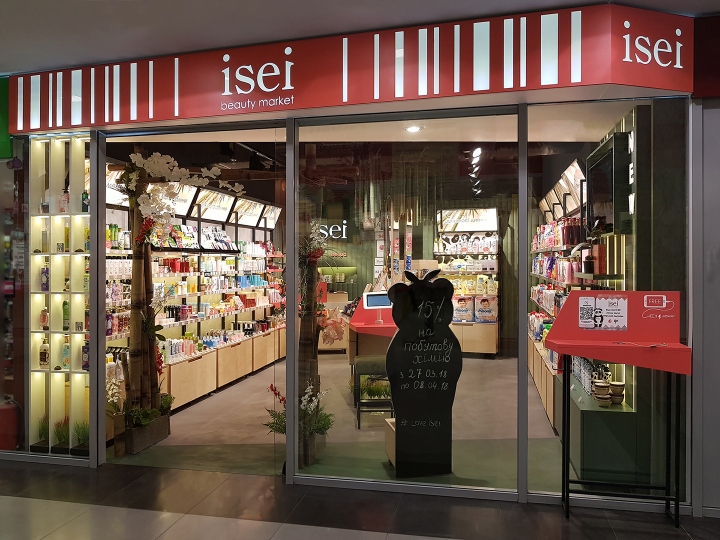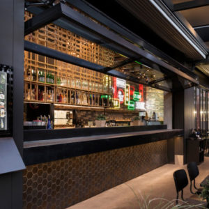

ISEI beauty shop is a network of shops in the format of drogerie & beauty, where you can buy decorative and care cosmetics, products for hygiene for the whole family, as well as household goods. The area of the store is very small – only 30 m2, and the marketing strategy of ISEI company assumes an plenty of goods and different categories. The goal was to represent the brand as good as possible, create a memorable image in the memory of the customers, emphasize the color and premium class of products. Adesign Studio managed to solve a difficult task – to make a clear zoning, understandable navigation, visually make the store clear enough and more attractive.

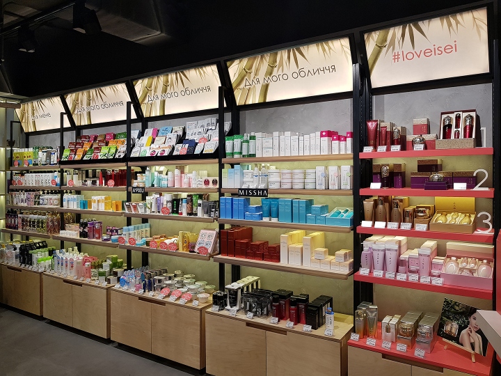
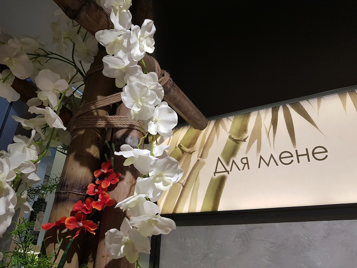
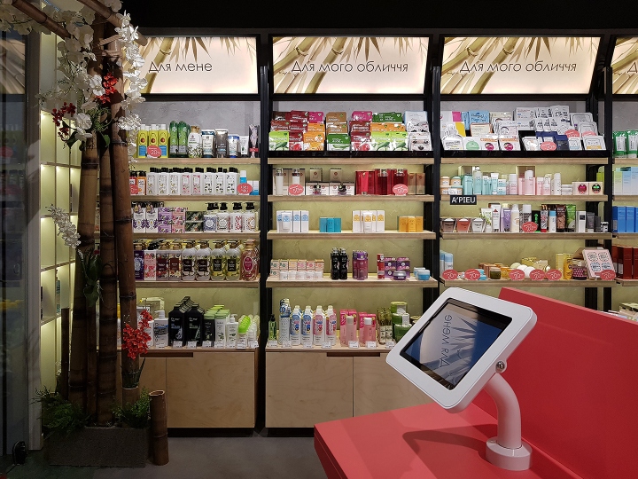
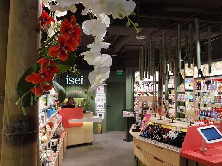
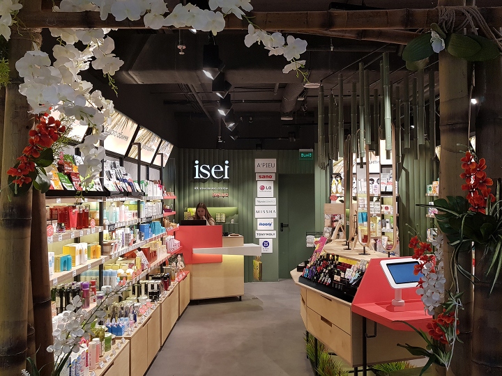
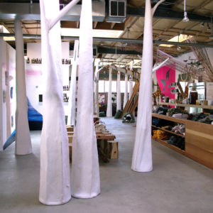
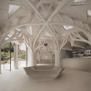
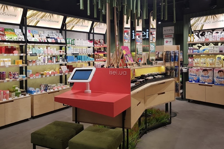
Thanks to the new concept, called Asian mood, Adesign studio created an interior that tells the customers that in ISEI store they will find the products of popular premium brands from Korea and Japan. Inspired by nature and especially by the bamboo forests of East Asia, we have developed a concept that brings the buyer to the fabulous atmosphere of nature, which helps to relax and stay in shop for a longer period of time. Using of natural textures draws attention to the brand values.

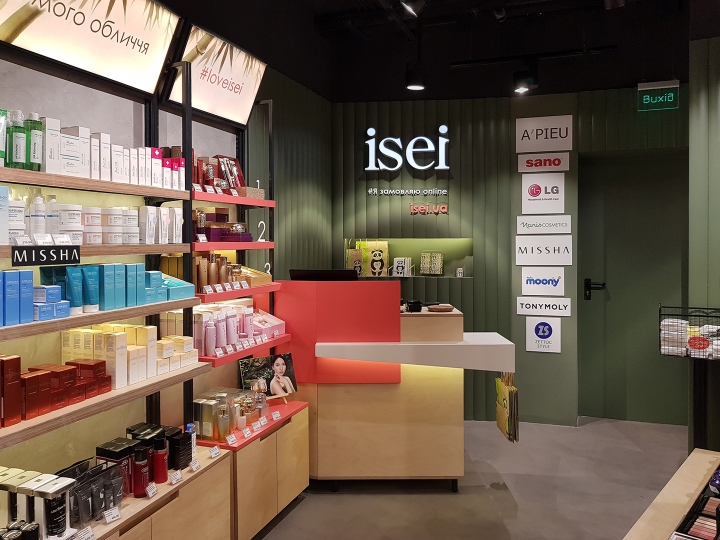
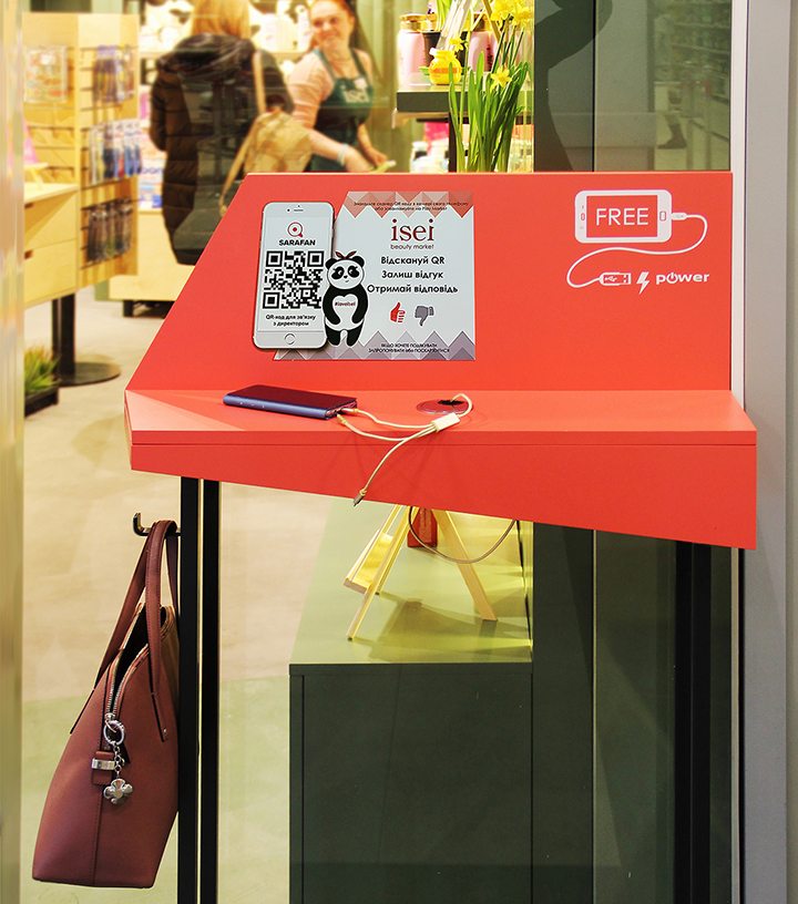
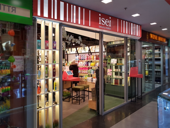
The store was opened in march 2018 in one of the shopping centers of the capital. It attracts attention from the entrance. Due to the fact that part of the ceiling flows from the outer space of the store to the inside, we visually erased the boundaries of the store and made the entrance maximally inviting. Near the entrance to the store is located a small stand with a free 24/7 charge for gadget phones. It attracts attention and demonstrates brand loyalty and concern for all visitors of the shopping center.

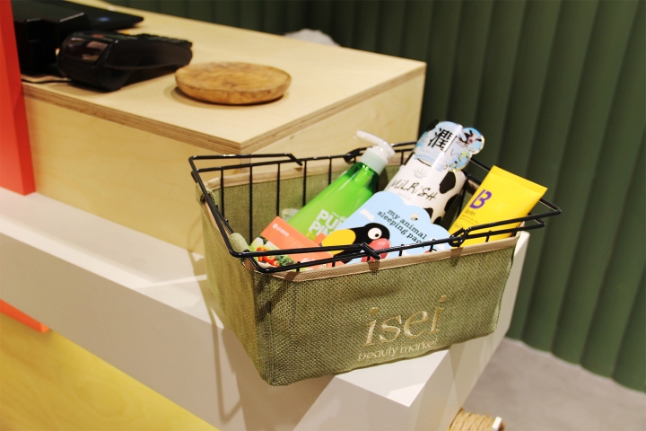
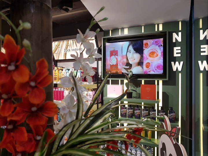
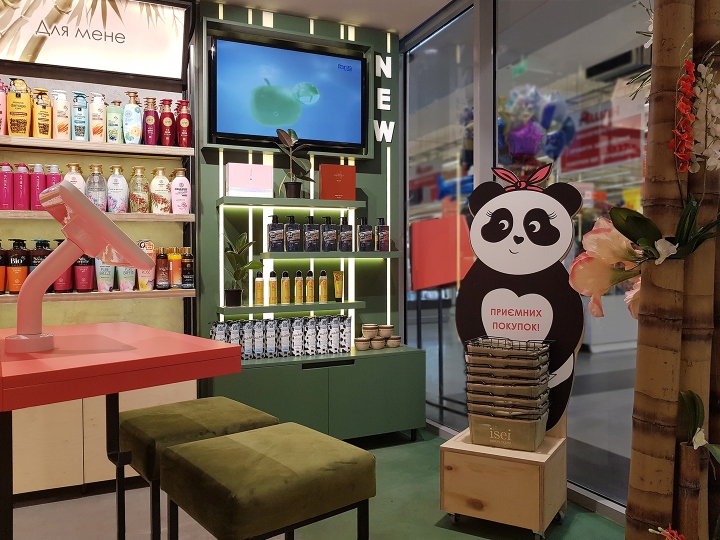
For the Isei brand, a new symbol of the network – the panda, was developed. Panda ISEI – is the keeper of traditions. This cute character is standing at the entrance with baskets and wishes pleasant shopping for all customers. The store is divided into several functional areas: on the left of the entrance is a cosmetics outlet, in the center is decorative cosmetics, on the right are hygiene products and household goods. Special attention was paid to the zone with products for babies. Near the entrance is a zone of new products, which attracts attention and tells
about new products on the TV screen. Near the place for payment, the #Loveisei zone is highlighted, there top sales products are displayed.

The new space speaks about the omnichannel of the brand and allows for better interaction between the client and the brand. In the center of the store is a zone with an online store, that looks very attractive and is equipped with the comfortable seats. This is a very effective tool that helps the brand to tell customers about its online store. Being in the physical store of the brand the client can read reviews and description of the goods on the Internet, this allows to see the complete catalog of the products of ISEI network and complete the purchase online.

Lighting plays a key factor in the quality representation of the store. It is warm, creates a cozy and pleasant atmosphere, bringing the focus to the products and it highlights interesting areas. Adesign studio created a space that met the expectations of the client. Since the first days of the opening, the number of people who entered the store has increased by 40%, and the length of the check has increased by 20%. This indicates the success of the concept!
Designed by A design Studio
