
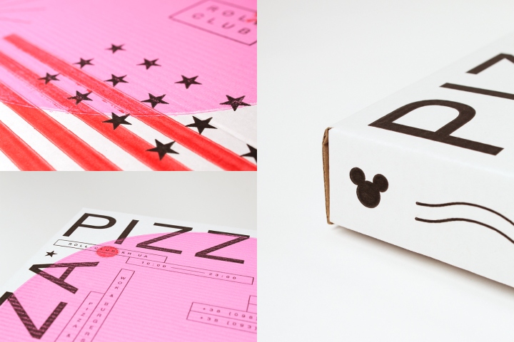
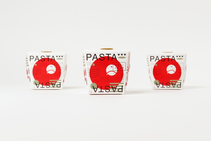
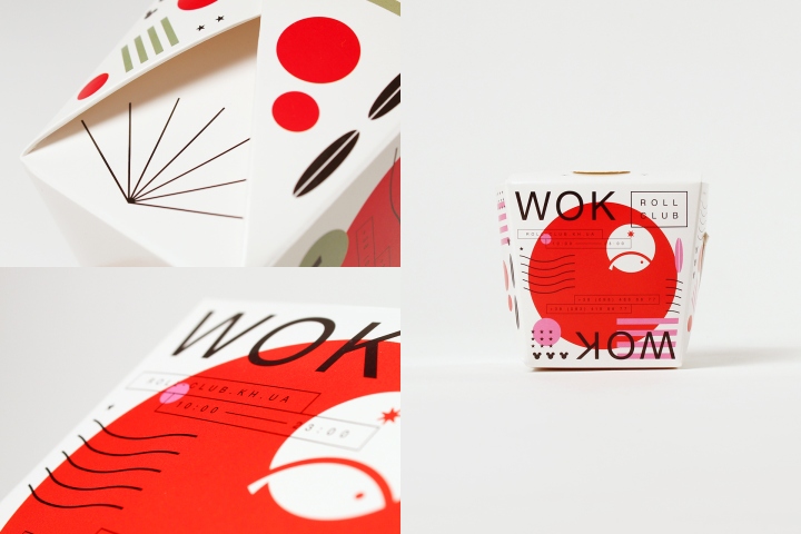
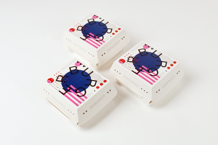
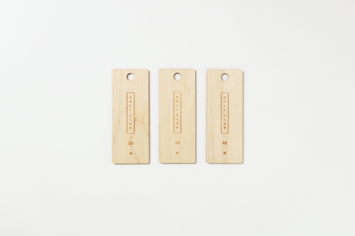
Roll Club is the food delivery service in Kharkiv. After a couple of years of successful work, they decided to open a little restaurant in the city center. Our goal was to make new identity for the restaurant and delivery. The main challenge was to show the variety of cuisines and dishes and make the new identity in a modern and stylish way. Menu of the delivery includes four cuisines such as Japanese (sushi), Chinese (wok), Italian (pizza, pasta) and American (burgers, fries). That’s why new identity shows that Roll Club is not just about rolls.
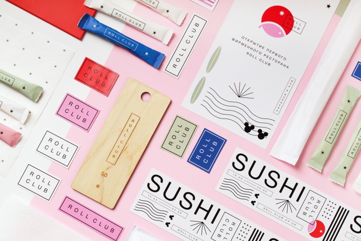
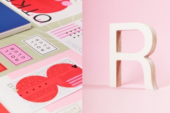
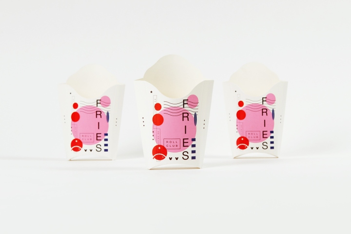
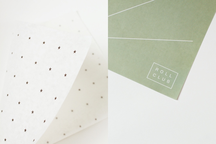
We decided to create a system of marks that symbolized different countries. For example, we used American pop elements such as stars, strips and mickey mouse; symbols of Italy that everyone knows — flag colors and the olive lives. Specific autographs from Japanese engravings gave us a form for a short texts. China in identity is shown with combination of the red and pink colors and Chinese lanterns.

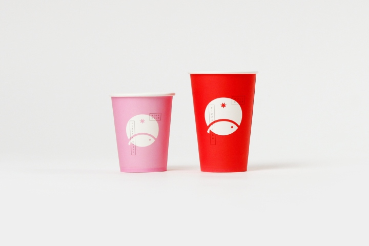
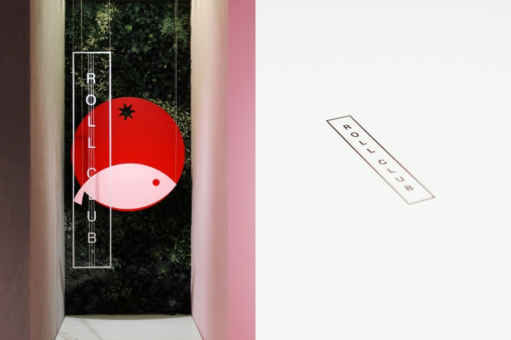
The company logo demonstrates the union of several kitchens in the menu as well. Tomato symbolizes dishes of Western cuisines since ketchup is a very common ingredient in Italian and American dishes. The fish symbolizes oriental cuisine — Japanese and Chinese. The font part of the logo is enclosed in a frame and superimposed on a sign, like a stamp in Japanese prints.
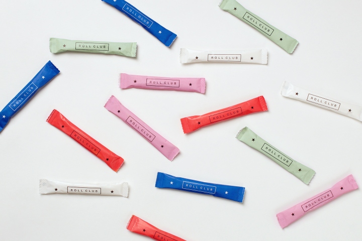
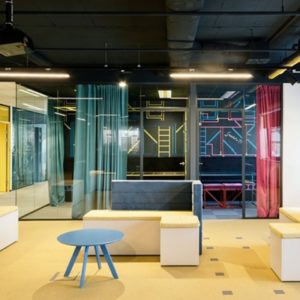
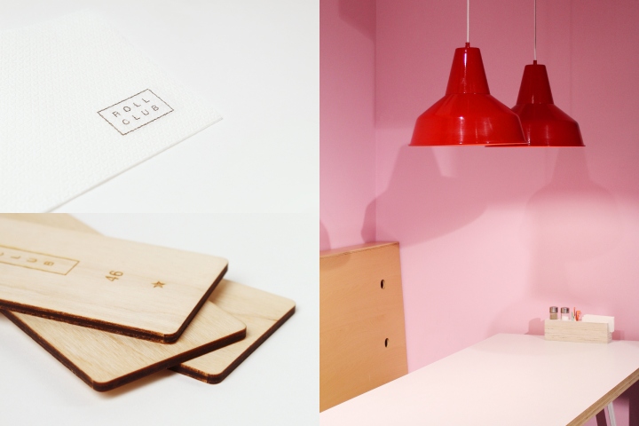
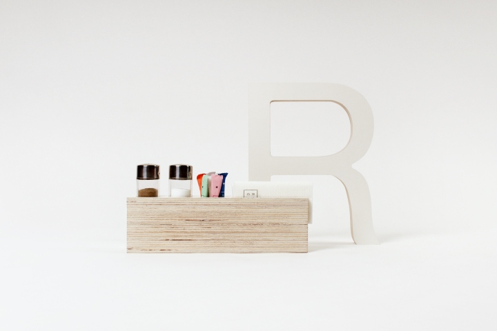
In addition to the rebranding of delivery, Roll Club decided to open its first restaurant, so the symbols and palette of the identity went into the interior design. Blue and pink floors, red stairs, olive lamps are closely related to the corporate style. The logo turned into an installation in the interior while playmates with a proprietary fan and napkins have become a complement to the tables. In addition, we have drawn an illustration of the Kharkov streets which is located on several walls.
Design: Canape Agency
Graphic designer: Daria Stetsenko





Add to collection
